• Portfolio
    • Illustration
    • Art Licensing
  • Books
    • Books
    • Activities
  • Visits and Talks
    • School Visits
    • Webinars & Workshops
  • Mentoring
  • Learn
    • Domestika Class
  • Blog
  • Contact
  • Subscribe
Marissa Valdez

Illustrator . Author . Daydream Expert

  • Portfolio
    • Illustration
    • Art Licensing
  • Books
    • Books
    • Activities
  • Visits and Talks
    • School Visits
    • Webinars & Workshops
  • Mentoring
  • Learn
    • Domestika Class
  • Blog
  • Contact
  • Subscribe

The Who, What, When, Where and Whys of Getting an Agent

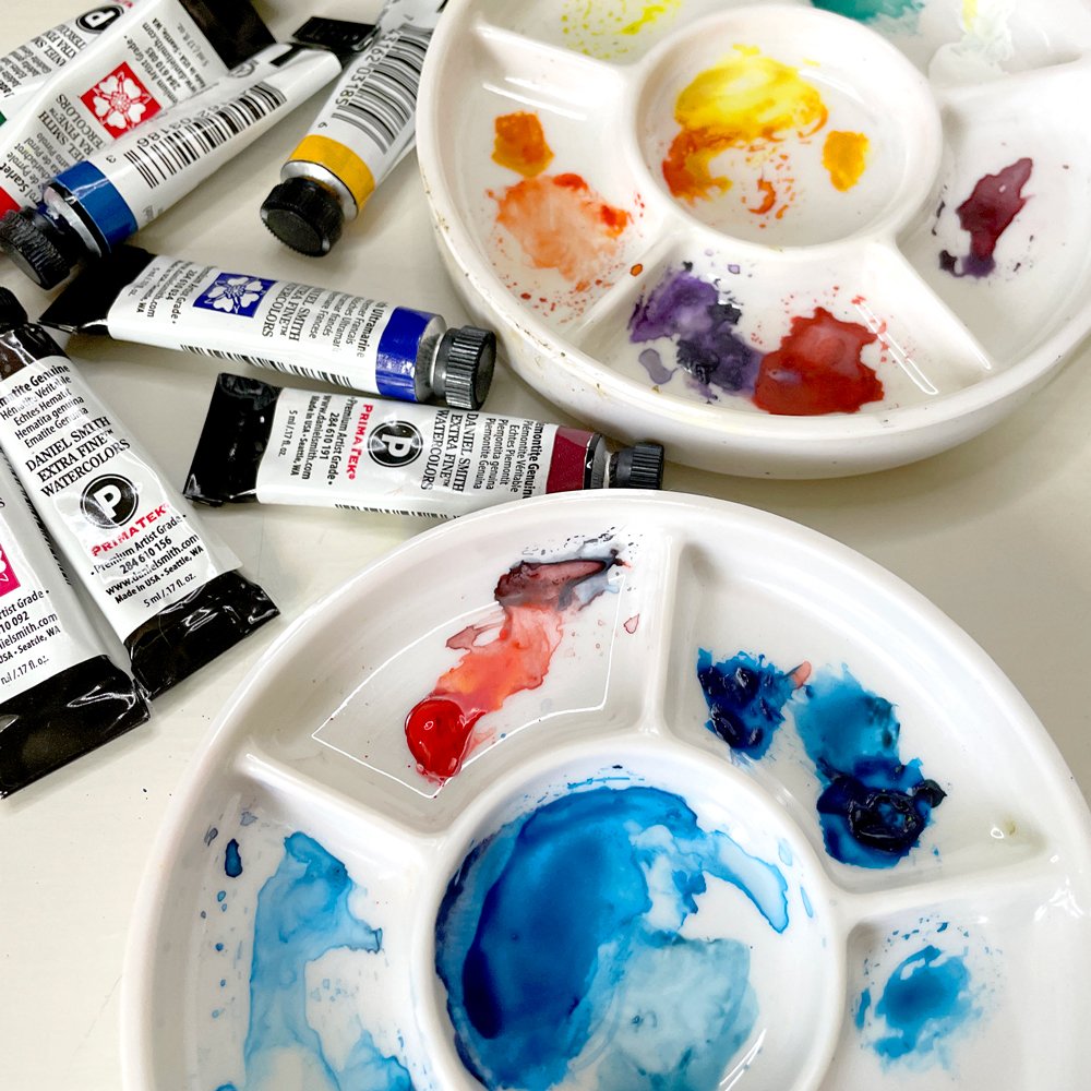
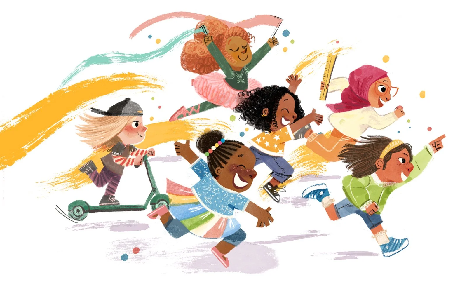
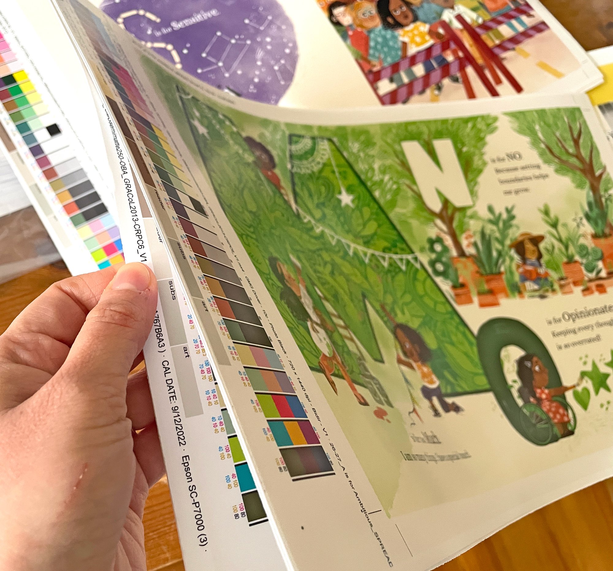
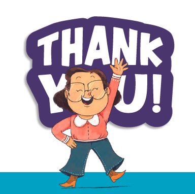
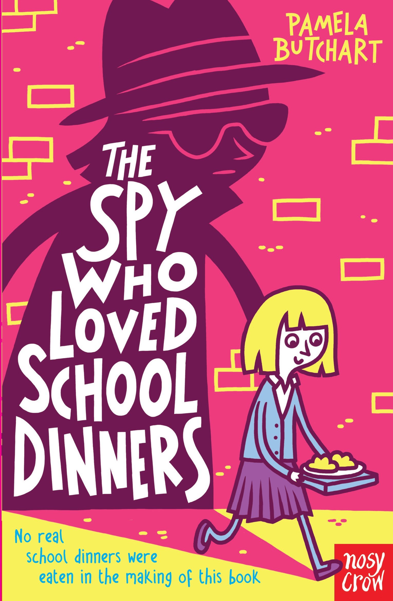
Summer is finally here in the UK and I’m admiring the sun from inside after just finishing final artwork for another picture book. At the end of creating a book I always become a bit of a hermit, wearing sweat pants all day, if not pajamas. Hygiene gets thrown out the window, showers are optional and eating comes in the form of snacks and scarfing down something at my office desk. But the work is done and I’m ready to finally go outside! Who knows, I might even get a tan.

Very worried person at desk thinking about literary agents. Her head is giant, filled with anxious thoughts. A dog is barking at her huge head!

Anywho, I wanted to write about a topic that keeps on popping into my life these days. Agents! I don’t know if it’s the summer air or if there’s a common thread in the combined consciousness of the children’s book industry, but SO MANY PEOPLE I know are querying and signing with agents right now! If you’re in the kidlit world, you know that’s a big achievement because the whole “agenting” process is not straightforward or easy.

When I first started getting interested in the children’s book industry, I had no idea what a literary agent was. I hadn’t heard about them in art school and the only time I had even heard the title was in relation to celebrities or to the FBI. And FBI agents, I found out, have nothing to do with making books.

I know that a large chunk of you lovely blog readers are illustrators who are working towards getting your first book deal. And getting into the industry sometimes feels like a daunting process especially when you’re at the point where you’re looking for an agent. So I’m writing this today to make the mysterious topic of agents a little less mysterious.

An illustrator in a bathroom is saying "good luck!" to a baby rocketing down a hill to agents. The baby carriage has the words "my portfolio" written on the side of it.

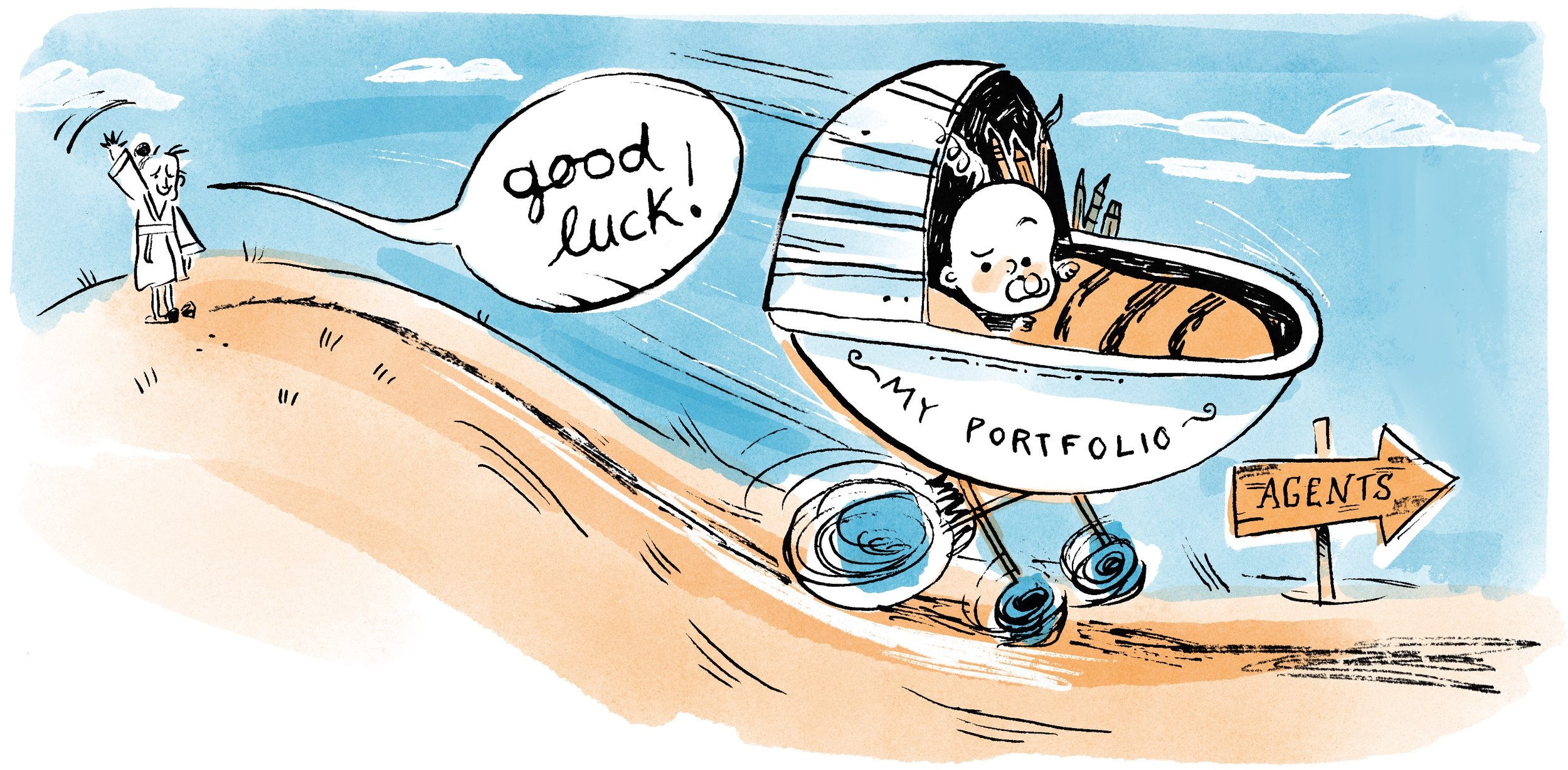
It can feel a little scary sending your precious portfolio into the big, wide world!


What is an agent/agency?

Okay, I KNOW I’m breaking protocol and starting with “what” instead of “who”, but I think it’s important that you should know what children’s book agents actually are. Here’s a definition from the Oxford English Dictionary:

A literary agent is “a professional agent who acts on behalf of an author in dealing with publishers and others involved in promoting the author's work.”

The children’s book world is made up of freelance authors and illustrators. Publishers hire us as contractors so, essentially, we have to make up a new contract for every project we work on. And if you want to make a career out of being a writer, illustrator, or both, you need to have a steady influx of book projects coming in to make a living salary. For author/illustrators you create books to sell to publishers in between doing illustration work for books already written. It’s a lot to handle yourself. Each publisher words their contracts, pays royalties and advances, states specific parameters for their books differently.

So agents are that in-between. They handle all of the contract work, the submission process, editing (although not always), scheduling, cheerleading, etc. My agent could be considered “superhuman” considering everything she juggles.

Let’s define “agent” even further:

  • Literary Agent: A literary agent is, I’d say, the most common type of agent you’ll encounter working in the children’s book industry. They tend to work only on book deals (no magazine projects, children’s products, etc.) and they tend to either be children’s book agents or adult’s book agents, but it can differ from agent to agent and agency to agency. Literary agents tend to take 15% commission. So that’s 15% of your advance + any royalties.

  • Art/Illustration Agent: A children’s illustration agent is someone who will represent you for book deals, magazines, children’s product design, and anything children’s illustration related. I’ve noticed that they tend to promote your work more than a literary agent might, like they’ll send out digital postcards or email campaigns. Art agents will represent illustrators and author/illustrators and I find that an increasing number are even representing authors. Art agents tend to have a higher commission starting at 20% but can go up to 30%.

When researching both literary and art/illustration agents you might hear the word “editorial” thrown around. An editorial agent is an agent that will edit your manuscript and dummy before submitting it to publishers. Other agents will let you do this on your own but might be involved in your portfolio curation. A good thing to remember is that agents, much like illustrators, are in a pretty flexible career. Each one is unique!


Who are the agents and agencies?

According to querytracker.com, there are hundreds of literary agencies and thousands of literary agents in the publishing industry. So where do you start searching?

Now that you know what an agent and agency is, let’s go over some of the top dogs in the literary agenting world. These are a few of the agencies I was interested in when I first started my journey that I thought could be a good starting place for ya’ll:

Screen Shot 2023-06-13 at 5.23.57 PM.png
Screen Shot 2023-06-13 at 5.24.20 PM.png
Screen Shot 2023-06-13 at 5.24.35 PM.png
Screen Shot 2023-06-13 at 5.25.03 PM.png

Literary Agencies:

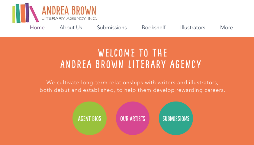
  1. Andrea Brown Literary Agency: This is where I’m represented! I might be a bit biased because I LOVE it here, but ABLA can stand on it’s own two legs. It is a children’s book agency only and represents notable authors and illustrators like Kate Messner, Raul the Third, and Meg Medina.

  2. Writer’s House: Writer’s House is an agency that represents both adult work and children’s work. They represent top illustrators like Dan Santat, Jon Klassen, and Oge Mora.

  3. Stimola Literary Studio: This is an adult and children’s book agency, so they do it all. They represent top authors and illustrators like Suzanne Collins, Anne Hunter, and Donna Barba Higuera.

  4. Folio Jr.: I heard about Folio Jr. from a couple of my kidlit friends. Folio Jr. is the children’s book offshoot of their main agency, Folio Literary Management and represents big names like Sydney Smith, Erin and Philip C. Stead, and Megan and Jorge Lacera.

  5. Root Literary: Root is a boutique agency. It doesn’t represent huge numbers of clients like Writer’s House does, but I’ve heard great things about it from fellow authors and illustrators. A boutique agency allows for a more focused environment. Root Literary represents adult and children’s work. There are only a handful of agents and they represent top authors and illustrators like Ellen T. Crenshaw, Joy Hwang Ruiz, and Colleen AF Venable.

Art/Illustration Agencies:

  1. The Cat Agency: Previously, I would have listed The Cat Agency as “boutique”, but they have grown exponentially in the past couple years. They have multiple agents and represent children’s book illustrators along with a handful of authors. Their notable clients are Niña Mata, Rahele Jomepour Bell, Nathan Hale, and Jamie Green, but they also represent a whole range of illustrators that inspire me.

  2. Bright Agency (UK based): I would consider this agency to be very large and one of the biggest children’s illustration agencies in the world. They represent clients in greeting gifts, design advertising, animation, literary, licensing and children’s illustration industries. I was surprised that they represent a handful of writers as well. Their notable clients are Benji Davis, Chris Chatterton, Fiona Woodcock, and Tom Knight.

  3. The Plum Agency (UK based): This illustration agency represents author/illustrators and illustrators in the children’s illustration market. They specialize in children’s illustration and media. I couldn’t find more information on exactly what “media” means but I assume TV deals are happening! Some of their notable clients are Paula Bowles, Kate Pankhurst, and Stef Murphy.

  4. Tugeau 2 or also known as T2: This is a boutique agency that has an interesting link to The Cat Agency. Nicole, the founder of T2 is Christy Tugeau’s (founder of The Cat Agency) daughter-in-law! What a small world. T2 represents children’s book illustrators and a handful of authors. Some of their notable clients are Devon Holzwarth, Teagan White, and Lee White.

These are just a few out of the hundreds of agencies out there, but I’m hoping this is a solid starting ground. Make sure to do your own research about these organizations and see if they fit your needs. It can be a long process to get an agent, but doing lots of research is worth it in the end!


When should I start looking for an agent?

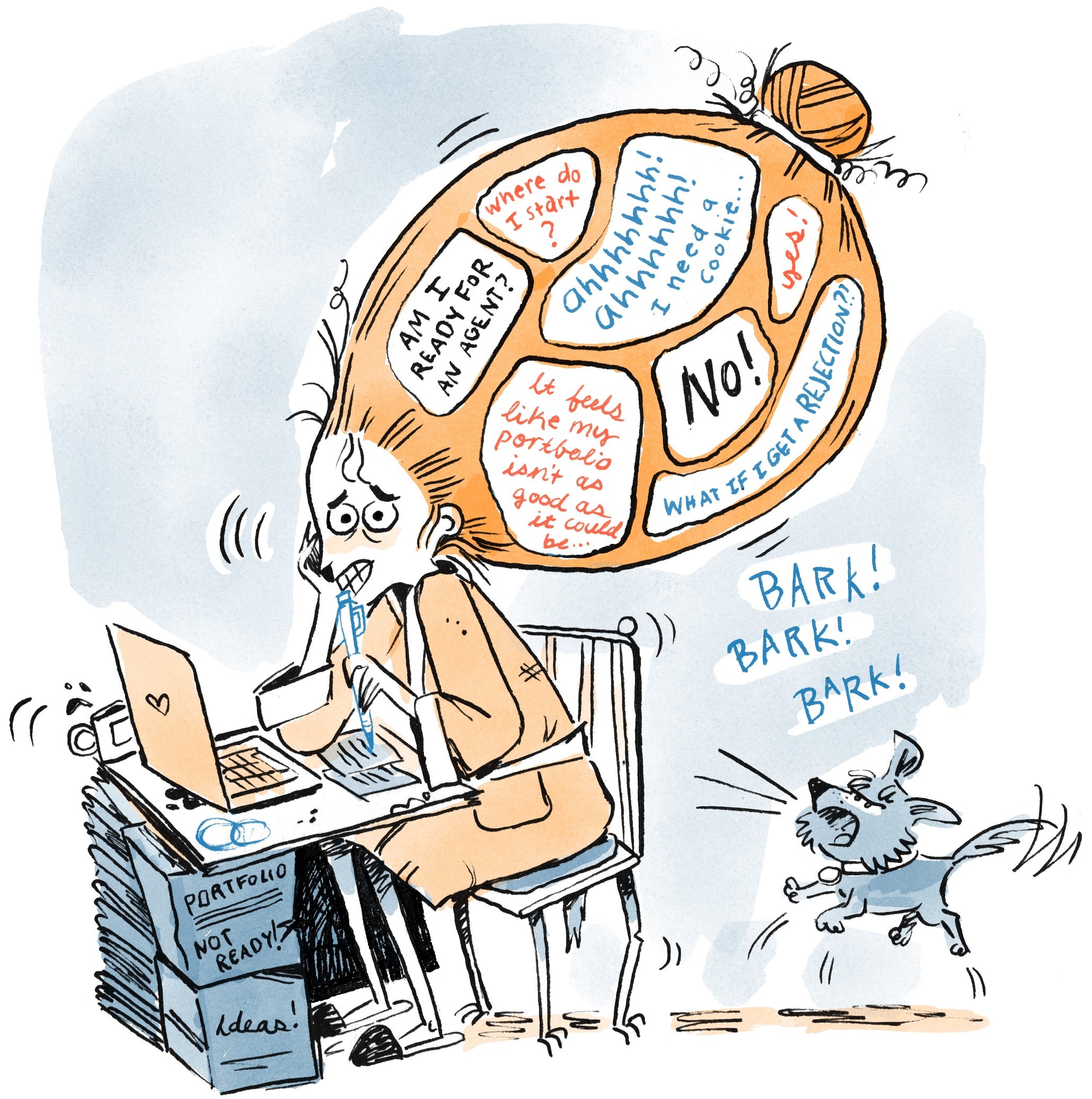
This is a hard question to answer and I believe it’s where a lot of illustrators struggle. It’s difficult determining when your portfolio is “agent ready”.

Portfolios, manuscripts, and dummies are living, breathing things and you can work on them forever. But at some point you need to make the leap and start sending out your work to agents!

If you’re an illustrator, take a look at your portfolio. Do you have a portfolio with 10 or more images in one style showing the kind of work you want to get, i.e. picture book illustration, middle grade illustration, graphic novels, etc? If so, then I would start making an agent list. If not, try building your portfolio up a bit more.

Shameless plug here, if you’re not sure what you need for a children’s illustration portfolio, check out my Domestika class on creating an Online Children’s Illustration Portfolio.

But also be kind to yourself. I didn’t think I was ready for an agent when I received offers of representation. It really took me by surprise! You can test out your portfolio readiness with critique groups, paid critiques from industry professionals, and fellow illustrators. Even try reaching out to illustrators that are agented by your dream agent and ask for their opinion.

They might be busy and not able to respond, but in my experience people kindly share their knowledge. People are really nice in this industry! They’ll help you determine whether you’re ready or not.

A trash pile that is on fire. Flies are buzzing above it. There's a letter in the middle of the pile that starts with the words "Dear Agent,".

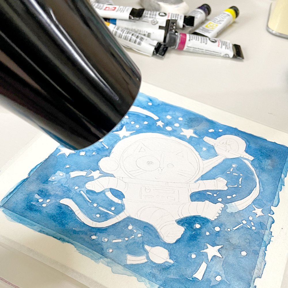
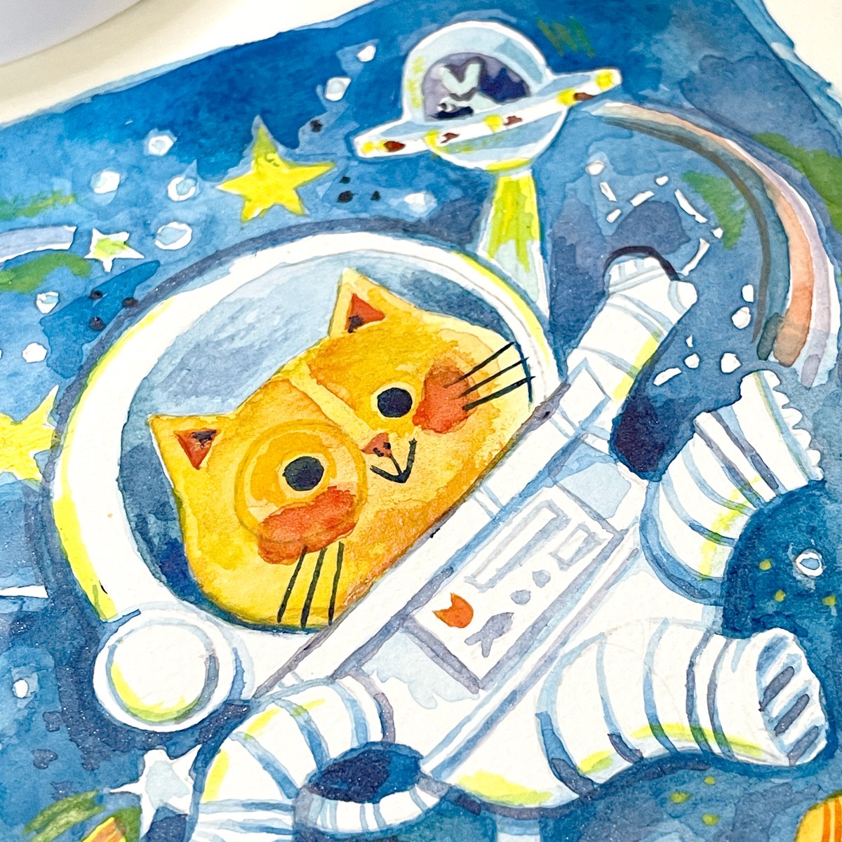
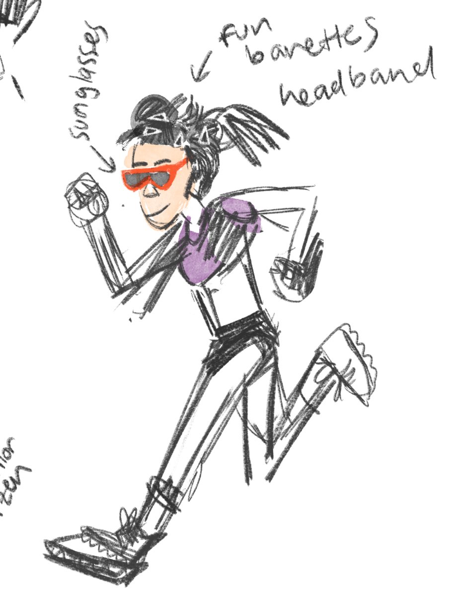
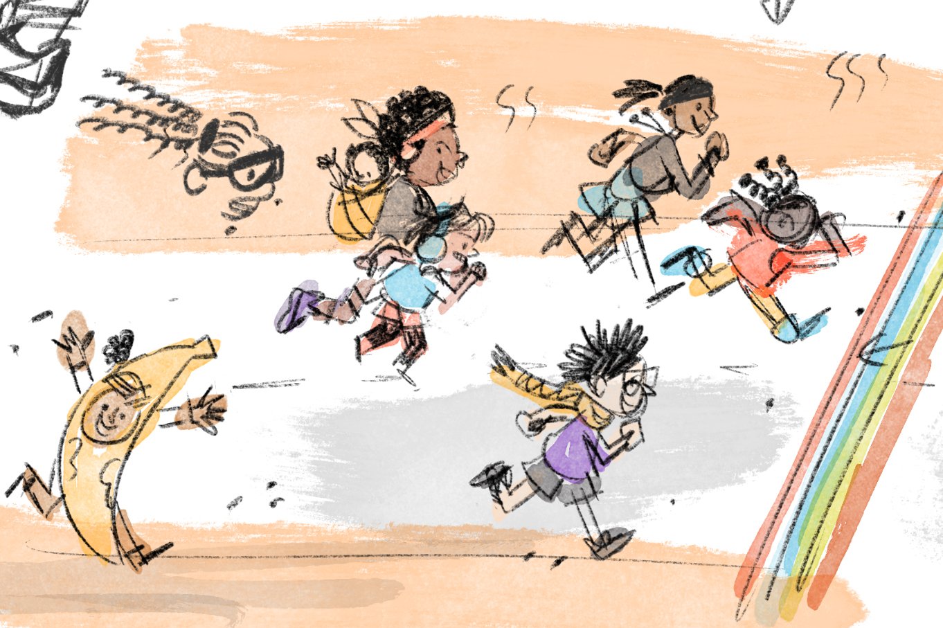
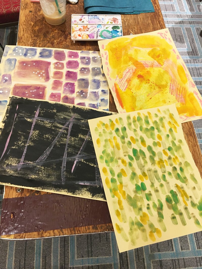
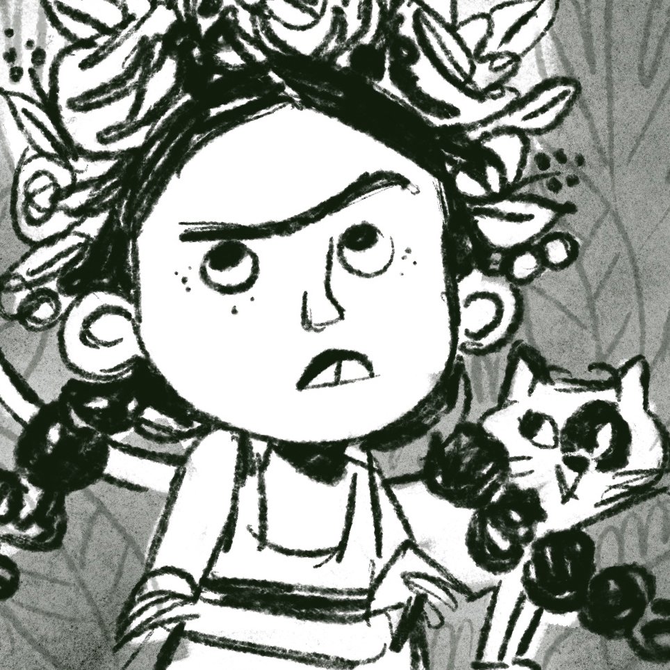
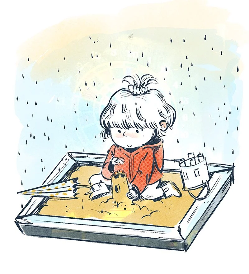
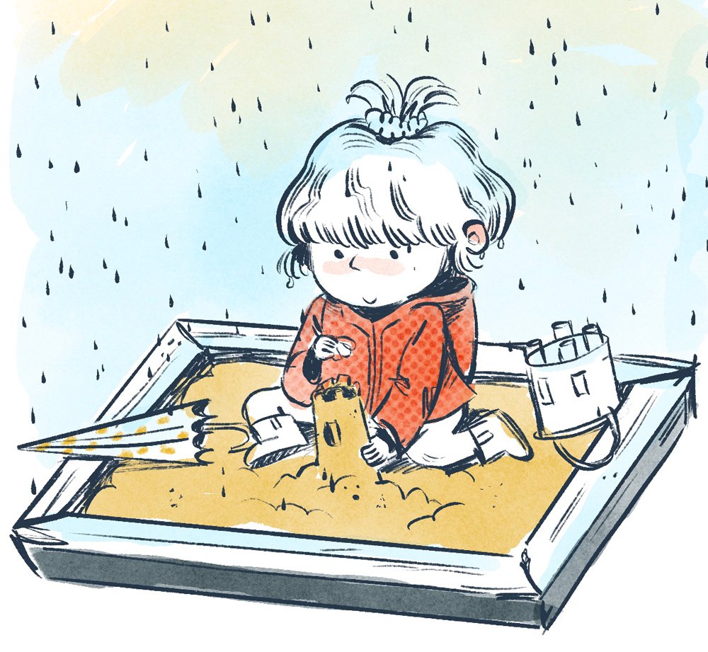
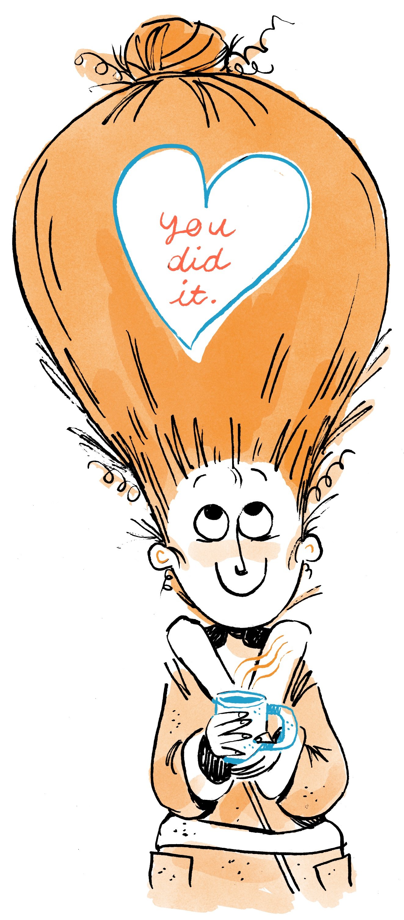
What it sometimes felt like for me when I was querying agents. Better finished than perfect though!


Where do I send in my queries? (+How do I prepare??)

First things first, what is a query letter?? If you haven’t heard this word being thrown around, “querying” is the term used when you start the process of reaching out to agents for representation. A query letter is a kidlit resumé and cover letter rolled into one. It’s usually sent as an email and it’s how you introduce yourself and your work to an agent.

Now that you’ve determined which agents you want to query and what you want to send, where do you send this magical query letter?


Each agency has different guidelines for sending in your query letter, portfolio, and dummy. This may even differ from agent to agent within an agency. Like everything else when it comes to querying, take your time, do your research, and organize your process. You’ll be sending out your portfolio in no time! I’ve outlined all the submission pages for the previously listed agencies below.

A screenshot from Kelly Sonnack's agent webpage. An arrow is pointing to where you would submit a query.
  1. Andrea Brown Literary Agency: https://www.andreabrownlit.com/submissions (You’ll need to go to each agent’s contact page and click on the teal-green text to fill out a query manager form.)

  2. Writer’s House: https://www.writershouse.com/submissions

  3. Stimola Literary Studio: https://www.stimolaliterarystudio.com/submissions

  4. Root Literary: https://www.rootliterary.com/submissions/

  5. Folio Jr.: https://www.foliojr.com/emily-van-beek (The submission requirements are located on the individual agent pages.)

  6. The Cat Agency: https://catagencyinc.com/contact-us

  7. Bright Agency (UK based): https://thebrightagency.com/uk/submissions/new?division=childrens-illustration

  8. The Plum Agency (UK based): https://theplumagency.com/submission

  9. Tugeau 2 or also known as T2: https://tugeau2.com/contact

How to prepare to query?

  • Draft your query letter! Now I’m not a query letter expert so I’m going to add some links here that better explain how to format a query letter better than I could. Feel free to use the example below of a letter that I wrote when I was querying agents in 2020 as a jumping off point! This is a query letter to The Cat Agency’s Christy Ewers that got me an email reply and a call. I find that seeing a real life example can help more than reading a list of tips and tricks. I’m a visual learner and I bet my butt that you are too :)

    • The 10 Dos and Don’ts of Writing a Query Letter, Writer’s Digest

    • How to Write a Query Letter, Queryletter.com

    • A Sample Literary Agent Query Letter with Hints and Tips, Jericho Writers

“Hello Christy,

I attended your Portfolios and Promotion webinar on March 12th and was enthralled. I’ve been keeping an eye on the CAT Agency for the majority of my illustration career and was ecstatic to see that you were accepting submissions from those who attended. As a previous Bostonian, I was also excited to hear someone use “wicked” in a sentence again!

I am a Latinx author/illustrator based out of Houston, Texas, where the weather is hot but the tacos are even hotter. Since focusing on my illustration career I’ve received several accolades: Top Portfolio Award at the 2019 Houston SCBWI Conference, winner of the Society of Visual Storytelling’s November 2019 Illustration Contest, and two-time winner of SCBWI’s Draw This Challenge published in SCBWI’s monthly Insight newsletter (Dec. 2018/Dec. 2019). I also illustrated PAPITO AND THE SQUEEZEBOX, a music-based Tejano picture book, for Puro Party Publishing released March 2020.

After graduating with a BFA in Animation from MassArt, I had a short but sweet career as a preschool teacher. Currently, I work as a graphic designer at a marketing agency and believe my combined experiences and colorful illustration style create a strong foundation for the children’s illustration market.

In addition to my portfolio, I’d like to share my 376-word picture book, HEDGEHOGS DON’T WEAR UNDERWEAR, about a tighty-whitey wearing hedgehog who questions whether he is brave enough to break through society’s elastic bands.

I've included five illustrations for your review and my online portfolio and picture book dummy can be seen at www.marissavaldez.com. If interested, the password to get into the dummy is: Undies1

Thank you for your time and consideration!

Safe and Healthy Wishes,

Marissa Valdez”

  • If you’re planning on pitching yourself as an author-illustrator, keep a growing list of your book ideas. You don’t want to forget a potential best selling idea if an agent asks to hear your ideas!

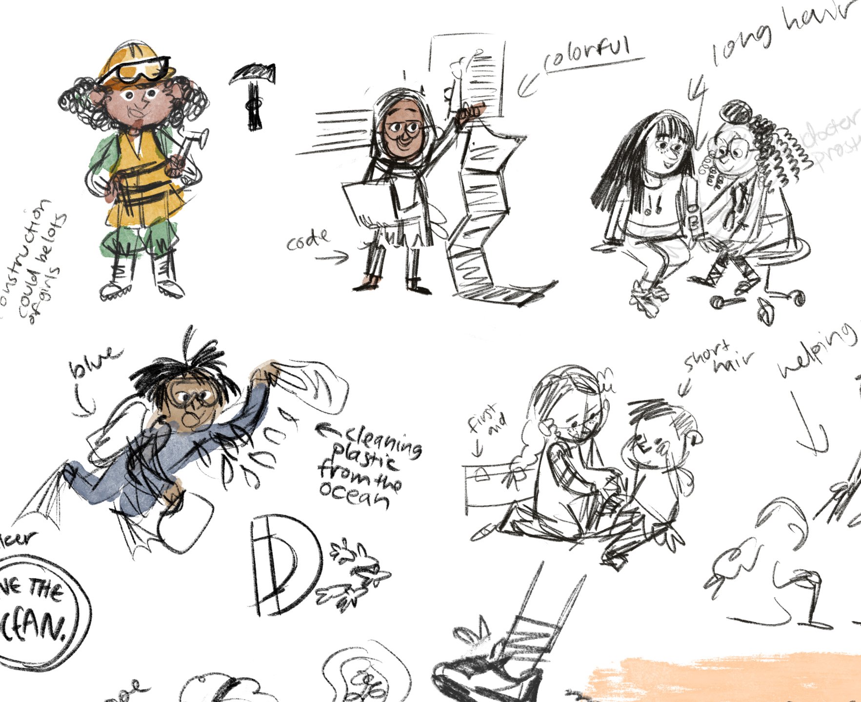
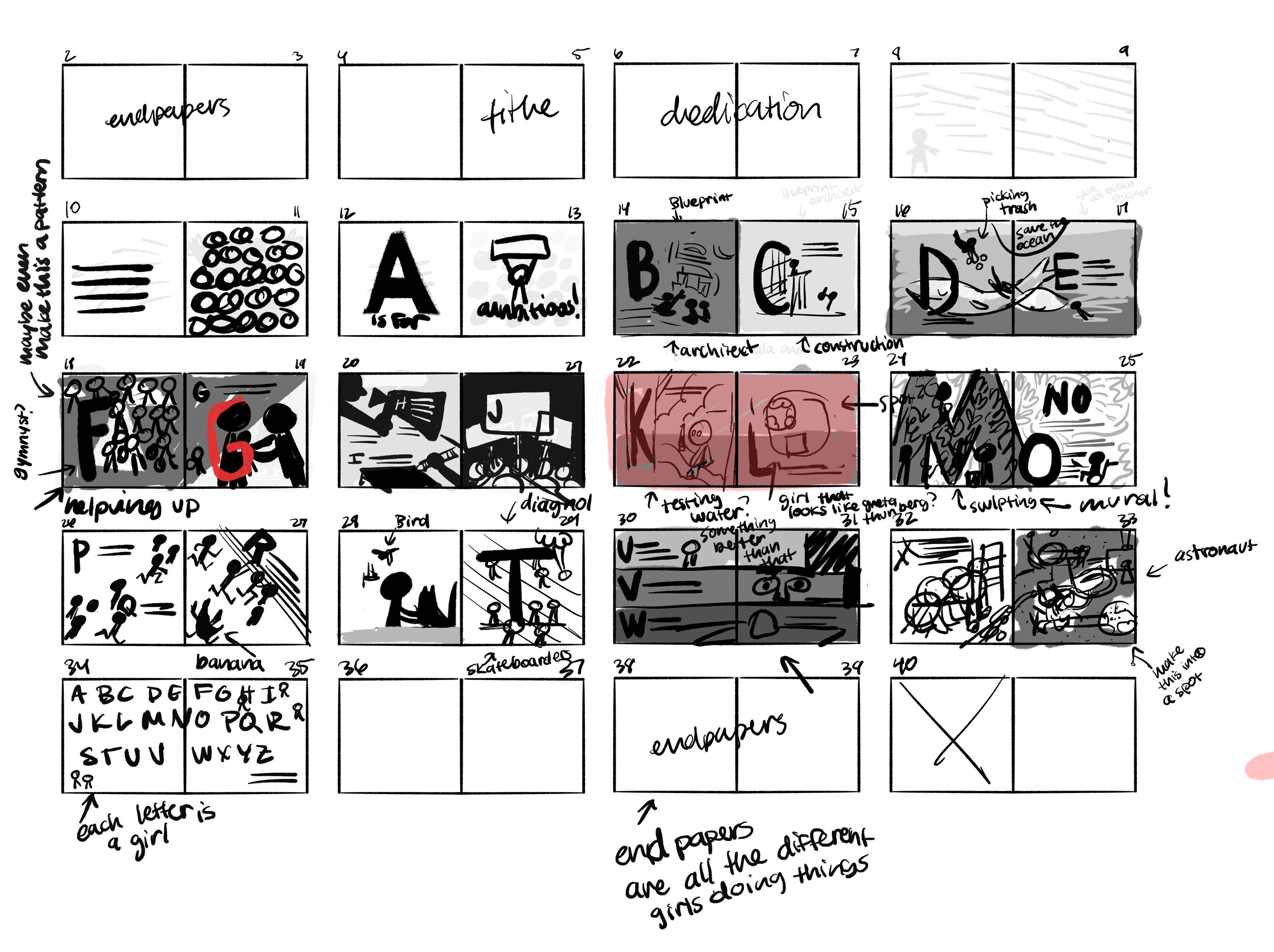
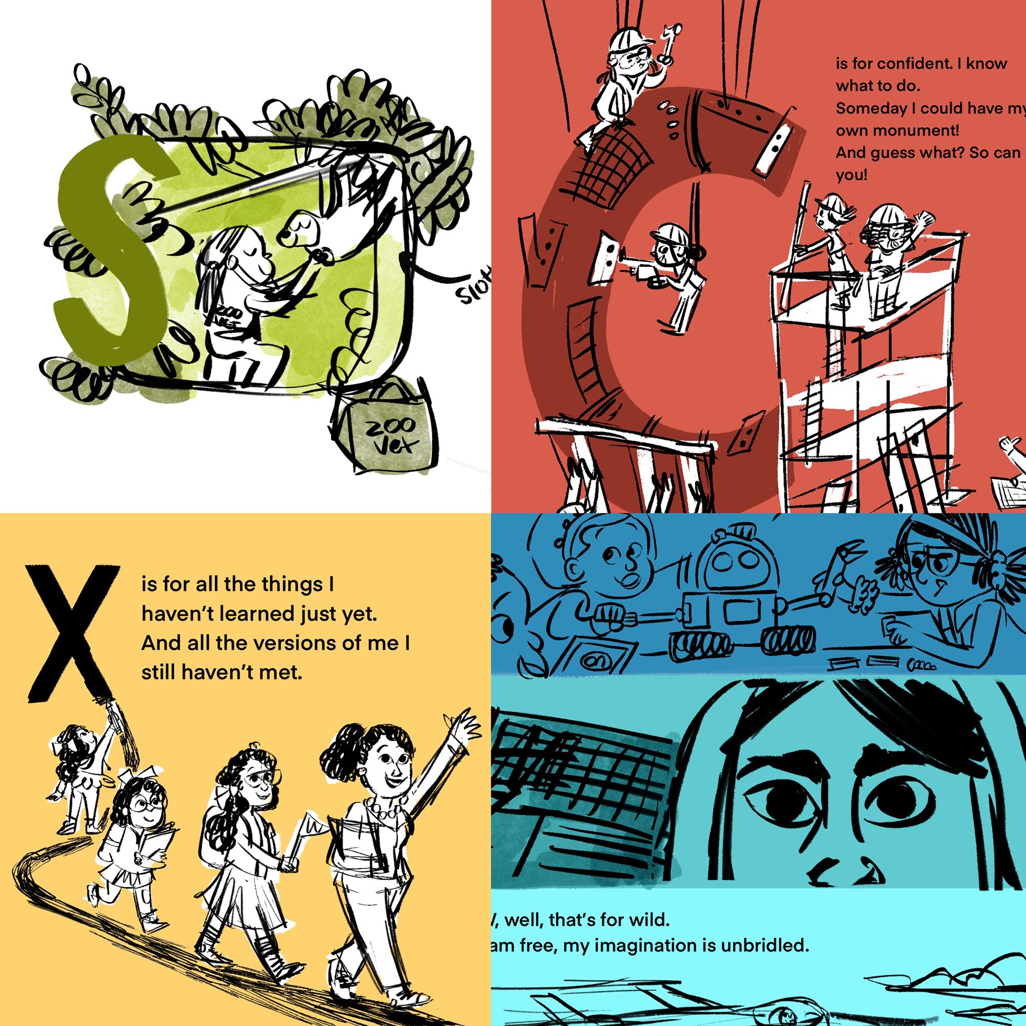
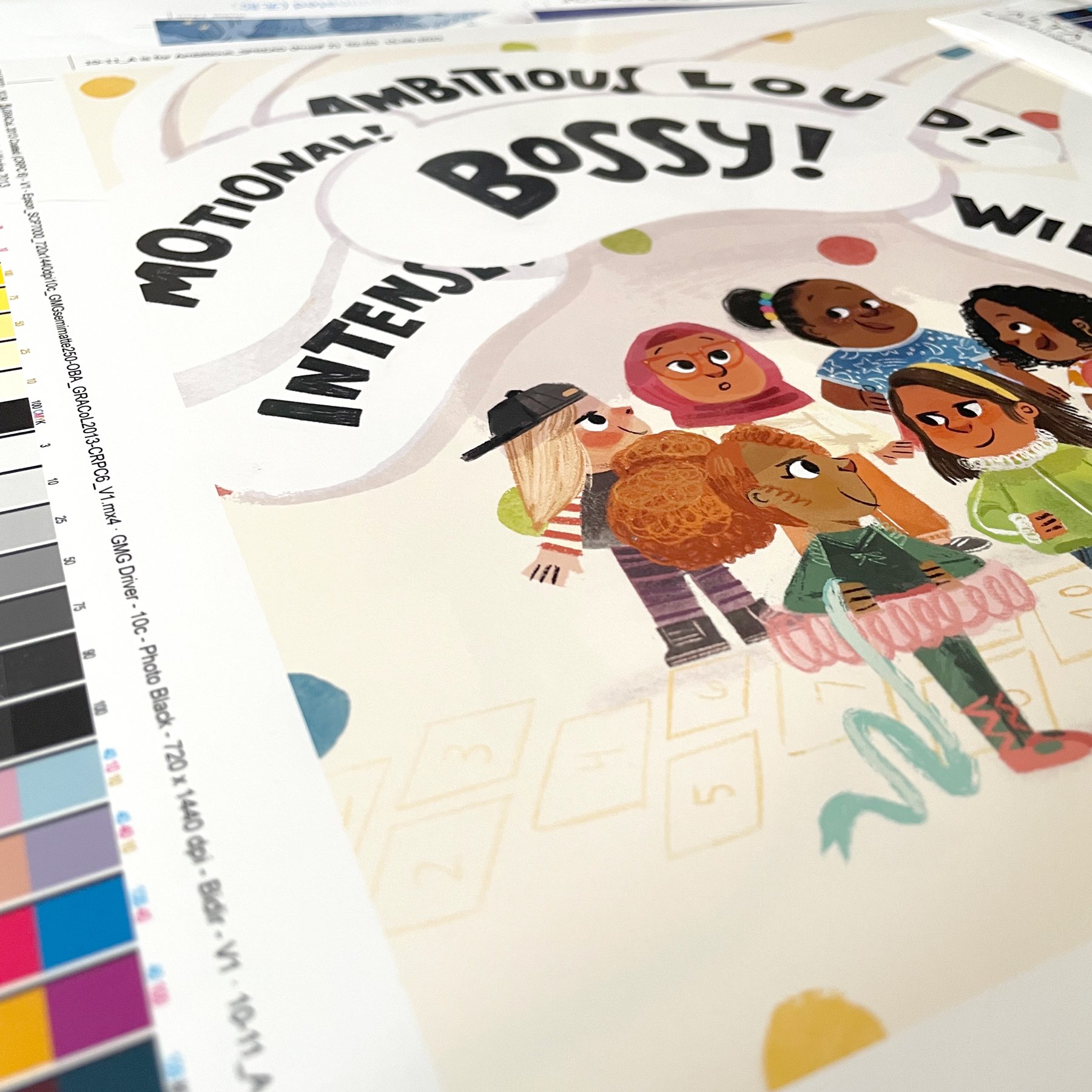
  • If you’re already working on a picture book dummy, polish it off. Don’t worry about making it so perfect that it could be published. Rough sketches and a couple final pieces are enough to send in a query because showing an agent that you’re a prolific creator is better than making one perfect book.

  • Create a list of who you’d like to query. You can start by using the list from earlier in this blog or start researching on your own. Think clearly about what kind of agent you’re looking for while you do your research.

    What kind of books do you want to work on? Which agents represent those genres? Do you want an agent that’ll represent you in art deals along with literary deals? Take some time to write down all your qualifiers and organize your agent list.

A screenshot of my Google Sheets agent organizer from 2020.

A screenshot of my Google Sheets agent organizer from 2020.

  • Organization is key when you’re querying! You might have to reach out to five agents before you get an offer, but you may also have to reach out to 100 or even more. It’s a different process for every person. So if you’re querying over months or even years, you’d want to make sure that you remember who you queried, when you queried them, what you sent them, and what their response was.

    Here are a couple of links to videos that can help start your query organization process:

  1. Creating Your Querying Spreadsheet, Book Ends Literary Agency

  2. How to Use QueryTracker to Organize Your Agent Search, Storyteller Academy


Why do I want an agent?

Okay, so now you know the basic who, what, when, where and hows. But the biggest question is, why do you even need an agent? Why do you want one?

I like to approach this answer from the perspective of a small business owner, because freelance authors and illustrators ARE running businesses. And when you have a small business, it’s important to delegate tasks that someone else can do BETTER than you. You would hire an accountant to handle complex tax situations, right?

The previous illustrator with a giant head in a bathroom is standing with a cup of coffee looking up at her hair. In the hair there's the text "you did it" in the shape of a heart.

So why would you not take on an agent to help you through complex publishing situations as well? This means that you can focus on the things you excel at instead of stretching yourself so thin that you rip.

P.S. A lot of major publishers won’t accept manuscript or book dummy submissions without an agent. I would say that most authors and illustrators working with major publishers right now are represented by an agent, so they’re a major component of the publishing industry.

In my situation, getting representation from my agent changed my career path for the better. But having an agent isn’t always necessary. If you’re planning to only work on self-published books, or if you already have intimate knowledge of the publishing industry, I wouldn’t get an agent. If you’re thinking about only doing children’s products and not books, you might not need an agent as well.

While I’m very pro-agent for the rest of us, being a client of an agent does not necessarily mean that the relationship will work out. I would say about 40% of the authors and illustrators I know have had to leave their agent and find a new one. That’s a scary thought, but it shouldn’t keep you away from the querying process because those 40% also found an agent that they now love!

So once again, I would do research, make a list of your priorities, and see if having an agent is the right choice for you. And remember, this is all a learning process. For better or for worse, being a children’s book author and illustrator is an incredibly flexible career path. Whatever decision you make isn’t permanent! We’re all just learning as we go 💛

Some last advice:

  • Agents are not publishers. They look at you as potential, not as a finished product. A relationship with an agent is going to grow over time and as long as there is equal give-and-take, the relationship should flourish.

  • Participate in online contests like #DVPit and mentorships to gauge how much interest you’re getting in your work.

  • I felt completely unready when I started looking for agents. I participated in #DVPit and thought that I would get little to no interest. To my surprise, I got interest from many different agents, several of those from major agencies, with multiple offers!

    All that to say that if I didn’t participate in that contest, I would have waited another six months to year to query agents. We creatives can be our own harshest critics but sometimes we need to push past that fear and take the leap into the unknown. So get to it!

Here are a few extra resources to help you along your journey!

Blog Posts:

https://www.curtisbrowncreative.co.uk/blog/how-to-query-a-literary-agent

https://brookevitale.com/blog/how-to-find-a-childrens-book-agent

https://taralazar.com/category/queries/

https://debbieohi.com/2023/03/redfoxliterary-loristeel-christopherthornock


Youtube Videos:

http://www.anooshasyed.com/blog/2020/11/15/how-do-i-get-an-agent

https://www.youtube.com/watch?v=BpQxUclWxZc&ab_channel=BookEndsLiteraryAgency

https://www.youtube.com/watch?v=X7IM1f-VqZk&ab_channel=TheIllustrator%27sGuide

https://www.youtube.com/watch?v=sLDgMf05YFo&ab_channel=GoodStoryCompany


Podcasts:

https://www.svslearn.com/3pointperspectiveblog/3pp130

https://www.jenniferlaughran.com/literaticast


Mentorship:

https://www.pbrisingstars.com/


Me holding a stack of books in front of a hedge in my garden.

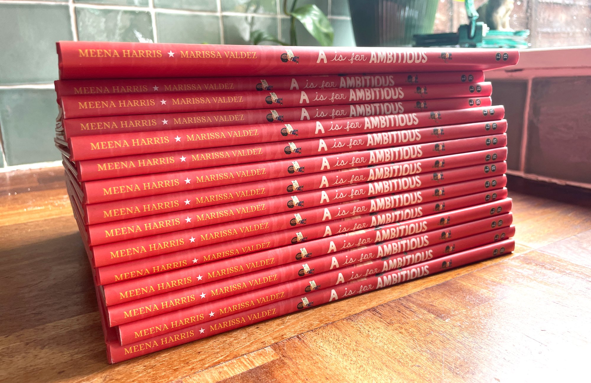
A hot day holding some hot new books! But seriously, I was sweating here…

Hugs,
Marissa


Did you know that I send out book news, inspirations, and book club recommendations through a monthly newsletter? Sign up below so you don’t miss out ✍️

Art Club Sign Up

Get updates, tutorials, thoughts and more via a monthly Art Club newsletter!

We respect your privacy.

Thank you!
tags: illustrator, illustration, childrens illustrator, children's book illustrator, art, art blog, picture book, picture book illustrator, art tips
categories: agent
Friday 06.16.23
Posted by Marissa Valdez
Comments: 1
 

Pros and Cons of a Painting Experiment

Well hello there, friends. I can’t believe it’s already May. How did it get to be five months into the year? I’m chugging along and looking 2024 straight in the face now. It’s sneaking up on me but I’m going to be ready for it! Hope your year is going at the perfect pace.

Gouache, watercolor, and colored pencil respectively. @marissaarts

I thought I would write about something lighthearted, tangible, and full of fun this month! So I’m talking about the pros and cons of working with three different traditional mediums: gouache, watercolor, and colored pencils.

But secretly, this blog post is a bit of an excuse for me to bust out my paints and draw cute cats! While I love getting messy with my paints, I don’t always have the time for it. I sometimes worry that the things that I enjoy doing will fade away unless I actively make the time to do them. I wanted to create an intersection of a blog post that I hope ya’ll enjoy while experimenting and having fun painting. I hope I’ve achieved that!

P.S. This is not a tutorial post, these are just my thoughts on a fun exercise. And truly I’d love it if this blog became a conversation. What traditional medium do you enjoy using the most? Are there any that are your less-than-favorites? Are you a digital artist that is trying to paint more traditionally? Like moi…

I’d love to hear what you think! Send me an email or comment in this blog post below. Alright, onto the reviews!


Initial cat space sketch on Bristol board. @marissaarts

The finished gouache painting. Pencil for scale :) @marissaarts

Okay, 1st up is Gouache.

My Materials:

M. Graham and Co. Gouache, Holbein Acryla Gouache, and Bristol Board

Pros: 

  • I love how opaque gouache is. If I make a mistake, I’m still able to fix that mistake fairly easily without muddying up the painting. It’s a wonderful mix between the opaqueness of acrylic paint and the transparency of watercolor.

  • The colors are SO saturated! Sometimes when I work digitally, I can get stuck trying to figure out what my color palette should be, there can be too many options! With my gouache sets, I find that I can get a nice saturated palette from just a few paint tubes. And nothing is too neon like it can be if I work digitally. Neon yellow can work sometimes but I know I’ve overdone it in Procreate before…

  • It’s nice for painting in a more graphic style. You can lay down flat colors really quickly while also adding dry and wet textures.

Cons: 

  • Not a lot of cons really! 

  • It takes some getting used to. When I first started using gouache, I was using it only like watercolor and nothing seemed to come out like I wanted. Once I practiced with it more, I found my sweet spot between using the paint thickly in some parts and more watery in others.

  • The paint can start to build up if you’re repainting one spot over and over again. So be careful not to build up layers too thick, especially in trouble areas that you might be trying to get juuust right.

  • It can sometimes be difficult to gauge how a color will look on your canvas. Keep a test paper nearby so you don’t unintentionally start slathering on a shade of blue that is waaayyy too dark or a pink that ends up looking more like a red. You can dab a little paint on the test paper to make sure that it’s the color you’re actually looking for.

My final gouache version. @marissaarts

How do I think the painting turned out?

I’m a big gouache fan, sooooo I might have gone into this exercise with a bit of a bias. But I love how it turned out! Some of the line work is messier than I wanted, but I still like there are rough edges and splotchy textures throughout. The colors came out wonderfully saturated as well, which was exactly what I was hoping for.

Tips:

  • Work with a basic palette, don’t bother with buying a ton of different gouache paint tubes. I love working with red, yellow, blue, and white and that’s pretty much it! You can mix whatever color you need from there.

  • Gouache allows you to add some lovely dry textures into your illustration. Don’t be afraid to try a dry brush technique to give your painting a stippling effect. 

  • I like using more of a squared brush head with gouache because it allows you to get really nice crisp edges with the slightly gooey paint. I find that if I use rounded brush tips (especially the larger sizes) the paint can get clogged up on my brush and refuse to go onto the paper easily. 


View fullsize IMG_9968-2.jpg
View fullsize IMG_9954-2.jpg
View fullsize IMG_9964-2.jpg

Watercolor is next! #2

My Materials: 

Daniel Smith Extra Fine Watercolors and Bristol Board

Pros: 

  • Painting with watercolor can be very calming. Adding one layer at a time and waiting for it to dry teaches me some much needed patience and gives me time to reflect on what I’m actually painting. I like that adding layers and layers of blue in the background of this piece made the galaxy behind the cat look really textured and full of space! (Although I will still pull out the hair dryer for a quick dry every once in a while…)

  • This painting has more form than the other two because I was able to add transparent shadow layers around the cat’s helmet and on the mouse’s alien spaceship. While it’s not impossible to create shadow with other mediums I find that it comes more naturally with watercolor.

  • Oh, that texture! The background came out looking really nice, especially in the corners, where I was able to let the water and color run a bit. The droplet textures really make your eye circle around the whole piece a few times. And it gave it a dreaminess that I feel like the gouache didn’t have.

Cons: 

  • Patience! Or my lack of when it comes to painting with watercolor. This is a pro AND a con, I guess! I tend to run out of patience and not wait long enough to let my watercolor dry. Then I either smear my paint or I leave a section under colored. 

  • I didn’t use masking liquid for this painting but I wish I did. It was difficult navigating around all the little stars and planets in the background even with a small brush. The constellations are a bit hidden because of that.

  • The color didn’t come out exactly like I wanted. I kept on trying to add more purple to the background but each time I mixed purple, it came out too muddy and just ended up looking like dark blue. This made me think of when I use purple in a Procreate painting in the CMYK space. My digital pieces tend to print out more blue/dark than purple. Hmm! A coincidence??

My final watercolor version. Couldn’t resist a paint splatter here and there. @marissaarts

How do I think the painting turned out?

I really like the texture that the watercolor created but I’m not super happy with the blue background. It came out more green-blue than I was looking for. This makes me want to try and paint it again to see if I can fix that. I enjoy the soft edges around the character though. It reminded me of a more classic children’s book illustration.

Tips: 

  • Don’t overwork your layers. There are parts of this painting where I layered on too many colors and they ended up muddy. It’s my biggest pain with working with watercolor BUT there are sections where I didn’t overwork it and it looks AMAZING! I want to work with watercolor more because it’s a real exercise in using as few paint strokes as possible to get your point across. 

  • Stay simple with your colors. This is more of a life tip than just a painting tip. The more I fill up my palette with different paint colors, the more I make a painting that looks too busy.

  • Invest in some masking liquid in case you want to keep really crisp lines around your white space. If you don’t use masking liquid, you might have more flowy/wavy edges, but that’s a great look too! Try out both methods and see what works for you.


Last but not least, Colored Pencils is #3.

My Materials:

Derwent Inktense Watercolor Pencils (technically watercolor pencils but I like to use them as colored pencils) and Bristol Board

Pros:

  • The coloring process. I LOVE sitting down with my colored pencils and just coloring away at a blank sheet of paper. It reminds me of when I was a kid and I used to pull out a stack of coloring books and just go to town. It might sound like a strange pro, but it’s one that matters to me. I think it’s important to like what you’re doing to continue doing it!

  • Texture!! Much like using watercolor, you get SOOO much texture from using colored pencils especially on rough toothed paper like this Bristol board. I love all the tiny white specks popping through the color. It almost makes the piece look like it’s covered in bits of starlight. 10/10 advantage for colored pencils for me!

  • Color blending is really easy with good quality colored pencils and makes for some great gradients. That’s pretty evident on the space cat’s face below.

Cons:

  • When you make a mistake, you MAKE a mistake. There’s no going back from accidentally drawing a line where you don’t want it. I attempted to use an eraser in a few spots that I wasn’t happy with but it didn’t make much of a difference. If there’s a way to completely erase a colored pencil line, please let me know!

  • Loss of detail at a smaller size. These pieces are about 6 inches x 6 inches, so not super huge. If the illustration started at a large size I could’ve drawn in more detail, especially in areas around the cat’s face and inside the mouse’s spaceship. A learning experience!

  • Smudging. Oh, the smudging. Some of the sections of this drawing definitely have smudging problems. With my palm, I kept on smearing blue dust from the background into the yellow of the stars and it really muddied up their color. I’m wondering if masking fluid could be used with colored pencil as well to keep smearing from being too much of an issue? An experiment for another time I guess :)

My final colored pencil version. You can still see faint pencil lines here too. @marissaarts

How do I think the painting turned out?

Like with the other two, I’m AGAIN really happy with how it turned out! I love, love, LOVE the texture of the colored pencil and I like how the shapes had to be a little more defined (especially with the star trails) because I wanted those areas to look really bright. The cat’s face came out way different from the other two pieces which I didn’t mean to do but just kind of happened while I was coloring. It was a nice surprise! Overall a great experience but I might try to recreate this image at a larger size to see if I can add in more detail.

Tips:

  • Put on a good podcast or audiobook while you’re finishing a piece with colored pencil. I found that it was a fairly slow process compared to the watercolor and gouache painting times. You might find that it’s meditative like for me though!

  • Keep a pencil sharpener close at hand. I think I was sharpening my pencils every minute or so to keep the lines crisp, especially in the more detailed areas.

  • Plan out where you want white space before drawing. Like watercolor, you’re working from light to dark. It can be really easy to draw over a section that you later realize should’ve stayed white and then you have to paint over it or composite two pieces digitally to get that white space back.


A teeny process video.

When I first started writing this blog post I had the initial idea of filming myself painting all three versions of this space cat. I got half-way through the gouache painting and my phone completely ran out of space. Yarg!

So here I am now, with half a process video that I don’t really want to keep locked away in file exile forever. I haven’t edited it, I haven’t added music behind it, and I haven’t sped it up. I thought it might be fun to share a totally real representation of what it’s like when I paint. Hope you enjoy!

P.S. I have a bad case of hay fever/allergies at the moment so you can hear me sniffling, coughing, and sneezing throughout the video. This is NOT for anyone who enjoys ASMR… Sorry about that!


Those are my reviews! I had a lot of fun creating these pieces and sharing my thoughts with ya’ll.

I often get asked if publishers will hire illustrators that work traditionally. Or is working digitally the only way to get a job? Honestly, I believe the children’s book industry is leaning towards books that have some sort of traditional aspect to the illustrations, like hand painted textures or just painting the whole book traditionally. Christian Robinson, Brenden Wenzel and Vanessa Brantley-Newton are all illustrators who do just that and do it beautifully.

If you’re someone trying to get into the children’s book illustration industry, don’t stop yourself from using traditional mediums because of outside pressure. Create art that feels like you. And here’s my last, last tip:

Have fun! I’ve felt that pressure. The pressure to work only in the way that I’ve worked previously, but I’m here to say it’s okay to experiment. That’s how you grow.

Please try this exercise yourself, share your thoughts, and give yourself room to try out new things. I’m thinking that I might try this exercise again but with mediums I rarely EVER use. Hellooooo oil pastels!

Have a lovely May, friends. Talk to you more soon ❤️

Me trying to look deep in thought. Chica got the stare down better than me though…

Hugs,
Marissa


Did you know that I send out book news, inspirations, and book club recommendations through a monthly newsletter? Sign up below so you don’t miss out ✍️

Art Club Sign Up

Get updates, tutorials, thoughts and more via a monthly Art Club newsletter!

We respect your privacy.

Thank you!
tags: illustrator, illustration, childrens illustrator, children's book illustrator, art, art blog, picture book, picture book illustrator, art tips
categories: painting
Monday 05.01.23
Posted by Marissa Valdez
Comments: 1
 

Making the Book: A is for Ambitious

Back in October of 2020, I was asked if I wanted to illustrate a book called AMBITIOUS GIRL, written by Meena Harris and published by Little Brown Books for Young Readers. It was my first publishing gig and if you haven’t heard me say it already, this book changed my life.

It’s a picture book that pushes against the phrase, “too ambitious.” I try to still tell myself, “there’s no such thing as TOO ambitious!” Because I dream up big plans for my art and my business and my books and for how much ice cream I can eat in one sitting.

Fast forward two years into the future and here I am, seeing my second book with Meena and the whole Little Brown team out in the BIG WIDE world. A IS FOR AMBITIOUS had its book birthday on March 14th! Woot woot! A lot of blood, sweat, tears, ice cream, smiles, and Star Trek went into this and I can’t wait to share my book-making process ya’ll.

A little summary of A is for Ambitious, written by Meena Harris and published by Little Brown Books for Young Readers. 

The #1 bestselling team behind Ambitious Girl is back to take AG on a new adventure. A is for ambitious—and so much more in this fun and empowering picture book that reclaims words often used to undermine girls and women from A to Z. When they’re ready to take on the world, ambitious readers will have the vocabulary to do so. 

This book offers ambitious children everywhere inspiration as they pursue their goals and dreams. With a powerful message for us all, this is a perfect read aloud for showing children the power of words. 

When I was first given the manuscript for this book, I was SO excited. This story takes place in the Ambitious Girl “universe” but it’s an ABC book that redefines negative words, i.e. a dream project for me. Along with being a classic ABC book, this manuscript allowed me to be more abstract with the illustrations. But that freedom came with hesitation. What would I draw if I could draw anything??

Brainstorming and Research

In the first AMBITIOUS GIRL book, I made sure the illustrations complemented the manuscript while also adding a separate underlying story. That secondary story is that Ambitious Girl and her family attend an award ceremony in the park to announce who is the most ambitious girl of the year. It didn’t say to do that anywhere in the manuscript; it’s something I added to give the story an extra layer of interest.

Which is what I LOVE to do. I LOVE creating illustrations that weave a story that aren’t necessarily there in the text.

If you have a book that’s half text and half illustrations, why not add something extra to the artwork? It’s not always easy or possible to do, but when you can do it, OH, I think it takes the book to the next level. And with A IS FOR AMBITIOUS, I felt like that extra layer would make this book a lot of fun to read for both kids and parents. It includes confidence-boosting rhymes like:

H is for when I’m feeling Headstrong. I’m not afraid to speak up if something is wrong.

Cool! But I couldn’t think of how to string all the images in this book together to make a cohesive underlying narrative. Soooooo… I just started researching. And researching. And researching some more. Luckily, I really enjoy this part of the process.

I went to my usual hangout for researching, Pinterest, and started making boards to figure out basic color, style and general feeling for the art. I looked at lots of ABC books, both old and new. I looked up lots of ambitious girls and women and eventually an idea came to me. Maybe each letter in this book could illustrate a profession/passion that relates back to the text? Eureka!

Using fun professions in a book wasn’t a super new idea to me though. When I do AMBITIOUS GIRL virtual school visits, I usually ask the kids I’m presenting to what they want to be when they grow up. I think it’s fun because they usually have HUGE ambitions. Astronaut, paleontologist, doggie daycare owner!

I even met one girl who had the astronomical aspiration of becoming a bird. I bet it would be a lot of work, but at least she was ambitious!

I think it’s important to teach kids at a young age to be ambitious because those big aspirations tend to peter out as they get older. But we should stay ambitious even if that means instead of being a paleontologist, you become a researcher. Instead of an astronaut, you work at SpaceX BUILDING the rockets! Heck that bird girl could definitely become a pilot! Anyway, it’s a topic that’s obviously close to my heart and so I felt like kids and parents reading the book would relate to the idea as well.


Once I figured out which careers I wanted to include in the book, I then started collecting reference photos. There’s no main character throughout, which means there’s a different set of girls on each page/each spread, which was a LOT of different faces, outfits, and styles to draw.

So I amassed 183 photos (I checked!) from Google and Getty images.

This took a long time but it was so worth it! Getty images is one of my #1 places to find reference photos because they have an enormous stock photo library to choose from. (They are just for basic reference though, so if you’re using them, know that you can’t trace off the images or recreate them exactly without having to pay for them.)

But with those 183 photos, I felt ready to start sketching.

Character Designs

View fullsize BlogPost11-Extra4.jpg
View fullsize Untitled_Artwork 20 copy.jpg

Okay, let’s get real: this book was created during an INSANE time in my life. I had just gotten married and I was about to move to the UK and I was turning everything upside down to get that all figured out.

So I didn’t have the time to focus on character designs as much as I wanted. That means most of the character sketches were done quickly and in Procreate. I think I may have done some designs with pencil and paper, but I assume those were lost in the move…

The character designs for this book weren’t as important as they had been for the first book anyway. In AMBITIOUS GIRL, we really needed to hammer down what Ambitious Girl was going to look like and it was important to make sure that her family was consistent from page to page. This book, eh, each page/spread was different, there was a new character/set of characters per scene outside of AG herself. I made the above really rough designs but mostly went with the flow deciding what kids would look like while sketching out the compositions. 

Although, the above character sketches ended up being almost exactly what I painted in the finals! How funny is that?

Thumbnails and Sketches

Onwards and upwards to the thumbnails! Another difference between the two AG books is that with this book:

1. I had more time to create it (I only had a month to illustrate, from start to finish, the entirety of AMBITIOUS GIRL). This time around I had more like 6 months.
2. I wanted to add more color. Like WAAAAAAYY more color.
3. And I wanted to experiment more with imagery. Go a little wild!


When my editor, Farrin, and I initially talked about what we envisioned for A IS FOR AMBITIOUS, she suggested having more of a vintage feel to the book to challenge the idea of what the “classic” ABC book looks like. Oooo, I loved that idea. A vintagy feel but with contemporary text sounded like a fun challenge. I’m also a huge Mary Blair and Richard Scarry fan so I relished the idea of making something similar to their work. I really liked their use of bright primary colors, bold shapes, and big monochrome backgrounds on spreads.

Super rough thumbnails for the book. I have to write down notes because I usually can’t tell what I’ve sketched out after a day.

While I had more time to work on the thumbnails, I found out quickly that it was going to be DIFFICULT.

I knew that I was going to be illustrating kids in professions and passions but it was difficult implementing those professions into real compositions. What made this even harder was that some spreads only had one letter on them, which meant lots of space to draw a scene. But others had three letters on them! The last thing I wanted to create was a cluttered book…

I spent a couple months just experimenting with the thumbnails to see what worked best. As you can see in the super, SUPER rough thumbnails above, I was trying to block out basic shapes on each spread and identify the foreground vs background. I also wanted a good mix of full spread, single page, and spot illustrations to keep the reader’s eye flowing through the story.

Side note: I know that children’s book illustrators are meant to draw lots of different kinds of compositions in a book, but hey, I like to go against the grain sometimes. My next goal is to make a book where there are only double page spreads! Okay, back to the topic at hand.

While it wasn’t easy drafting out the roughs for A IS FOR AMBITIOUS, it was a lot of fun. I like to think picture books are like puzzles (I had my wonderful editor on another book say the same thing to me once!). It takes so many tries to see what piece fits where. But it’s like glitter cannons and narwhal rockets go off when you place that last puzzle piece into its place because it’s just so dang satisfying getting it right!

A few more finalized sketches from A IS FOR AMBITIOUS. Some of these made it to finals, some did not and some got moved around! Lots of fun :)

So I worked on the thumbnails and sketches for a few months and turned them in either right before or right after I made my major move to the UK. I was pretty happy with how they were looking! And my editor and art director were pretty stoked with everything as well. It was a blessing from the book gods that things were going so smoothly!

Then I hit a teeny snag. When I first started thinking about the book as a whole, I had to think about trim size. Which meant, what size would the book be? The first Ambitious Girl book was 9 x 11 inches, but because this was a totally different topic, I was thinking this would look better as a square. I felt like having a square book rather than a rectangular one would lend itself to that “classic” ABC book look.

My initial sketches were all for a square book, 10 x 10 inches. I was really happy with how it was looking but then a little email slid into my inbox. My editor said NOPE, we had to keep the size of the book the same as the first for marketing purposes.

Bummer! I was annoyed that I had to change every spread, but in the end, it wasn’t that big of a deal. I felt sad that the book was literally changing shape, but I got over that quickly when I started sketching out pages on the new dimensions. I realized there were some compositions that weren’t totally working on the square pages and in the new rectangular format they had a lot more space to breathe.

I feel like 95% of being a children’s book illustrator is rolling with the changes, keeping an open mind, and embracing new ideas for your book. Taking a cookie and coffee break when things don’t always go your way helps too ☕️

Color Palette

Sketchy sketches from several spreads in A IS FOR AMBITIOUS. The sloth one was moved around a few times in the book.

The color palette for this book really helped me figure out how to form the compositions. When I was sketching, I kept the vintage primary color palette in mind. I knew that I wanted a lot of bright primary colors to mimic that Mary Blair kind of style.

Looking back, I’m really glad that I made a moodboard/pinterest board to help me make my decisions as I moved through the book. The color palette has come as more of an afterthought for other books I’ve worked on, but I think the way I work best is by incorporating color, even if it’s just basic colors, early on in the process. It’s something I’m going to try and do for my future projects. I think it’s crazy that it’s taken me years (my whole life really) to figure this part of my process out. I love my brain but I wish it would be a bit more efficient with its thinking sometimes…

Because I was working on the color palette at the same time as the sketches, I turned it all in at the same time to the publisher, which was nice! Everything off in one handy dandy email. When I got notes back, I’m pretty sure there were NO notes about the color which was fantastic too. The book was coming together!

Finals

After doing a couple round of revisions on a few pages and changing the trim size of the book, I was given the okay to start on the finals. This happened only a little while after I landed in the UK so I said hi to my husband and then just plopped myself into a chair, turned on Star Trek: The Next Generation (which is a surprisingly EXCELLENT show by the way), and went to town on finalizing everything.

While finals aren’t usually the most fun part of the process for me, there were several times in this book where I finished a spread and was really proud of what I created. Especially some of the spreads that challenged me! I am NOT the type of artist that enjoys drawing cars or trucks or construction equipment, but I decided that I would try to do that for the letter F. And not to toot my own horn but, TOOT TOOOOT. The vehicles came out exactly like I wanted them to and I even wanted to draw more vehicles for books in the future.

Imagine caterpillar Marissa emerging out of her artsy chrysalis to blossom into a butterfly that thinks construction equipment is not so bad and kind of cool, really.

A final spread from A IS FOR AMBITIOUS.

The finals were made almost entirely in Procreate, using a few handmade textures here and there for minor details. I used watercolor brushes, chalk brushes, and some splatters to get the final look. From Procreate, I took the art into Photoshop to do some basic compositing and color correction. And then that was it! I loaded all the files into my Dropbox and sent them over to my art director, Saho.

It’s always SO nerve-racking sending in the finals for a book, but I felt such relief afterwards. I’m pretty sure I sent those in and then took the longest nap of my life.

BlogPost11-RealImage1.jpg
BlogPost11-RealImage6.jpg
BlogPost11-RealImage3.jpg
BlogPost11-RealImage2.jpg

After turning in the finals and after doing some minor final revisions, I had the lovely wait for my proofs. I was working on a couple other books so my mind was occupied while I was waiting for the proofs, so it was a big surprise when they showed up on my doorstep! I really loved getting to see them because the color came out practically perfect. Previously I’ve had problems with other books looking washed out or being too dark but this one came out exactly how I envisioned.

I also really enjoyed the proofing process because it was the first time that I sat down with my editor and art director to discuss all the tiny details that we wanted to change from the printer for the final book. It was a lot of fun diving deep to make sure this book was going to be as beautiful as it possibly could be. 

And that’s it! On to the next book :)

It was a real eye-opener working on A IS FOR AMBITIOUS because I got to push my style and it paid off! There have been times in the past where that was not the case, but I enjoy going forward, trying new things and taking the good and bad as they come. Talking about the good, below are some of my favorite images from the book. My all-time favorite thing to draw was the veterinarian and her sleepily-happy sloth! I NEED to draw more sloths in the future…

View fullsize BlogPost11-RealImage11.jpg
View fullsize BlogPost11-RealImage9.jpg
View fullsize BlogPost11-RealImage12.jpg
View fullsize BlogPost11-RealImage7.jpg

This is the second blog in the “Making the Book” series and I hope you enjoyed it! There’s A TON to creating a book so I hope this overview provides at least a teeny insight into the mysterious process of illustrating a book. OOoooOOOo.

P.S. I tried to put in as much of my process in this blog post, but there’s so much that goes into it that I’ve also had to leave a lot out! If you have a question about something I didn’t talk about here, please let me know and I can answer your question via the newsletter OR maybe even in another blog post.

A IS FOR AMBITIOUS is out now ❤️ If you liked what you saw in this blog post, you can grab the book at your local independent bookstore, at your local library, or through Amazon.

My stash!

Hugs,
Marissa


Did you know that I send out book news, inspirations, and book club recommendations through a monthly newsletter? Sign up below so you don’t miss out ✍️

Art Club Sign Up

Get updates, tutorials, thoughts and more via a monthly Art Club newsletter!

We respect your privacy.

Thank you!
tags: illustrator, illustration, childrens illustrator, children's book illustrator, art, art blog, picture book, picture book illustrator, art tips
categories: making the book
Saturday 04.01.23
Posted by Marissa Valdez
Comments: 2
 

Unexpected Turns in My Kidlit Journey

Helloooo March! I’m late with the blog this month. I hate missing a deadline but it’s better than last month. Last month, there was no blog post!

Life happened. Our situation changed and I ended up making an unexpected move with my husband. We spent the majority of January and February packing, figuring out moving logistics and then unpacking, unpacking, and unpacking some more. It was a lot and that left little, to no, time to write.

Last month’s blog post was supposed to be about how to create unique characters for children’s books (let me know if that still sounds fun to read). I assumed that I would just continue writing on that topic into March. But then something struck me: a feeling that I needed to write about something more relevant to this year’s madness. To quote Big Magic, by Elizabeth Gilbert:

“When an idea thinks it has found somebody -say, you- who might be able to bring it into the world, the idea will pay you a visit. It will try to get your attention.”

I often get the question: how can I become a full time illustrator? How can I get to a point where I can quit my day job?

I get messages from artists who are at a point in their children’s book journey where they feel confused about what to do next. So I’m here today, not to write about character designs but to write about all the unexpected twists and turns I had along the way to becoming a full-time children’s book illustrator. I’m hoping that my journey (a journey that never ends btw) can provide a little insight about where a children’s book illustrator’s path can lead.

A Troubled Start in Art School

Let’s start at the beginning. I had always loved drawing so when I was lucky enough to decide where to go to college, I made the decision to attend the Massachusetts College of Art and Design in Boston. It was an expensive decision to go to art school and I still have the student debt to prove it, but I loved it. The freedom to explore my creative practice as a young artist was worth it.

After my initial foundation year, I had to decide what art practice I wanted to focus on for the next three years. When I was in high school, I had briefly thought about children’s book illustration as a career but became enamored with illustration in general. So I felt sure that I would major in illustration in college. But I kept on hearing from friends, family and professors how as an illustrator, I wouldn’t be able to make enough money to live off. Talk about bad ear worms! My gut told me that illustration was the way to go, but I made the choice to major in Animation in the end. Animators work for studios that give them salaries which seemed like a safer financial choice overall. I’d mark this as the first time I didn’t listen to my gut as an adult and I paid the price. Because, ya’ll, animation was NOT. FOR. ME.

I was a bad animator and student. I didn’t attend classes like I should have, I didn’t put a huge amount of effort into my assignments and I truly ended up wasting a lot of time and money. It felt horrible at the time because I WANTED to be the perfect student, but I couldn’t force myself to spend time doing something that I had absolutely no MOTIVATION for.

A moment that I think back to was when I was on a class trip to an animation festival in Ottawa. I was asked who my animation influences were. Uhhh… no one? I didn’t have any! Looking back, I realize that I already had a major picture book influence, Jon Klassen, but I couldn’t care less about animators!

By the end of my university time, I had an appreciation for animation and animators (because MAN do animators work hard) but I didn’t have a job-ready animation reel or portfolio. All that being said, my animation skill-set helped me develop my children’s illustration portfolio in ways that I couldn’t have anticipated later on in life and I made lifelong friends at that school. It wasn’t all bad!

Some illustration work I made in college that I liked more than my animation reel 😂

My First Job

So there I was, a new artist out in the workforce, hoping to find a job that I was passionate about but that also paid a nice salary. The mythical unicorn of an art career. But that didn’t happen. After graduating from art school, I wasn’t making enough money as a pizza place cashier and a kid’s camp counselor to pay an expensive Boston rent. I boarded a plane along with my beloved cat, Baby, and we flew back to Texas to live with my older brother and his family. “I’ll be there for a few months, maybe a year at most.” I had thought to myself. I had high hopes…

For a little over a month, I was unemployed but applying everywhere. I applied to mainly retail jobs because while I had this degree, I didn’t feel like I was actually good enough to get a job. Like a lot of creatives, I tended to undervalue myself. I was about to accept a position at Bath and Body Works, but then I saw a job posting that caught my eye. Preschool Teaching Assistant? I had been working and volunteering with kids since I was in my early teens, so this felt like a good potential path. After a quick interview, I was in!

I worked for a small independently owned preschool in the outskirts of Houston, Texas and loved it. The kids were so funny and smart and I left work everyday feeling fulfilled. Out of the blue, I felt a spark: I was reading books to the kids everyday. I poured over the art with them, acted out the entirety of WE’RE GOING ON A BEAR HUNT, and took notice of which books they liked best. It felt perfect.

Lack of Magic

But it wasn’t right. I still craved that art career I had dreamed of as a teen. Some other aspects of the job started to bother me too: I wanted to have more authority over my work (which eventually manifested into being my own boss) and honestly, I wasn’t making very much money. I was barely making enough to scrape by and I knew that I’d eventually need to be the breadwinner for my future family.

So while I was still at the preschool, I took a leap and started applying for graphic design and animation jobs in the area. I must have applied to at least 20 companies but got a callback to only three. Only one called me back to say that they wanted to hire me. So that’s where I went! 

Let me tell you, this was hard to do. I had SO many people telling me to just focus on getting a teaching certificate. It was the easier route they said! And while I think teaching is an amazing career, it’s not what I wanted to do quite yet and I remembered the last time I didn’t listen to my gut.

So there I went, to a national company in their graphic design department. For the first year or so, I felt amazing. I was working in the art industry and finally making enough money to start paying off my student debt. It was freeing.

I was working for a company that mainly made marketing material for car dealerships and I didn’t care about cars at all. I liked learning about graphic design but I had absolutely no motivation for the material I was creating. So once again, I got stuck in a rut. Except this rut stayed with me for the next 3 years.

What now?

Eventually I started feeling really broken down. I was working a full-time job but knew that I needed to get out. I just didn’t know how or where to go. Friends and family started encouraging me to do freelance design so I started exploring that world. Others told me to go into software development because I’d be able to make a lot more money. Sound familiar? But I couldn’t even force myself to start coding. There was NO joy in that for me. I tried lots of different things but nothing serious happened for a couple of years.

Then BOOM, one day I started listening to a children’s illustration podcast at work. Immediately I was hooked. The podcast, Three Point Perspective, was three industry professionals talking about the ins and outs of working as children’s book illustrators.

It literally blew my mind. These guys were talking about what I always wanted to do. They literally laid out a roadmap to becoming a children’s book illustrator and the feeling of “I NEED to do this” hit me so bad, that I couldn’t focus on anything else for a while after that. After some serious conversations with my partner about where this would lead, I decided to take the leap into the children’s book industry, working on that in the evenings and weekends while keeping my day job. 

SO! First thing I did was join the SCBWI, which I talk about a lot on this blog. What a life changing event. The first time I attended a meeting, I could feel that I found my community. SCBWI taught me everything I needed to know about the complicated world of children’s publishing. They’re pretty much the best.

From there, things were kind of a blur.

I was still trying to work on doing freelance graphic design as a side hustle. The odd illustration commission slid into my email every once in a while. I joined a critique group and started working on my children’s illustration portfolio and with fear in my heart, started posting my art on instagram. I even participated in Inktober! I told myself that if I could finish a 31 day art challenge then I was SERIOUS about illustration being my new life.

IMG_8948.jpg
IMG_8949.jpg
IMG_8961.jpg
IMG_8976.jpg
IMG_8985.jpg
IMG_8971.jpg

Pulled in Different Directions

The thing is, I wasn’t putting 100% of myself into children’s illustration. I still had those same voices in the back of my head whispering, “How are you going to make a living? How are you ever going to pay off your student loans? How will you support the family that you want to have in the future?” My gut said this was the right path, but everything else said to find a safe way out.

Reluctantly, I started applying to graphic design jobs that were more in line with the industry that I wanted to be in. A good compromise, right? So I applied to a children’s toy manufacturing company. I got a few steps into the hiring process but eventually I got a hard no. I think that was the universe giving me a hint that this wasn’t the right road for me, but like many other times, I ignored that nudge.

A little while after, a friend told me that Highlights was hiring in their graphic design department and it felt like a light in the dark. Working at a children’s magazine with a steady salary? An actual miracle!

Quick note: I had a HORRIBLE graphic design portfolio at this point. The company I was working for had a clause in their contract stating that their employees couldn’t share any work created there publicly, so my portfolio was just a few graphic design bits and bobs that I had cobbled together over the years. It was paltry at best, but I decided to apply to the Highlights job anyway.

My Big Break, or So I Thought…

Because of my lack of credentials, I decided I needed to do something big to get Highlight’s attention. I created and illustrated a cover letter that mimicked the classic highlights magazine and oh boy, did it get their attention. A day after sending in my cover letter, I got a call back. They loved it! And they wanted to see more.

Screen Shot 2023-03-08 at 2.38.18 PM.png
Screen Shot 2023-03-08 at 2.38.33 PM.png
Screen Shot 2023-03-08 at 2.38.46 PM.png
Screen Shot 2023-03-08 at 2.38.55 PM.png

Funny story: At one point, I was asked if I actually created the cover letter I submitted. And I can’t blame them for wondering! I think they could see the effort I put into my illustration work but they couldn’t see the same thing in my graphic design work.

Happily though, I received several calls back from the hiring manager. After completing a few graphic design tests for the company, I felt sure that I was getting the job. I started telling my family and friends that I was moving to Pennsylvania to work at this amazingly cool children’s magazine company. But then I got the call that I was dreading. Highlights decided to go in a different direction.

And with this rejection, I was absolutely crushed.

I was spending 60+ hours a week working my day job, freelance jobs, and applying to jobs. Nothing that I was doing seemed to be working. The universe obviously had different plans for me.

Enjoying the Journey

In the end, it was meant to be.

Losing the job opportunity at Highlights was so devastating that it made me rethink my intended career path. I had a long talk with my partner about what to do next and what I really wanted to focus on. What were my priorities?

While I was working to get hired at Highlights, I had submitted my portfolio to my local SCBWI conference and won the portfolio award. So things were moving along, but I realized that I was stretching myself too thin. Even though it felt wrong and like I was throwing away a huge potential income stream, I stopped working on graphic design completely and focused only on my kidlit portfolio. I was still at the day-job, but outside of those eight hours, I honed in on making my own picture book dummies. 

Taking A Leap of Faith

What a huge change! I felt happier because my brain wasn’t stretching itself in 20 different directions. I still had those voices telling me this was a bad idea but shooed them away and embraced the fact that I was on this path and only this path. I was now going to do everything in my power to become a children’s book illustrator. And those voices were a lot quieter than my gut who kept on saying, “Go, go, go!”

I attended every SCBWI meeting I could and started reaching out to illustrators I admired to gleam any bit of knowledge from them. I started receiving small local freelance jobs for children’s illustration more often and I took any opportunity I could find to showcase my portfolio.

Soon after I made this decision, a friend (the same friend who told me about Highlights, yay for kidlit friends!!) told me about a twitter pitch contest called #dvpit that she thought I should participate in. It was for diverse authors and illustrators to showcase their story pitches and portfolios to agents and editors on twitter. Because of my hispanic background, I decided to join in.

Like previous times in my life, it felt like my portfolio wasn’t good enough to get me into the industry, but darned if I cared because I KNEW this was the life I needed to live.

I’m convinced that being successful in the children’s book industry is 10% sweat, 20% luck, 2% skill, and 110% pure determination/risk-taking. Because when I put my work on twitter, it started getting attention. Around a dozen literary/art agents liked my post which indicated they were interested in representing me. I COULD NOT BELIEVE IT.

I was convinced that my portfolio was bad, but the universe proved me wrong.

I had about three agents that I ended up seriously talking to. It was an actual dream come true! In the end, I went with my amazing agent, Kelly Sonnack, and we started formulating my next moves to get illustration work. She was helping me create my own career map.

Where I Am Now

A lot happened in between getting an agent and now:

  • I had signed on with Kelly with a rough picture book dummy I was working on and she was able to sell that within the year.

  • I put my portfolio in a Los Angeles SCBWI showcase and won an honour which got the attention of a few editors at major publishers. Another win for taking risks!

  • I left my day job after getting my first round of book deals.

  • I have three children’s books out in the world, two of which got the #1 slot on NY Times Bestseller list and the third recently winning a Golden Kite Award Honor.

  • I’m working on a few more picture books for publishers and have spent time developing my own picture books and a potential graphic novel.

  • I’ve done freelance illustration work for Highlights! They were great to work with and I’m a lot happier being on the illustration side of things :)

These are only a few things that have happened in the past two years. They are really great, wonderful things, but I still have to focus on what my gut is telling me to do on a daily basis. Sometimes, I make the wrong decision. Or I don’t want to take a risk! Geez, sometimes I just want to fall on my couch, cozy up with a Netflix show and eat cookies. But I keep on going and remember the journey that brought me to where I am today. And I remember how this path finally feels right.

4 Big Takeaways from My Journey

Here are some takeaways from my weird and winding road to children’s illustration that I hope can help you:

  1. Take risks: Network in your local community, put your portfolio in a showcase, send out postcards to art directors and editors and/or start a social media account!

  2. Name your influences: If you find that you don’t have any children’s book influences, maybe rethink your priorities. 

  3. TRUST. YOUR. GUT.

  4. Remember that each person’s journey is going to be different: I don’t have kids or a big family to think about yet, but lots of people do! You might live in a country where accessing community groups is harder. Whatever the situation, do what is best for you.

I hope what I’ve shared with you has been helpful, hopeful, or at the very least, entertaining. Good luck along the way, and don’t forget that you can always reach out to me to share your own experiences. I’d love to hear them ❤️

I’m in a new office now and I wanted to share a cute photo of my setup but instead, I have this! A messy but realistic studio :)

Hugs,
Marissa


Did you know that I send out book news, my inspirations, and book club recommendations through a monthly newsletter? Sign up below so you don’t miss out ✍️

Art Club Sign Up

Get updates, tutorials, thoughts and more via a monthly Art Club newsletter!

We respect your privacy.

Thank you!
tags: illustrator, illustration, childrens illustrator, children's book illustrator, art, art blog, picture book, picture book illustrator, art tips
Thursday 03.09.23
Posted by Marissa Valdez
 

Brainstorm, Art-storm, Storystorm!

IT’S 2023. Hip, hip hurray to another new year!!

We’re in the future now, right? Flying cars and teleportation are going to be mainstream aannnyyy day now. 

But while I wait for a half-flying-car, half-time-traveling-machine, I’ve been thinking about my 2023 New Year’s resolution. Usually I choose a word or phrase to help me define my upcoming year. Last year’s phrase was leap of faith and, let me tell you, it was the perfect phrase to choose.

I got married, moved to another country, and flung headfirst into writing a graphic novel. So I think having that initial word at the beginning of the year was great guidance when I had my “what am I doing again?” moments throughout 2022.

Last year was a whirlwind of jumping into the unknown, but this year the word balance keeps coming to my mind. Balance between work and personal life that maybe wasn’t there in 2022. Balance between health and hobbies. Even focusing more on bank balances balance would be great.

So I’m leaning towards 2023 being the year of balance. 

I used to participate in online art challenges like Inktober and MerMay which required balance between time, art and creativity. After I started working as a children’s book illustrator full-time, I found it hard to keep up with the challenges. At the end of a long day illustrating, I would lose my drive to draw. But I always loved the satisfaction of having 31 illustrations I could stack up at the end of the month. I could point to those and go, “look at what I’ve accomplished”.

So that’s why today, while I may not have time to do illustration challenges, I still participate in Storystorm. It’s an easily attainable children’s-literature-based monthly challenge where you get a whole heck of a lot at the end of it. A whole stack of teeming children’s book ideas that you can point to and say, “look at what I’ve accomplished”, and “look at what I’m going to write”!

Illustration of a dinosaur cooking saying "cooking up something good!".

Made with watercolor pencils and procreate.

What is Storystorm?

“The Storystorm challenge is to create 30 story ideas in 30 days. You don’t have to write a manuscript (but you can if the mood strikes). You don’t need potential best-seller ideas.” Creator of Storystorm, Tara Lazar

Tara Lazar created Storystorm to encourage people to create 30 picture book story ideas in 30 days. She’s an awesome writer who’s published many hilarious picture books so I’m going to encourage you to head on over to her Storystorm website to read why she created this challenge. Unlike a lot of social media challenges, this one is really easy to participate in no matter what your schedule. You only need to jot down one idea per day. If you miss a day, well it’s easy to fudge that too, and I won’t tell anyone.

If you’re someone who craves accountability (can I get a “whoop whoop”) Storystorm has a wonderful online community. There a facebook group, Tara’s twitter plus the #storystorm hashtag, and the storystorm blog.

Also! Ding ding ding!! Tara’s offering up prizes for each day of the month for participating in the event, including feedback from agents and editors and critiques from authors and editors. That’s a big ol’ deal!

Okay, I’m really trying to sell Storystorm to you (I promise I’m not sponsored) but that’s because I’m so excited that this is available for people who are trying to get into the industry. Let’s be real, children’s book publishing is a HARD industry to break into, often with lots of near misses, so to have the opportunity to enter into an industry professional’s radar is a fantastic thing to offer.

In past years, I missed that there were prizes and I regret not taking the opportunity to sign up. So don’t miss out like I did! Sign up with this link here. Registration is still up for the next few days on Tara’s blog.

Dinosaur footprints going to the right. Speech bubble saying "Where are we going?"

Made with watercolor pencils and procreate.

Why participate?

Okay, to the nitty gritty. As an author/illustrator, I usually have several ideas churning in my head for books to write and illustrate. But the pressure for authors and illustrators to create unique, funny, heartwarming, profitable books can sometimes hinder creative brainstorming.

What makes a bestseller? A snake that likes dancing? A dinosaur that loves cooking? Or a cow that uses a typewriter? Pretty sure that one’s been done…

Brainstorming ideas over a month takes the pressure away. You don’t have to create the perfect idea. You’re just throwing bits of brain matter onto a wall and hoping that it sticks. Out of 30 ideas, you might have five that actually get written and only one that will get passed on to an agent or editor. But that’s one book that will go out into the world! And that’s a huge accomplishment in my opinion.

When I entered the kidlit sphere a couple years ago, I heard about Storystorm from my writing critique partners. I was attempting to write books seriously for the first time and was having a hard time creating manuscripts that were interesting to read.

After participating in Storystorm and seeing how my fellow writing partners came up with their ideas, I realized I wasn’t spending enough time in the all-important brainstorming phase of writing. Which surprised me, because as an artist I was taught to flesh out my art in thumbnails before finalizing the art.

Sketchbook full of colorful and inky sketches.

Some character thumbnails I made for a sea monkey kid!

Thumbnails are made in the sketching/idea phase of making a piece, whether it be a book dummy, cover, food label, surface pattern, etc. You’re taught to create thumbnails, (a sketch usually the size of a thumbnail although mine tend to be the size of a Ritz cracker) to help pull the meaty, interesting ideas out from the back of your brain. Because the sketches are so small, they lack detail. And because they lack detail, they’re raw and ready to mold into something delicious.

I’ve found that you tend to draw the obvious ideas out first. The first few sketches may be compositions or characters that you already had in your head. By thumbnail #25 though, you’ve come to an idea that you had no idea existed inside of your brain. Sometimes those later ideas are the best, sometimes the first were perfect from the start, no matter what, you’ve worked those muscles inside your brain to create something unique.

My Ideas for Today

To help get you started, I’m going to share three picture book ideas I wrote down for today:

  • A squirrel that’s having a hard time choosing what to put in his sandwich.

  • A crab that needs her own space. 

  • Space camp (in space.)

And that’s about it! I am going to write down three ideas daily for the next thirty days. By the end of the month, I’ll have 90 ideas! And as a plus, I often look back at my Storystorm-idea-list for inspiration throughout the year. It feels great to have my own personal goldmine ❤️

Some Tips for the Journey

  • Don’t hold yourself back. Get weird! Write down ideas that you think could never be turned into a picture book. You may surprise yourself. P.S. you never have to show anyone your list! Take some advice from one of the most prolific picture book authors out there:

“​​Don't ever write just for a trend or fad, because it's a moving target, and by the time you get your work out there, the trend or fad is gone. Dig deep; don't be afraid to write fiercely. Expose your heart.” Jane Yolen

  • Keep your list in one place. I have the habit of writing down ideas on sticky notes and then never seeing them again. I feel frustrated when I know I had a good idea but it’s been lost between my desk and the wall. Make a list on your phone that you look at daily or write down ideas in a notebook that you keep close by.

  • Make a goal to write out a picture book manuscript after Storystorm. Now that you’ve got those ideas, make sure to flesh them out. It’s easy to hold on to ideas and let them sit in that list forever. Give yourself a deadline to write out a first draft from your list to help get the ball rolling and getting your book published!

Illustration of a pterosaur flying in the sky and holding a plate of spaghetti.

Pterosaur tortellini, anyone? Made with watercolor pencils and procreate.

At this point, I don’t have a huge stack of published books that I can point to and say “this was all because of Storystorm!”, but I do have a long list of ridiculous words, jokes, and phrases that make me smile when I read them.

I want to leave you with some wise wisdom from the great Jane Yolen again, who is a champion of writing as much as you can. Her writing is so beautiful that it inspires me up to my eyeballs.

“Exercise the writing muscle every day, even if it is only a letter, notes, a title list, a character sketch, a journal entry. Writers are like dancers, like athletes. Without that exercise, the muscles seize up.”

Until next month, in 2023!

Circle image of a fluffy adorable cat rolling around on a bed.

Here’s a cute cat photo to start off the year 💛

Hugs,
Marissa


Did you know that I send out book news, my inspirations, and book club recommendations through a monthly newsletter? Sign up below so you don’t miss out ✍️

Art Club Sign Up

Get updates, tutorials, thoughts and more via a monthly Art Club newsletter!

We respect your privacy.

Thank you!
tags: illustrator, illustration, childrens illustrator, children's book illustrator, art, art blog, picture book, picture book illustrator, art tips
Monday 01.02.23
Posted by Marissa Valdez
Comments: 1
 

The Little Joys of The Past Year

Happy December my wonderful blog readers ~ The air is crisp and cold here in Birmingham and me and my cold nose love it.

We’re closing in to the end of the year and I’m coming to terms with the fact that I’ve written eight of these blog posts so far. Where did the time go? It can be easy for me to fall off of projects but I’m delighted that the experience with writing this blog has been different. I appreciate the space to write out my thoughts, feelings and weird facts (did you know that the pterosaur Quetzalcoatlus is the largest known flying animal to have ever existed) and I am thankful for everyone who has reached out and said that you’re enjoying it as well. Woo!

We’ve almost reached another year’s end. So why do I feel a holiday slump?

Well, November was a month of everything and nothing happening at once for me. I attended the eye-opening British Isles SCBWI annual conference where I sat in workshops that made me want to write more and more and more and more and all the books (a suspense YA thriller workshop in particular). A serious highlight of the month! But before and after, as can happen with big events, I fell into a slump. Maybe it’s the winter darkness, maybe it’s because the year is ending, but the usual holiday glee that I usually feel wasn’t quite there. 

That slump took over a lot of my life, including writing and illustrating. Sometimes writing these blog posts comes naturally, but this month even the theme of this month was up in the air until a few days ago.

Because of that, I worked on this blog post a little differently than I normally would. Usually, I would write the blog post first and then figure out the illustrations but this month I painted the illustrations before anything else. After worrying that I wouldn’t be able to draw anything I ended up sketching out the above mice in a double decker bus pretty quickly. And then I broke out the paints and just went at it. When a whole day of painting went by I realized that I had gotten through my slump and found my joy through creating art again.

Holiday illustrated divider.

So *drum roll please*, I decided I would write about the little joys that I’ve had this year! What art defined me this year? What books could I not put down?? Reminding myself that life is full of slumps AND highlights was a great exercise to get me feeling joyful and more creative again. I often tell people that making art for a living is kind of an emotional rollercoaster. You put a piece of yourself on those pages and that can take it out of you. BUT you also have the power to create those joys in your life that take your emotional rollercoaster to its climax!

Okay, I’ll stop talking like a motivational poster and get right to my list of little joys from 2022:

Handy-dandy-6-point-list-of-joys-and-delights-from-2022:

6 pieces of art that I’ve made that define my year:

View fullsize Do_What_You_Love.jpg
View fullsize Untitled_Artwork-152.jpg
View fullsize 16-17-final-2-2.jpg
View fullsize Untitled_Artwork-21.jpg
View fullsize Untitled_Artwork 120.jpg
View fullsize FumbleandDoodle-FinalArt-Page1-2_v1.jpg
  • This was a fun exercise to pick only six images that define my year. This year, I spent a lot of time trying out new styles, using new mediums, writing new stories and just experimenting in general.

5 books I’ve loved reading this year:

  • Books are a big part of my life but I don’t always have the time to sit down with a good book and read. Luckily, this year, I was able to read more books than I have since I was a kid and I can feel the positive outcome. Books open up a world to a different part of your brain, don’t they? Maybe that’s my book creator bias talking! Anywho, here are my favorite books from the past year:

Screen Shot 2022-12-01 at 9.19.01 AM.png
61h6+yUbVwL._SY344_BO1,204,203,200_.jpg
91GPpr1Ej1L.jpeg
81n21oDwy1L.jpeg
  • Ready or Not by Tracy Darnton: This was a recent read! I bought this at the British Isles SCBWI conference after attending the author’s workshop. I’m not always a fan of young adult books, but this one was AMAZING. It’s a whole genre that I feel like I’ve overlooked.

  • Stig of the Dump by Clive King: I had never heard of this book before my husband mentioned that it was an English classic. We listened to it on a road trip over a period of hours and I fell in love with it. I’d be honored to ever write a book as funny, heartwarming and unique as this.

  • The Lion of Mars by Jennifer L. Holm: I’m a Sci-Fi fan, so reading a book about a cat in a Mars colony for kids was an immediate grab for me. I never wanted to put this book down and after I was done I wanted more. Let me know if you have any good recommendations for space themed middle grade books!

  • The Spy Who Loved School Dinners by Pamela Butchart and Thomas Flintham: SO FUNNY! I usually gravitate to funny books so I was completely satisfied reading this early middle grade book. The neon pink cover is also a huge bonus! My inner child ate this wacky, hilarious book right up.

  • Hello Hello by Brenden Wenzel:

Can’t wait to read more next year!

4 drawing tools I loved using year:

  • Winsor & Newton Henry Collection Ink Pack of 8: I bought the eight pack of these inks when I first moved to the UK. I had never used colored inks before but I had seen them in other illustrators’ tool belts and dreamt. Where have they been all my life?? They have intense, almost neon tones that I enjoy using for painting textures and backgrounds. They’re so great that I’d like to incorporate them into my book work in the future.

  • Vintage Calligraphy Pen Nib: Okay, I need to get SOMETHING off my chest. I have NO IDEA how to care for pen nibs. *Exhale* Okay that feels better. When I purchased this vintage Birmingham, UK pen nib I didn’t take the best care of it. I put it to the side and didn’t clean it very well when I first got it. BUT! Recently, I’ve started using it more and I realize that this baby is WONDERFUL. I never felt like I could ink real work until I started seriously using this. Hopefully you’ll see a book out in the next few years that was made with this bad boy.

  • M. Graham & Co. Gouache Set: I’ve had this set of gouache for the past couple years now, but I keep coming back to it because it’s so lovely to use. I love that gouache is an in-between for acrylic and watercolor: opaque but still easy to spread around. I used this M. Graham paint for the blog illustrations this month ❤️

  • Sticks! I started using sticks as a drawing tool after taking a workshop with Jane Porter about breaking through your creative block. She talked about how using unexpected tools could help you have fun when you sketch. She’s darn right that it’s fun!

3 non-drawing hobbies I’ve loved this year:

  • Yoga, reading and sewing. When I made my art “hobby” into a career, I went through that phase of not knowing what to do. Art had always been what I filled my extra time with. So this past year, I made an effort to find other things to do outside of painting and drawing. I haven’t had as much time as I wanted for these hobbies but that’s okay too! Being able to sew without the pressure of needing to monetize my hobby is refreshing. I can also touch my toes now thanks to yoga. It’s all been a win-win!

2 photos I took this year that make me smile:

raggits.jpg
Baby-in-a-coat.jpg
  • It was hard to pick just two! SO many things happened this year that made me smile, but I kept on coming back to these two pictures. It’s just a little moment from my life but the image on the left is from the local pet store where they had “raggits” for sale. You couldn’t make a better title for a picture book if you tried IMO.

  • The picture on the right is my cat, Baby, on a walk, in a coat. If you hadn’t noticed already, I’m a real cat fanatic so having to dress my Texas cat in a coat because of the cold English winter melts my heart.

1 thing I’m proud of this year: 

  • Having three published books out in the world. It was actually hard to think of this as well. I kept on thinking, “you can’t be proud of your books, that’s your work”. But it’s a goal that I’ve been edging towards for most of my life. I’ve wanted to make a career in a field that I’m passionate about. And I’ve accomplished that this year!

After writing that out, I’m feeling bubbly, full of energy, and a little hungry!

But truly, it helped remind me that even in a chaotic year full of really big life events, or even just around the chaotic time that are the holidays, I’ve lived another whole year on this planet! And things happened! I think that’s an accomplishment in itself. I enjoyed this exercise so much that I might even make an accordion book to commemorate those joys.

How about making a list yourself? If you do make one, let me know how it turned out.

Happy Holidays to all ya’ll lovely creators! Thanks for tuning in to this blog again and I can’t wait to talk to you more in the new year ❤️

A little something from a wreath making class I took ~

Hugs,
Marissa


Did you know that I send out book news, my inspirations, and book club recommendations through a monthly newsletter? Sign up below so you don’t miss out ✍️

Art Club Sign Up

Get updates, tutorials, thoughts and more via a monthly Art Club newsletter!

We respect your privacy.

Thank you!
tags: handmade, illustrator, illustration, childrens illustrator, children's book illustrator, art, art blog, picture book, picture book illustrator, art tips, holiday
Thursday 12.01.22
Posted by Marissa Valdez
 

8 Tips for Conquering "Blank Page" Fear

Your pencils are sharpened. Your paper is down. You’re completely ready to start drawing but… nothing… comes… out. Dun dun duuun!

Does your mind ever go blank and you can’t bring yourself to make a mark on that nice clean sheet of paper in front of you? Maybe you can’t think of any “good” ideas? We’ve all been there. So how do you get over that fear of the blank page?

Collaged bird and leaves.

This topic popped into my mind because I recently had an experience with “blank page” fear. A couple months ago, I knew I needed to start sketches for a picture book but something was stopping me. I sat myself down in front of a stack of computer paper and tried to start. But nothing came out. No matter how hard I tried I JUST COULDN’T START DRAWING.

Blank paper anxiety hit me bad and in the moment it felt ridiculous. I knew I needed to draw, I even knew what I needed to draw, but I couldn’t start. My muses disappeared and they left my creative brain in a mess. At least clean up a bit, geez! But I realized that “blank page” fear doesn’t pop up out of nowhere: there was a reason (or in my case, reasons) for why I felt stuck.


After having a heart-to-heart with my very wise significant other, I identified a few reasons for my BPF (aka “Blank Page” Fear):
 

  • I was afraid to fail. This picture book project is close to my heart. The book is written by two amazing women who care about writing genuine and important books for children. And that scared me; I didn’t want to make something that didn’t live up to their amazing message.

  • There were 101 other things to do. I’m an illustrator and a business owner and BOY do I get busy. Not only am I often working on sketches, but I’m usually juggling 2 to 3 to 4 books at once. This is combined with marketing and social media, emails, classes, finances and a myriad of other minor tasks my brain is trying to focus on. The overwhelming feeling of having too many things on my plate can be debilitating.

  • I was tired. Sometimes, good ideas don’t flow if my brain is fried! A few months ago I creatively burnt out, but after some rest, a slower work schedule, and better planning, I was able to pull myself out. But diving headfirst into a new book felt like I’d be sinking into burn-out again.

Identifying why I was scared helped me work through the fear. And working through that fear lead to something amazing: finished sketches for a new picture book!

Snail going around berries and an acorn.

Figuring out what’s causing “blank page” fear is part of the process of conquering it, but if you’re still feeling unsure about drawing that first stroke in your sketchbook, here are some tips I use to overcome “blank page” fear: 

1. Write a list. 

I always keep my notebook close by to write down ideas. Ideas tend to come to me when I’m in the middle of doing something else; ideas like: “What if slugs took over the world?” or “What would a birthday party look like if only chickens were invited?” Instead of letting those ideas waft away into the universe, I take out my handy dandy notebook and write them down. This allows me to go back into that list at a later point and choose one of previous ideas to draw out when “blank page” fear strikes.

If you need to draw something on a specific subject, list out all of the aspects of that subject that interest you. I’ve found that the more you list the better! Skip a five point list and go write down a HUNDRED interests. I guarantee you’ll be excited to draw one of those things by the time you finish your list.

2. Set a timer.

Confession time: I’m a timer fanatic. Doing the dishes? I set a timer. Painting collage papers? I set a timer. Using the bathroom? You get the picture…

Give yourself fifteen minutes, an hour or two. See what you can draw within that time! When your time is up, acknowledge that you sat down, tried your best, and move forward with your next task.

Having a time to work on something also alleviates that “I have 101 other things to do” feeling and I’ve found that creating artwork in an allotted amount of time allows me to draw faster and looser than without the timer.

3. Give yourself a reward.

A good way to push myself to start a project is to offer a reward after I’m done. I’m more likely to work on a task that I might not want to do if I say, “When I draw 5 different versions of this book cover, I can play 30 minutes of video games”. Or “When I finish initial thumbnails for my next book, I can have a cookie and coffee after dinner”.

Choose whatever motivates you! I recommend giving yourself a reward that mirrors the size of your task as well. You don’t want to promise yourself a 4-week tropical vacation for finishing a few sketches because it’ll feel meaningless when you finish that REALLY big project. But you might reward yourself doing something you enjoy for an hour; for example, I’m going to reward myself by carving a pumpkin if I finish this blog post today. A few hours of blog writing = one hour of pumpkin carving!

4. Create drawing exercises. 

Sometimes my brain goes BLANK. During those times, a lighthouse could shine its light in my brain and there’d be nothing but fog and seaweed. And maybe cat photos. But that’s it.

Having go-to drawing exercises takes the indecision out of my “blank page” fear. Instead of sitting there, staring at your blank page and thinking “what should I create”, you already know! Anything that can help you go into a “drawing autopilot” is a good tool to have in your artist belt.

And guess what? You don’t have to think of your own drawing exercises! Here are some already existing exercises and challenges you can take advantage of:

  • Transmundane Tuesdays: a weekly drawing exercise run by illustrator, Carson Ellis.

  • Color Collective: A weekly challenge where you make work based on a single colour announced via twitter.

  • SCBWI’s Artober: an Inktober adjacent list of themes that you can use any time of the year.

  • Illustrating Children’s Books by Martin Ursell: a how-to book that is filled with kidlit-specific drawing exercises.

  • Making Comics by Lynda Barry: a mind-bending book filled with comic-specific drawing exercises.

5. Don’t be precious. Make trash art.

Perfectionism can be a creativity killer. My mantra lately is “you can’t make something perfect if you don’t make anything at all.”

So if I’m having a hard time getting something on the paper, I tell myself that I’m going to make X number of UGLY illustrations first. When the pressure of being perfect is taken off the table I find that I can create fun, imaginative work. Don’t get me wrong: I make ugly work too, but that’s part of the conquering process.

Give yourself the space to create something DISGUSTING.

6. Try using new materials. 

If you’re making something for a client, you’ll need to make a certain illustration, in a certain style, with certain colors most likely. You have to be specific about what you’re drawing, but sometimes I find those limitations daunting.

Try making something using materials you wouldn’t normally use first. My go-to is creating little collages with textured paper (like for the illustrations in this blog post!). Or try sculpting something. Heck, maybe even get wood-working tools out! Using different parts of your brain can open up creative channels that you wouldn’t normally have access to. After those channels are open, it’ll be easier to start working on that blank page.

A messy desk filled with paint and collage papers.

My messy desk after one of my collage sessions.

7. Keep yourself accountable. 

Nothing is more helpful to me than keeping myself accountable. When a deadline is looming, it can be stressful but also can kick me into gear and get me to start drawing.

Give yourself a personal deadline and mark it on your calendar. In red!

If personal deadlines don’t work for you (like for me…) tell a friend, family member, or whoever you trust, that you need to start and finish an illustration by a certain day. Their external expectation will encourage you to overcome that “blank page” fear because you can’t show someone your work if you never start it.

8. Take a break! 

If none of the above worked, take a break. We all can get to a point where we’re overworked and tired, and our brains just need to unwind. Do something you enjoy for 30 minutes and see if you feel charged and ready to tackle that blank page afterwards. If you have the time, sleep on it and try again refreshed and awake the next day.

Textured leaves and holly berries.

I hope these tips help you get over any “blank page” fear you might be feeling. Remember: it’s not something that you just need to get over once. It’s an ongoing challenge to be beaten over and over again. But when you have the right tools, “blank page” fear becomes a piece of cake to conquer!

Don’t be afraid of drawing that next thing, because whether or not it’s good, you created something out of a pile of raw materials. That’s practically magic, my friend.

Happy Autumn to all of you Northern-Hemisphere-artists out there, and happy Spring to all you Southern Hemispher-ians as well. Keep creating. I know you’ll make something great ❤️

Collaged image of a squirrel sleeping on a pile of leaves.

Hugs,
Marissa


Did you know that I send out book news, my inspirations, and book club recommendations through a monthly newsletter? Sign up below so you don’t miss out ✍️

Art Club Sign Up

Get updates, tutorials, thoughts and more via a monthly Art Club newsletter!

We respect your privacy.

Thank you!
tags: handmade, illustrator, illustration, childrens illustrator, children's book illustrator, art, art blog, picture book, picture book illustrator, sketchbook, collage, art tips
Tuesday 11.01.22
Posted by Marissa Valdez
 

Making the Book: Esme's Birthday Conga Line

Back in March of this year, I wrote in my newsletter that I would share how I created the illustrations for the first (and only) chapter book I’ve worked on: Esme’s Birthday Conga Line. I can FINALLY say that it’s here!

It’s the first time I’ve shared my book making process and I’ve had some nervous flutters about it. My sketches aren’t always the cleanest and my process can be messy, but this blog is all about sharing a more authentic me outside of social media. And what better way to do that than sharing both the good and the bad?? Even if that’s a little nerve-racking…

ESME’S BIRTHDAY CONGA LINE, written by Lourdes Heuer (check out her other great work here!) and published by Tundra Books. 

Esme lives with her grandparents on the uppermost floor of the topmost best building. It’s her birthday. Mimi and Pipo gave her a beautiful guitar. But they didn’t plan a birthday party.

Esme thinks this is the way with grandparents. They don’t know about parties or piñatas or birthday cake. No problem! Esme is great at problem solving.

With the help of her cat, El Toro, and a LOT of help from her neighbors in the topmost best building, the irrepressible Esme gets the birthday party of her dreams.

I first learned about Esme through my agent, who approached me with the story right after I signed on with her. When I read the manuscript, I was immediately entranced. A funny chapter book about a confident girl and her cat planning a birthday?? It’s like the author, Lourdes, knew EXACTLY what I was like as a kid and knew exactly what I would love to draw as an adult. I couldn’t wait to start sketching out this book!

But where did I actually start?

Research

This is always the hard part with books. Ideas are swirling around in your head, but you need to start making decisions about style, color, designs. It can be a little daunting knowing that you’re creating a whole WORLD for your story.

I started by reading the manuscript over and over again until I got a sense of what all the characters were like. At this point, I can usually see some form of the story drawn out in my head. After that, I began to research. My go-to research tool is a handy-dandy Pinterest board so I pinned scores of images of hispanic culture, senior citizens, apartment buildings, cityscapes, piñatas, cats, and matadors to an Esme specific board. Research is a pretty fun part of the process for me, especially when I can go down a few rabbit holes. And with experience, I’ve found that the more research you do up front, the faster the rest of the process becomes.

Here you can see pins for fabric used by Esme’s seamstress neighbor. I find that if you work off of real objects and locations for props and backgrounds, the more believable they end up looking in your final illustrations.

After that, I created a mood-board (see image below) that I sent to our editor and art director. This one was especially simple, but having a visual representation of what you want the book to feel like can help the editor and art director understand your overall vision. It’s a quick thing to create and it’s great to look back at when you’re working on the book to make sure you’re sticking to the proposed mood too.

Character Designs

Oh the characters! Outfits, hairstyles, TURNAROUNDS. Creating characters is my favorite part of the process! When I first envisioned Esme, I saw her being a small but spunky Latina girl. While Lourdes wrote SO MUCH of Esme’s personality into the manuscript, she never really specified what Esme looked like or what her heritage was. Other than Esme having glasses and knowing that her favorite color was green, everything else was up to me. Because I’m from Mexican heritage, I wanted to mirror that part of me with Esme. A lot of creating characters, in my experience, is finding that aspect of yourself that you can give to the characters to flesh them out.

Different versions of Esme and her cat, El Toro (who ended up looking a lot like my cat…).

I think drawing from your own experiences and personality adds a fullness to the character that would be hard to achieve otherwise.

With Esme, I mirrored my heritage, my somewhat bushy eyebrows, and the frizzy hair I had as a kid. But don’t be fooled: I didn’t draw her perfectly the first time. Esme went through MANY design iterations. At one point she had big fluffy pigtails, she donned a tutu at another, I even gave her a pug nose which I eventually axed in the end.

This book ended up being a character development BEAST. There are fourteen characters in total and I wanted to make sure that each character matched Esme’s style but was also completely distinctive in their own way. Lourdes had created characters with such unique personalities anyway so it wasn’t too difficult to make each character look distinct and interesting in the sketches. Drawing out scenes with fourteen characters WAS a little time consuming though!

A couple of my favorite characters are El Toro, who originally had a luchador mask design on his face (check out the image above), the Garcia Twins who are 100% modeled after the twins from The Shining and the Mora sisters, who had the coolest apartment in the world to draw.

After creating a character sheet, I sent the finalized sketches of Esme, El Toro and the rest of the gang to our editor who shared them with the art director and Lourdes. I received some feedback and with a few tweaks we decided on the dot eye version of Esme with a ponytail. Surprisingly, Lourdes asked if we could change Esme’s outfit to a pair of pink overalls, which I LOVED. Lourdes must be a mind reader, because I had initially thought of putting Esme in a pair of overalls, but, at the last minute, decided that might be a little too average looking. Stick with your gut, friends!

Thumbnails and Sketches

Esme was especially fun to draw sketches for because the manuscript was so funny but roomy enough that I felt like I could add in my humor to the story as well.

I started the sketches when the AD, John, sent over page layouts that included the text. These outlined, on each page, where I needed to place my illustrations in coordination with the text. I printed the page layouts at about 20% of their normal size out onto paper and started drawing VERY sketchy initial thumbnails with pencil. I’m talking shapes and scribbles, people. Nothing fancy!

I printed the layouts small because I think thumbnails are just that: thumb size. Starting out teeny tiny is great because I can focus on composition, bigger shapes, and flow lines instead of worrying about the smaller details. This definitely doesn’t always happen but it’s incredible looking back on the sketches and seeing how closely the finals actually mirrored the thumbnails.

After that initial pass at the thumbnails, I cleaned them up to a state where they were readable enough to send to the editor. Like I mentioned earlier, I’m a pretty messy sketcher, so I have to go through several passes to get my sketches at a stage where objects and characters actually look IDENTIFIABLE.

I mean, look at this thing! What is it? Some sort of spider? Is that cat flying in the air in the background??

After sketches were sent to the editor, I was sent feedback about potential revisions. There were a couple places where the sketches needed to be revised (usually in spots where I made the scene a little TOO ridiculous, like in the sketch below) but most images stayed as is from the original thumbnails. Little to no revisions don’t always happen but let me tell you, when it does it FEELS GREAT!

Can we get a “bwahaha” in here??

Color Palette

Color is not something that comes naturally to me, so choosing a color palette for Esme was a challenge. I created a few initial color studies but it felt like nothing was gelling until I received an email from the editor and Lourdes.

“Could we incorporate a Cuban color palette into the illustrations?”

Uh, OF COURSE WE COULD. I immediately started looking at Cuban buildings and fashion and saw that Cuba is wonderfully pastel. Voila! Lightbulb moment! Eureka! My issues with the color palette were solved. When I started using pastel pinks, greens, blues and yellows, everything made sense. This is a textbook example of how collaboration can lead to MAGIC. And if you’re illustrating books, there’s a good chance you’re most likely a fan of working with other people anyway.

View fullsize BlogPost6-ColorStudy-1.jpg
View fullsize BlogPost6-ColorStudy-2.jpg
View fullsize BlogPost6-ColorStudy-3.jpg
View fullsize BlogPost6-ColorStudy-4.jpg

Finals

FINALS. Oh, finals. Unlike character designs, finals are NOT my favorite part of the process. You might call this the bad that I was talking about earlier… Finishing art is a long and physically demanding task for me, especially because my process includes drawing on a lot of layers and drawing in a lot of tiny details. This is when I put my head down, put on a good podcast or audio book and just draw, pretty robotically, for 8 to 12 (sometimes 16…) hours a day.

Some pages were harder to finish than others and, at times, I would find myself starting to doubt whether the illustrations looked good or not. But the wonderful thing about Esme and El Toro was that I was always entertained. Every time I was in a rush to finish a page, a witty joke that Lourdes wrote would make me laugh and brighten my day.

In the end it took me about two months to finish the forty spreads, and when I finished, I was really proud of what I had created.

I finished the illustrations for Esme in Procreate, using watercolor brushes for the base colors and a chalk brush for details, with some handmade textures sprinkled in at the end. The nice thing was that I had already done work figuring out the colors for each page, so that made the finals just that much easier to work through. Some books have stricter time limitations so I’m not always able to create color studies, but when I do, it makes the whole process that much easier! It’s something I now strive to do for every book.

Sketches to finals for one funky conga line illustration.

From there, I received proofs in the mail and looked them over. The proofs at first looked pretty desaturated partially because the printer printed them out that way and partially because I wasn’t great at not using CMYK friendly colors at that time. I’ve learned since then! After some lovely tweaking by the art director, I was sent another round of proofs that looked PERFECT. Praise all the art directors out there! Unfortunately, I had to leave all my proofs behind when I moved overseas so I don’t have any pictures of them to show in this post.

(Just imagine me in a lofty, Victorian library surrounded by large sheets of glossy paper filled with swirling images of piñatas, cats, and elevator fires, thoughtfully stroking my chin and smoking a pipe while looking at the proofs. That’s not what it was like AT ALL but that sounds pretty cool, right?)

Once the proofs were approved I had the wonderful pleasure of receiving my illustrator copies of Esme’s Birthday Conga Line in the mail! WOOOO!! There’s nothing more exciting than holding the real-life book that you helped create.

View fullsize BlogPost6-Finishedbook-4.jpg
View fullsize BlogPost6-Finishedbook-3.jpg

Any insecurities I may have about my illustrations all go away when I flip through pages of the final book. There’s something mesmerizing about seeing the art-directed-text on the page with your illustrations. You spend so much time working on the art that it’s easy to forget see how the text is going to coordinate with your illustrations on the finished pages. It’s magic when you see everything together! One of the things that makes children’s books so great in my opinion.

And that’s it!

An in-depth overview of how I created the illustrations for one of my favorite books of all time, Esme’s Birthday Conga Line, written by Lourdes Heuer and published by Tundra Books. I hope this blog post helped reveal any mystery about illustrating books as well; it’s a process that differs from artist to artist and it can take a long time, but it’s not impossible and if you’re trying to make a book now, you can do it! Even if the process gets a little messy.

Esme’s Birthday Conga Line is out now! If you liked what you saw in this blog post, you can grab the book at your local independent bookstore, at your local library, or through Amazon.

Thanks for sticking around, hope you have a very spooky Halloween. Can’t wait to talk to you more next month ❤️


Hugs,
Marissa (and Esme!)

Art Club Sign Up

Get updates, tutorials, thoughts and more via a monthly Art Club newsletter!

We respect your privacy.

Thank you!
tags: handmade, illustrator, illustration, childrens illustrator, children's book illustrator, art, art blog, art tutorial, picture book, picture book illustrator, sketchbook
Saturday 10.01.22
Posted by Marissa Valdez
 

A Quick Life Update

Life Update

What’s happening, friends?

This blog was supposed to be a monthly thing but as we all know, things don’t always go as planned. After a break from the blog and social media, I’m excited to share what I’ve been up to!

Tea cakes and a goose I saw in the park. Painted in gouache with washi tape collage.

Tea cakes and a goose I saw in the park. Painted in gouache with washi tape collage.

Big British News! I’ve made the permanent move to the UK: Birmingham, England to be exact.

I’m originally from Texas, USA but after meeting my wonderful English husband and getting married, we took the plunge and moved to the UK permanently. It was scary to think that I’d be in a totally different place but I’m adapting to my new country fast. In a weird way, it kind of feels like this has always been the home for me. 

View fullsize  Paintings on a yellow wall.
View fullsize  Cathedral in the sunlight in Bath.
View fullsize  Large antique black boat against a blue sky.
View fullsize  Two stuffed Natterer’s bats in a glass case.

A few things I’ve seen in England so far: Horrible Histories book covers from a Martin Brown exhibit, beautiful architecture in Bath, an 18th century metal cruising ship in Bristol, and some stuffed Natterer’s Bats at the natural history museum (these might be my favorite kind of bat now…).

This year has already been such a whirlwind. Getting married, moving to a new country, books coming out and more. My two cats, Baby and Chica, even traveled over the Atlantic to be at home with us in England. Did you know that pets have accents from their own countries? The vet swears my cats still sound American…


Thoughts about a picture book workload.

The last couple months, I was in a mad dash to finish two more picture books. They’re finished now and I love how they turned out, but books can take a LONG time to finish. Sometimes the whole process can take six months to a year from start to finish and it can become grueling.

The part of the process that always gets me is finishing finals. I tend to lock myself away in my office, most likely in pajama pants with a good podcast or Star Trek on in the background, and I just double down on finishing artwork on my Ipad. Unlike the sketching phase, finishing artwork doesn’t take as much brainpower but it is a LOT of physical work.

Spending almost every waking hour drawing? You may think, Marissa, that sounds like heaven! But sometimes it can be really draining.

I was probably drinking too much coffee in a day, I sometimes forgot what the outside world looked like, and I definitely didn’t stretch enough. At points, I began thinking to myself, what does a good picture book even look like? There’s even the occasional thought of giving up. But I think most children’s book illustrators go through this at one point or another. You find that it’s always is worth it in the end when you feel that finished book in your hands.

So my final thoughts on finishing those two books: making books can mean long hours, hurt shoulders, and bags under your eyes, but I wouldn’t change it for the world.


View fullsize  Marissa holding the book, Esme’s Birthday Conga Line and laughing.
View fullsize  Illustration of Esme holding her guitar with El Toro, her cat, next to her.
View fullsize  A picture of a scene from Esme’s Birthday Conga Line in the book on the top and a sketch of the same scene on the bottom.
View fullsize  Illustration of Esme peeking into a room filled with plants, and sewing supplies.

Esme’s Birthday Conga Line came out on May 10th!

Pull the confetti cannons and smash the piñatas, Esme and her trusty cat sidekick are out in the world! I’m sure you’ve heard me talk about this book because I can’t stop thinking about it. And I can gladly say that Lourdes, the author, and I are not the only ones who love it. Esme now has some great book reviews out in the world, like this one:

Organized into 12 short chapters, the playful text features zippy dialogue, bullet-pointed lists, and plenty of pleasing repetition for beginning readers. Valdez’s colourful, animated cartoon illustrations extend the celebratory fun and offer a peek inside apartments on each floor of the “topmost best building.” Like the best bashes, this early-reader series debut is amusing and inviting.— Linda Ludke, Booklist

All that being said, I wish I had a little more time to celebrate this book on its debut day. In my head, I was planning on flying to Florida to surprise Lourdes with piñatas and cakes with Esme’s face on them and hand-sewn plushies of Esme’s cat, El Toro.

But life gets in the way! And I’m trying to celebrate this book as much as I can NOW even if I couldn’t on it’s release day.

Who knows, maybe I’ll fly over to Florida one day? Maybe I can make a cake at home for an Esme Halloween extravaganza? I DID get to make Lourdes an Esme style piñata which you can see on her instagram here. Even if I didn’t get to hand it to her in person, it still felt nice to show her how special Esme is in a small way. AND I’d love to make a how-to sheet on making your own Esme-inspired-piñata in the future! I’m realizing that there’s no expiration date for a celebration.

If you want to celebrate Esme too, grab it from your local bookstore or check it out at your local library if you can!

P.S. If you do see Esme and El Toro out in the real world, don’t forget to tag me and Lourdes (@marissaarts and @lourdesheuer) on insta so we can share in the Esme love ❤️


Hattie Harmony: Worry Detective debuted as #1 New York Times bestseller 🤯

Hattie Harmony, written by Elizabeth Olsen and Robbie Arnett, published by Viking Books, totally blew my expectations wide open by debuting as a #1 New York Times Bestselling children’s book! Incredibly, this means that I’ve gotten, as an illustrator, a number one spot on the New York Times bestseller list TWICE. I have to admit that I feel completely strange tooting my own horn so hard. Hello, imposter syndrome vibes…

But at the same time, I’m so incredibly proud of this book. The team at Viking, our editor Tamar Brazis and our art director, Jim Hoover, knocked it out of the park with being kind, patient, and understanding throughout the whole bookmaking process. It’s wonderful to see Hattie and the entire Hattie team getting some good ol’ praise.


If you’d like a copy of Hattie Harmony, grab it from your local bookstore using this link or check it out at your local library if you can! Libraries are great!


Hand drawn image of the Domestika banner.

My Domestika course: Creating a Children’s Illustration Portfolio.

Take a peek at it using this link. I’m pretty sure I’ve mentioned this class a few times in my newsletter but it officially came out in early May.

Honestly ya’ll, creating this course was a challenge. I had never created a class in such depth; in fact, I had never created ANY class for illustration before! When the good people at Domestika initially contacted me about creating a course with them, my initial thought was “NO WAY”. But my mantra for the past couple of years has been “take risks” and this felt like one great big, fun risk.

It took around six months to create the syllabus, class workflow, course examples, and four intense days shooting on set with the New York Domestika crew to film the four hour long course. As an example for the class videos, I created a new picture book character, Francis-stein. Unexpectedly, I fell in love with her and her story so much that I plan on creating a Francis-stein book in the future! Unexpected things like that tend to happen with art, don’t they?

Image of Marissa drawing Francis-stein on an Ipad for Domestika.

The whole process took a lot of time, but it was completely worth it. I remember when I first started off in the children’s illustration world. IT. WAS. SCARY! I didn’t know where to find information to help me down my new career path. I finally found my way through podcasts, SCBWI, and social media but it was always hard figuring out where to go next.

So being able to provide ANY useful info, tips, or encouragement for artists starting out in this is industry feels like my duty. And as illustrators, we never stop growing; I’m constantly learning something from other artists in and out of the children’s book industry.

Let me know if you’d be interested in hearing more about the process of creating a Domestika course in the comments. It was a lot of fun, and like I said before, I want to share what I’ve learned.

If you’re interested in either taking this course or gifting it to a friend, use this link here to sign up and take 15% off the course with the promo code: MARISSAARTS-KIDLITPB. (expires 09/26/2022) Thanks!


I had fun painting this snail in gouache and collaging the pencil, snail’s shell, and accents with kraft paper and washi tape.

It feels like sometimes things are going too fast and I’m happy things are finally slowing down so I can take in more of the world. Happily, I’ve found time to spend experimenting with my artwork (like the paintings in this blog!) while still making time for hobbies and my family.

I bless these slower times but I don’t think I’d be happy without the fast times as well. We’ll see what the future holds!

Lovely to get back into blogging again and I’ll make sure to keep all of you lovely people up-to-date. Hope your life has been fast, slow, or in between, whatever you’ve needed it to be ❤️

Me on a beach in the UK flabbergasted by donkey rides!


Hugs,
Marissa

Art Club Sign Up

Get updates, tutorials, thoughts and more via a monthly Art Club newsletter!

We respect your privacy.

Thank you!
tags: illustrator, illustration, childrens illustrator, children's book illustrator, art, art blog, art tutorial, picture book, picture book illustrator, sketchbook
Thursday 09.01.22
Posted by Marissa Valdez
Comments: 1
 

Sketchbook Tour #1

Three different variations of the words "Sketch Book Tour #1".

*some sketchy sketches for the sketch book title in this sketchbook post

I thought I’d make this month’s blog post a little different and give ya’ll a sneak peek into one of my sketchbooks for this blog’s first iteration of a sketchbook tour!

Sketchbook Tour: Why am I doing this?

I’ve always kept my sketchbooks very close to my heart; I rarely show them off and I recently haven’t been sharing my sketchy drawings on social media at all. It made me think: do I treat my rough, scribbly, scrobbly sketches TOO preciously? Am I scared of what people will think of my rough work?

When I was brainstorming ideas for blog posts, I made the decision to put myself out there and do something that felt a little strange: dedicating a whole series to sharing the inner pages of my sketchbooks. Let’s get vulnerable!

A sketch showing two long crazy dogs and three tiny creatures with wings.

*a few random sketches that fell out of my head.

I’ll be outlining what kind of sketchbook I worked in, what materials I used, what intention I had for the sketchbook and what I learned from actually finishing the sketchbook! (Which, trust me, I have A LOT of unfinished sketchbooks…)

A stack of sketchbooks.

I’m also planning on this post to be the tiniest kick in the butt for me to draw in my sketchbooks more! Blank page anxiety is a real thing, ya’ll. 

View fullsize IMG_5410-2.jpg
View fullsize IMG_5412-2.jpg
View fullsize IMG_5446.jpg
View fullsize IMG_5436-2.jpg

Sketchbook #1

View fullsize IMG_5464.jpg
View fullsize IMG_5470.jpg
View fullsize IMG_5478.jpg
View fullsize IMG_5482.jpg
  • What kind of sketchbook is this? Oh nelly, I chose this book for the first sketchbook tour because it’s my favorite! I hand sewed this one with smooth white Bristol paper and regular sewing thread.

    I am not a seasoned book maker but my friend Meghan showed me a sketchbook she made herself and I fell in LOVE with it! She used high quality paper for it and it just felt great to hold in my hands. Ya’ll, there was some real sketchbook jealousy happening. So I just had to make own!

    I think everyone has a preference about their sketchbook size: my preference is smaller. I made this book so that it was 5x7 inches, which ended up being perfect. I know if I have smaller sized pages, I’m more likely to actually fill the page. If I only ever worked in 5x7 sketchbooks, I would be very happy! What’s your preference?

P.S. If you’re looking into making your own sketchbook, I recommend watching Sea Lemon’s tutorial on Kettle stitching: It’s what I used to create this sketchbook and few more after this one. It’s great for beginners!

This sketchbook was actually my first venture into hand stitching and woah, I got SO hooked to it!

If I could make ALL of my sketchbooks I definitely would. While I loved the process, my hand stitching wasn’t the best so I hid my stitching by pasting some rough pink paper I made during my papermaking phase onto the covers and spine of the book. I’m pretty happy with the result and every time I look at my sketchbook I’m reminded that I saved some paper from being thrown in the trash. Definitely a win-win!

I LOVE this sketchbook, but it was also a lot of work. Doing this is certainly a labor of love!

  • What kind of materials did I use in this sketchbook? Lots of watercolor, brush pens, dip ink pens, colored pencils, paper collage and oh so more. I can’t remember everything but there was lots of fun stuff to work with!

    I felt open to using ALL the materials for this sketchbook and I’m really happy with the result. I wasn’t afraid to just try stuff out: I slapped down watercolor, I gouach-ed the heck out of pages and I used my fancy dip pen nibs A LOT. It was fun and really encouraging to use mediums that I may normally be a little hesitant to try out. I found out that I really want to work with dip pens more and I’m even trying to incorporate it in my professional work now.

    In fact, I made the dividers for this blog using that same dip pen!

An ink sketch of a page divider with delicate leaves.
View fullsize IMG_5508.jpg
View fullsize IMG_5507.jpg
View fullsize IMG_5517.jpg
View fullsize IMG_5521.jpg
  • What was my intention for this sketchbook? The intention of this sketchbook was to draw as much as possible! When I made this sketchbook, I told myself that I would draw something substantial in it at least once a week. I may have even said once a day?? The main goal was to draw and paint something in it as often as possible.

Before I even started drawing in this book, I also told myself that I would FILL the pages with art. And that meant good or bad art! Whatever came, as long as the pages were filled top to bottom.

Ink sketch of a sun face with starbursts surrounding it.

Setting that intention allowed me to focus on why I was drawing instead of what I was drawing. I wasn’t scared about drawing or making something bad or worried about being too scribbly because I knew what my overall goal for the book was before I even started.

For some people, having a sketchbook where you don’t think about what you’re going to make ahead of time can be a great thing, but I thrive with structure.

I’ll definitely be thinking of my intention for my other sketchbooks before I start working on them! If you’re like me and you crave structure, set an intention for your sketchbook and share it with me! I’d love to hear what you come up with.

And know this: not all of my sketchbooks are as polished as this one; I often include waaaaay more writing and chicken-scratch-esque sketches in my sketchbooks. You’ll hopefully get to see all that in the next sketchbook tour :)

View fullsize IMG_5708.jpg
View fullsize IMG_5714.jpg
View fullsize IMG_5722.jpg
View fullsize IMG_5727.jpg
An ink sketch of an adorable screeching cat.
  • What did I learn from finishing this sketchbook? You can fill up a sketchbook REALLY quickly when you set your mind to it. I also learned that playing around with full colored sketches is really fun. When I was younger, my sketchbooks were usually only in black and white because I felt like color was reserved for finished pieces only.

I also learned that I had A LOT OF FUN trying stuff out in this book and I can’t wait to finish another one.

An ink sketch of a page divider with delicate leaves.

I’m not saying everyone should share everything they make in their sketchbook. An artist’s sketchbook can be a wonderfully personal thing but I love it when I can see into the working mind of other artists. This is my way to give my working mind to the children’s book community while also getting over my fear of sharing!

Thanks friends! Until next time (with another finished sketchbook) ❤️


Hugs,
Marissa

A really messy and inky sketch of a young girl running.

*a super sketchy sketch that I love!

Art Club Sign Up

Get updates, tutorials, thoughts and more via a monthly Art Club newsletter!

We respect your privacy.

Thank you!
tags: handmade, illustrator, illustration, childrens illustrator, children's book illustrator, art, art blog, art tutorial, picture book, picture book illustrator, sketchbook
Thursday 03.31.22
Posted by Marissa Valdez
 

Incorporating Texture into Digital Illustrations in Procreate

February: the month of love, winter storms, and another blog post about handmade textures. 

Can you believe it’s already February? A lot is happening this month: I just got married (whoop!), the other half and I are applying for visa status from the UK for moi, we’re getting our cats, Baby and Chica, ready for a transatlantic voyage, and I have a few books in the works. I never thought I would try to pack so much into 28 days.

That being said, this blog has become a sort of a haven for me. A place to slow down and focus on one thing for a little while. I’m so happy to take a breath and just think about this month’s theme: a texture companion blog post to last month’s post, where I went over how to create your own handmade textures. 

Creating your own handmade textures is all good and dandy, but what do you do with those textures once you have them?? 


The idea behind creating my last two blog posts actually originated because I wanted to create supplemental resources for my almost-released Domestika course, Creating a Children’s Illustration Portfolio.

Domestika is an online learning platform that specializes in creative courses about pretty much anything. While making my class about creating a children’s book portfolio, I found out that there is A LOT that goes into making a children’s illustration class curriculum! With the help of my fairy godmother of a producer, Gina, I filled in pages and pages of curriculum detailing exactly what we were going to talk about in each lesson. In the end, we had to cut a LOT of content because we couldn’t fit everything into a 3-hour course. 

If you’ve ever taken a Domestika class (which you totally should; I may be biased but I LOVE them) they’re only a few hours long at most. My producer encouraged me to not throw away all that extra content from the curriculum, but instead create “supplemental resources” that students could view outside the class, such as pdf tutorials and videos. 

SO…this blog post IS one of the supplement resources!

Handmade textures give my illustrations a tangible and warm quality that draws in a lot of my clients and gets me enough work to be a full-time children’s book illustrator. Along with making this blog as a supplement to my Domestika course, I’m creating these art process posts to help you understand how you can incorporate your handmade, unique textures into your illustrations.

3 Ways I Incorporate Texture into my Digital Illustration

  1. Using texture as a collage. I was talking to a friend and critique partner recently, and I showed him how I use a certain watercolor brush in Procreate. I made a color layer and then cut out the shape I wanted with a lasso tool. He was surprised when he saw that I don’t use the watercolor brush in Procreate like I would using traditional watercolor paints. Yeehaw! At that point I realized I tend to use color and texture like collage - I lay it down and then cut it out digitally. It’s SO NICE using texture like this because it's an easy and fast way to get base colors down for painting. In this case, it worked out perfectly because the texture I used had a mottled look, much like an elephant hide. And let’s be honest; I don’t know if I could have achieved that look with just Procreate brushes!

  2. Using texture as an overlay. While I was making the textures, I kept in mind that I would use them as overlay layers, specifically the rough pastel textures that I created, on different parts of the elephant and its surroundings. I knew that I wanted to use those rough, shadowy textures around the elephant's ears, hands and feet. In real life, animals, and people aren’t all one color! If you look at a picture of an elephant, you’ll notice that its feet and ears are a different tone from its face and stomach, and the end of its trunk is a different tone from the beginning of the trunk. Adding in those little textures, like the darker pastels, changes the tone and creates a gradient around the extremities that adds form to your character and illustration. Try using this method in one of your illustrations and let me know how it works for you. :)

  3. Using texture as accents. This is a lot like #2 because you’ll most likely be overlaying these accents as well, EXCEPT these accents aren’t super obvious. They are the teeny tiny bits that make your piece perfect. These last little accents (like the brush textures I used to create the blushed cheeks of the elephant) are the last sprinkle on top of the cherry on top of your illustration cake. If it feels like your piece isn’t quite there, try adding an accent texture (something small!) to see if that’s just what you needed to make it perfect. I also love adding a couple of ink splatters right when I’m finishing up an illustration; the little accent makes ALL the difference at the end and I’m often too scared to try adding those in my traditionally painted pieces. I usually end up getting paint everywhere!

While I could just write about it, I thought it would be beneficial to actually show you how I incorporate texture into my illustrations using Procreate. Sooooo *tiny drum roll* here’s a time-lapse of me using my handmade textures to make a digital illustration!

I’m not going to get into the nitty-gritty technical aspects of how I illustrate in Procreate but let me know if you’d like to learn about that and I’ll share in a separate blog post!

*Quick Tip! When I don’t need super high resolution versions of my textures, I’ll just take a picture of them in nice quality light with my iPad and import those photos into Procreate. 

That’s about it! However you end up using your handmade textures, remember, enjoy the process! 


You do you: try different ways of incorporating that warm, fuzzy, handmade feeling into your illustrations and share your illustrations with me through email or instagram: @marissaarts. I’d love to see what you make!

Goodbye for now, mark-makers! See you next month ❤️

One of my fav wedding photos! Photography by @picnikkphotos


Hugs,
Marissa

Subscribe

Sign up with your email address to receive news and updates.

We respect your privacy.

Thank you!
tags: handmade, handmade texture, illustrator, illustration, childrens illustrator, children's book illustrator, art, art blog, art tutorial, picture book, picture book illustrator, youtube tutorial, domestika, wedding blog
Friday 02.25.22
Posted by Marissa Valdez
 

How to: Handmade Textures

Handmade textures, oh golly, handmade textures! I always look forward to the day/week/month when I get to focus on making textures. It’s one of my favorite parts of the illustration process and the time when I know I can break out acrylics, gouaches, colored pencils, sponges, random items, fabrics, and fun mark-making tools. Making textures sends a fresh rush of adrenaline up my creative spine!

@marissaarts - handmade + procreate illustration

Why create handmade textures?

I get asked a lot whether I create my illustrations traditionally or digitally. Surprisingly (to me at least!), a lot of people think I paint in actual watercolor. So much so that it was even mentioned in a review of AMBITIOUS GIRL:

“The soft watercolor illustrations amplify the book’s underlying messages of love and hope, filling the backgrounds with a multiracial cast of women diverse in age, sexuality, ethnicity, and ability.” - Kirkus. 

But guess what — I haven’t used watercolor for aannnyy of my book illustrations so far. I even have a little secret… I don’t even like using watercolor! (Don’t tell anyone I said that, okay??) Honestly, I wish I had the skills to create a book entirely using traditional mediums (which is definitely a goal one day!), but it’s not something I want to tackle at the moment.

That being said, the way that I’m able to accomplish a look that mimics traditional mediums is by using the seriously amazing Maxpack Procreate brushes and by importing handmade textures into Procreate. I’ve found that the traditional textures I create add that teeny, tiny extra touch which knocks the piece onto another level. In fact, sometimes I’m surprised by what the texture does to the illustration. That handmade quality of the texture can affect my base illustration in a way that I don’t initially expect, much like the happy mistakes that you tend to get when you paint traditionally. 

Those happy accidents (like grabbing the wrong color, accidental ink spills, smudges, etc.) tend to add some whimsy to the digital illustration process where whimsy tends to be in high demand, especially because every mistake is only two taps away from being undone.

Recent sketch @marissaarts

A recent example of unexpected whimsy: I was free-sketching in Procreate one morning and made the illustration above. I finished up the linework and color, but the piece still seemed a little… bland. Because this was just a sketch, I pulled out a random “texture” from my photo folder and plopped it in Procreate as an overlay layer.


Holy HECK! Not only did it add that teeny, tiny something special I was looking for, but it added something I wasn’t expecting: it added a light source to my doodle!

 The “texture” I used for the finished sketch. It’s picture I took of an old vintage dart board game!
Blog2_2.jpg

*The original “texture” photo and my sketch pre-texture. It’s not bad, but it didn’t have that little thing that made it great!


I have a hard time incorporating light sources in the first place, so this was a good reminder that it’s an element that I shouldn’t ignore in my future illustrations. That was something that I never would’ve added with a brush; my mind wasn’t going in that direction and doesn’t go in that direction naturally. So instead of toiling with the piece only using my digital tools, the texture did a lot of that work for me!

So… you’ve heard why I love making handmade textures; now try it yourself.

Tools and Materials:

  • Mark-making tools. Don’t limit yourself with these! Almost anything can become a mark-making tool and can surprise you in how it moves around the paint/ink/medium you’re using.  You can use paint brushes, dried-out paint brushes, twigs, old toothbrushes, rags, paper towels, cut-up potatoes, leaves (I even used Oreos one time as a stamp!). Go wild!

  • Paint. Same here, be creative! Acrylics, gouache, watercolor, veggie dye you’ve created yourself. The sky's the limit! My favorite paints at the moment are Daniel Smith Watercolors and M.Graham & Co. Gouaches.

  • Ink. You can use a variety of inks, from india ink to fountain pen ink. Just remember that some are water-soluble and others are not. Water-soluble means that the ink will bleed and move around if you paint with watercolor or watered-down gouache on top of it. My favorite ink to use at the moment is Dr. Ph Martin’s Black Star Waterproof India Ink. It’s waterproof and the color is a deep, dark, soul-crushing black which I LOVE.

  • Dry media. Colored pencils, pastels, and crayons and lots more. Some of my favorites at the moment are Derwent Inktense Ink Pencils and Caran d’Ache Neopastels.  

  • Paper! Or really any material you can paint on. I’m gonna keep saying this over and over, but be as creative as you want to be with the materials on this list. What I like to work with at the moment are smooth bristol paper, tissue paper and brown craft paper (like the kind included in packages; yay for recycling!) 

  • Scanner, camera, Ipad, or anything that you can use to take a photo of your handmade texture. If you’re planning on using these textures in a handmade collage or illustration, feel free to disregard this step. BUT ALSO, if you can, getting high quality scans of your textures to keep on your computer is a great idea. When I’m on a tight deadline and I’m just looking for some of that extra pizzazz for an illustration, I’ll pull a texture that I’ve already created from my texture folder. It’s great when you don’t have the time to make something brand new for a project!

Now it’s time for the fun part…

Make your mark! Honestly, there’s no wrong way to create your textures. I recommend scheduling an hour or two at a time to go crazy because I find it can take a while to get into that crazy-mark-making-zone. If you’re making textures with a specific illustration in mind, you might want to stay a little more structured, but I find that I make my best work when I get into those truly open-ended play times with my art. That means dipping a potato in paint and then smooshing it into crumpled paper. Or finger painting with cheap paints from the dollar store. Or ripping up paper just to collage it all back together again.

In fact! Take a glimpse at how I made some textures with a specific illustration in mind:

(That scraggly twig thing in the video is a witches’ broom pen I got as a gift from a friend. It’s become one of my favorite mark-making tools!)

Honestly, isn’t that child-like playing-around the best part of being an artist? Magic happens when you let your mind explore!

So get messy, get dirty, go roll in some dirt and paint with your muddy clothes. I hope you make lots of happy mistakes along the way ❤️

Hugs,
Marissa


If you’ve made those handmade textures but you’re unsure about how you can incorporate them into your illustrations, keep an eye out for my next blog post where I share how I create an illustration with the textures I made in the video above!


Subscribe

Sign up with your email address to receive news and updates.

We respect your privacy.

Thank you!
 
tags: illustration, children's book illustrator, handmade, paint tutorial, art tutorial, art blog, childrens illustrator
Friday 01.21.22
Posted by Marissa Valdez
 

Why blog? My Mental Health Epiphany

You may or may not know me: My name is Marissa, I’m a full-time children’s book writer and illustrator, a coffee enthusiast and a cat mom. I’ve been seriously illustrating for the past couple of years and broke into the children’s book industry in October of 2020 (yup, mid-covid) by illustrating my first picture book, AMBITIOUS GIRL, written by Meena Harris. 

So, why am I starting this blog? Well…

Recently, I took a break from social media. It wasn’t an intentional thing: earlier this year I went on vacation where I hid away in a no-internet-access mountain cabin for two weeks. That gave me the chance to breathe and step away from the platform for a bit. But when I came back from vacation I just kept on taking a break. And it was the same for the next week, and the week after that and (you guessed it) the week after that, until now, almost six months out from my last post.

Here’s what I’ve learned from my break:  It’s. Been. Glorious not being on instagram. I’ve loved not worrying about posting constantly, about my constantly-in-flux like count and about whether or not I’ll have enough time to create new illustrations for instagram on top of working through my constantly looming book deadlines (let the book gods take pity on me).

But the thing that’s really kept me away from the platform is plain and simple: my mental health significantly declined when I was on instagram, like a lot. 

Here’s why:

  • I started to focus on my follower count (which is in the high 2k right now) and based my self worth as an artist on the 10k follower mark, even though I had and still have book deals consistently coming in.

  • I doubted my style and my artistic decisions when one post did better than the others and vice-versa. If I made a piece I was really proud of, but it bombed on instagram, did that mean I couldn’t trust my artistic sense? Did I actually have terrible taste? By the way, the answer is no, my taste (and if you’re feeling this way, yours too) is fine. 

  • The guilt, oh the guilt! The guilt ate me up alive when I had promised to do something on instagram, like a challenge or staying on a regular posting schedule, even though I knew that I didn’t have time for it because I was already spending all of my waking time drawing, writing, cooking or doing laundry. I felt like a failure when I couldn’t post regularly. 

  • I felt like instagram didn’t really want me to share my true personality and thoughts. It often felt like I was docked points for creating posts with longer form writing or for sharing aspects of myself that didn’t necessarily fit with my cute children’s book illustrator persona (like when I shared that I like listening to true crime podcasts and lost 30+ followers). We’re all unique, well-rounded human beings; I don’t feel comfortable hiding who I am or acting like a cardboard cut-out of myself. I love seeing when my favorite illustrators are genuine about their life outside of illustration!

Those feelings, the ones of self-doubt and confusion, built up over the past several years and culminated in me dropping the platform entirely. But like I said before, I felt better being off of it. My mind was clearer, I felt happier about the work I was making and I was making more room in my life for things like hobbies (could you imagine??).

But I do miss one GIANT thing about Instagram: the community of artists. And I’ve heard a lot of artists saying they’re staying with IG because of the same reason. 

When COVID started, IG became the place where I connected with artists and illustrators the most. In 2020 and 2021, I connected with artists that gave me advice that helped me switch careers, with illustrators that make up the critique groups that I adore now, and with artists that have become my good, good friends!

Sooo, I’m not breaking up with social media entirely (you’ve got me still IG!). I’m planning on going back to instagram, but I’m making sure that it’s not going to be the only representation of who I am as an artist. I love getting to know artists through their blogs and newsletters, when they share their processes, thoughts, and influences, so why can’t I (and you!) do that as well?


What my goals, mental health and artistic, are for this blog:

  • To share my thoughts with an audience in a genuine and authentic way. 

  • To share my in-process work, to share new book projects and writing, to share things I’ve learned about children’s books along the way and to give actionable advice (because I think being an illustrator is all about taking action!).

  • To share my authentic thoughts about events happening in the book industry without worrying about how that might affect my follower count (some of my ideas for future blog posts are like why the industry isn’t more transparent about how much illustrators get paid, what it’s been like to work with major publishers and my own trouble with organizing and maintaining my children’s book business.)

  • To start a newsletter attached to this blog to get content out to people consistently, so I don’t have to try to adapt to a constantly changing algorithm.

Wowee, just writing out those goals makes my brain feel clearer! Ya’ll, I’m hoping that through these goals, I’ll be able to maintain my social-media-mental-health in a much happier and more sustainable way.

So I invite you to join me on this new blog journey! And you know what, if you’re feeling the same way about social media at the moment, maybe we can figure out how you can share your genuine self in a healthy and positive way together.

Thanks and see you on the flip side (of this blog)!


Hugs,
Marissa

Art Club Sign Up

Sign up and get updates, tutorials, thoughts and more via my monthly newsletter.

See you there!

We respect your privacy.

Thank you!
tags: Blog, instagram, mental health, social media fatigue, children's book illustrator, illustration, blogger, illustrator, art blog
Wednesday 12.15.21
Posted by Marissa Valdez
Comments: 2
 

All images © Marissa Valdez 2024