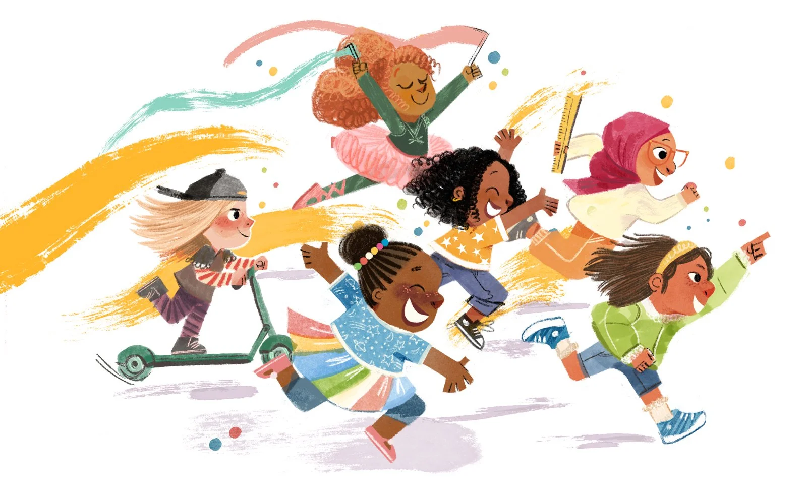
Back in October of 2020, I was asked if I wanted to illustrate a book called AMBITIOUS GIRL, written by Meena Harris and published by Little Brown Books for Young Readers. It was my first publishing gig and if you haven’t heard me say it already, this book changed my life.
It’s a picture book that pushes against the phrase, “too ambitious.” I try to still tell myself, “there’s no such thing as TOO ambitious!” Because I dream up big plans for my art and my business and my books and for how much ice cream I can eat in one sitting.
Fast forward two years into the future and here I am, seeing my second book with Meena and the whole Little Brown team out in the BIG WIDE world. A IS FOR AMBITIOUS had its book birthday on March 14th! Woot woot! A lot of blood, sweat, tears, ice cream, smiles, and Star Trek went into this and I can’t wait to share my book-making process ya’ll.
A little summary of A is for Ambitious, written by Meena Harris and published by Little Brown Books for Young Readers.
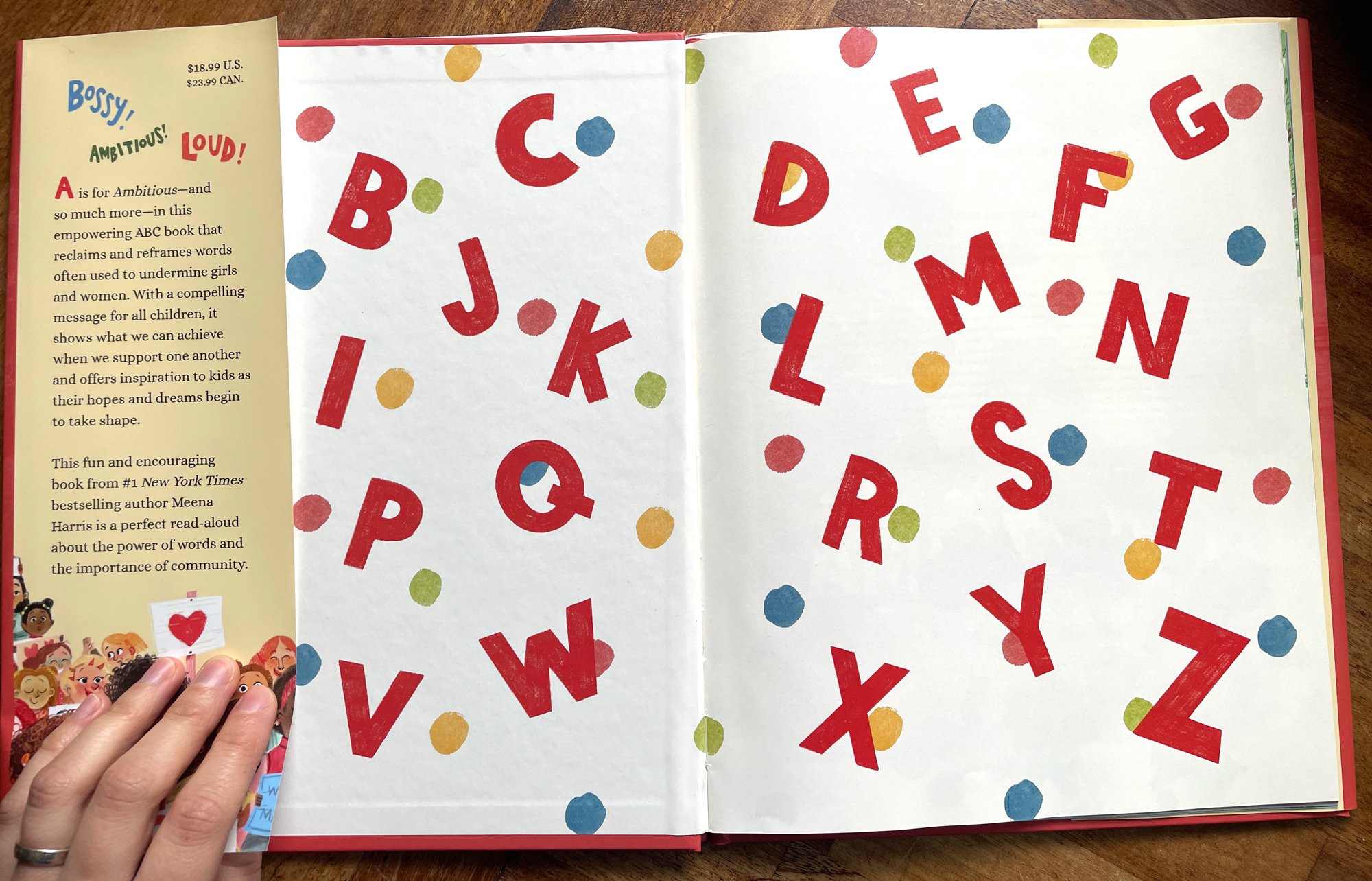
The #1 bestselling team behind Ambitious Girl is back to take AG on a new adventure. A is for ambitious—and so much more in this fun and empowering picture book that reclaims words often used to undermine girls and women from A to Z. When they’re ready to take on the world, ambitious readers will have the vocabulary to do so.
This book offers ambitious children everywhere inspiration as they pursue their goals and dreams. With a powerful message for us all, this is a perfect read aloud for showing children the power of words.
When I was first given the manuscript for this book, I was SO excited. This story takes place in the Ambitious Girl “universe” but it’s an ABC book that redefines negative words, i.e. a dream project for me. Along with being a classic ABC book, this manuscript allowed me to be more abstract with the illustrations. But that freedom came with hesitation. What would I draw if I could draw anything??
Brainstorming and Research
In the first AMBITIOUS GIRL book, I made sure the illustrations complemented the manuscript while also adding a separate underlying story. That secondary story is that Ambitious Girl and her family attend an award ceremony in the park to announce who is the most ambitious girl of the year. It didn’t say to do that anywhere in the manuscript; it’s something I added to give the story an extra layer of interest.
Which is what I LOVE to do. I LOVE creating illustrations that weave a story that aren’t necessarily there in the text.
If you have a book that’s half text and half illustrations, why not add something extra to the artwork? It’s not always easy or possible to do, but when you can do it, OH, I think it takes the book to the next level. And with A IS FOR AMBITIOUS, I felt like that extra layer would make this book a lot of fun to read for both kids and parents. It includes confidence-boosting rhymes like:
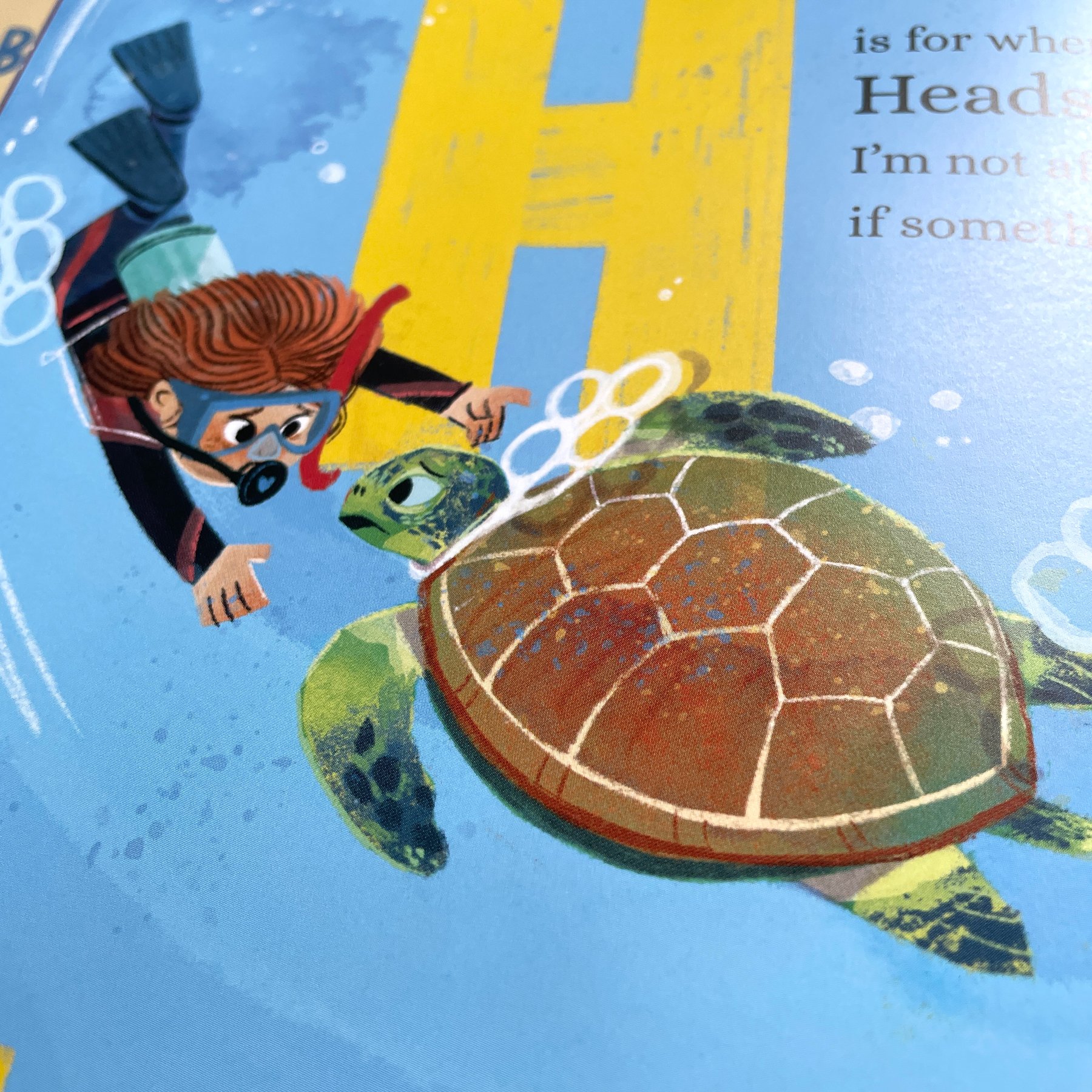
H is for when I’m feeling Headstrong. I’m not afraid to speak up if something is wrong.
Cool! But I couldn’t think of how to string all the images in this book together to make a cohesive underlying narrative. Soooooo… I just started researching. And researching. And researching some more. Luckily, I really enjoy this part of the process.
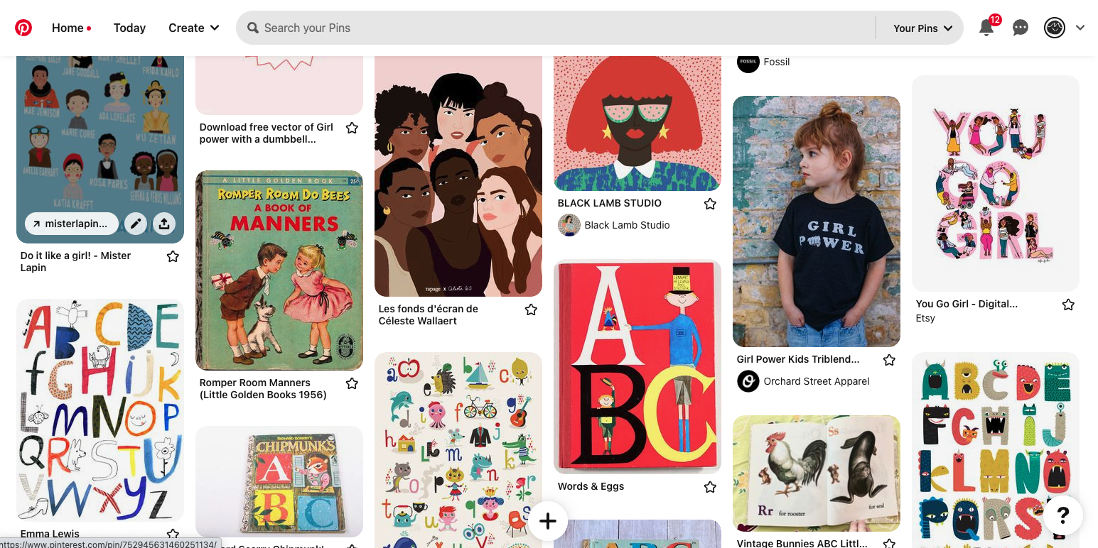
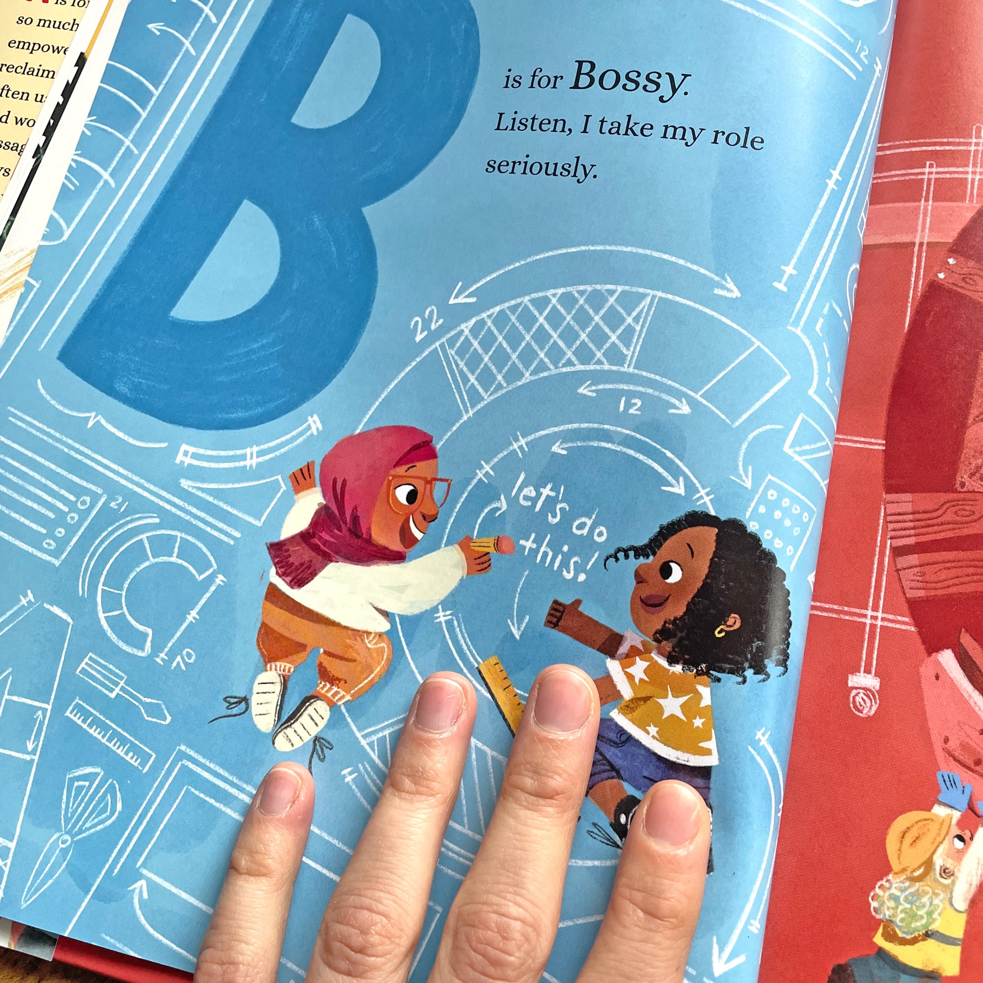
I went to my usual hangout for researching, Pinterest, and started making boards to figure out basic color, style and general feeling for the art. I looked at lots of ABC books, both old and new. I looked up lots of ambitious girls and women and eventually an idea came to me. Maybe each letter in this book could illustrate a profession/passion that relates back to the text? Eureka!
Using fun professions in a book wasn’t a super new idea to me though. When I do AMBITIOUS GIRL virtual school visits, I usually ask the kids I’m presenting to what they want to be when they grow up. I think it’s fun because they usually have HUGE ambitions. Astronaut, paleontologist, doggie daycare owner!
I even met one girl who had the astronomical aspiration of becoming a bird. I bet it would be a lot of work, but at least she was ambitious!
I think it’s important to teach kids at a young age to be ambitious because those big aspirations tend to peter out as they get older. But we should stay ambitious even if that means instead of being a paleontologist, you become a researcher. Instead of an astronaut, you work at SpaceX BUILDING the rockets! Heck that bird girl could definitely become a pilot! Anyway, it’s a topic that’s obviously close to my heart and so I felt like kids and parents reading the book would relate to the idea as well.
Once I figured out which careers I wanted to include in the book, I then started collecting reference photos. There’s no main character throughout, which means there’s a different set of girls on each page/each spread, which was a LOT of different faces, outfits, and styles to draw.
So I amassed 183 photos (I checked!) from Google and Getty images.
This took a long time but it was so worth it! Getty images is one of my #1 places to find reference photos because they have an enormous stock photo library to choose from. (They are just for basic reference though, so if you’re using them, know that you can’t trace off the images or recreate them exactly without having to pay for them.)
But with those 183 photos, I felt ready to start sketching.
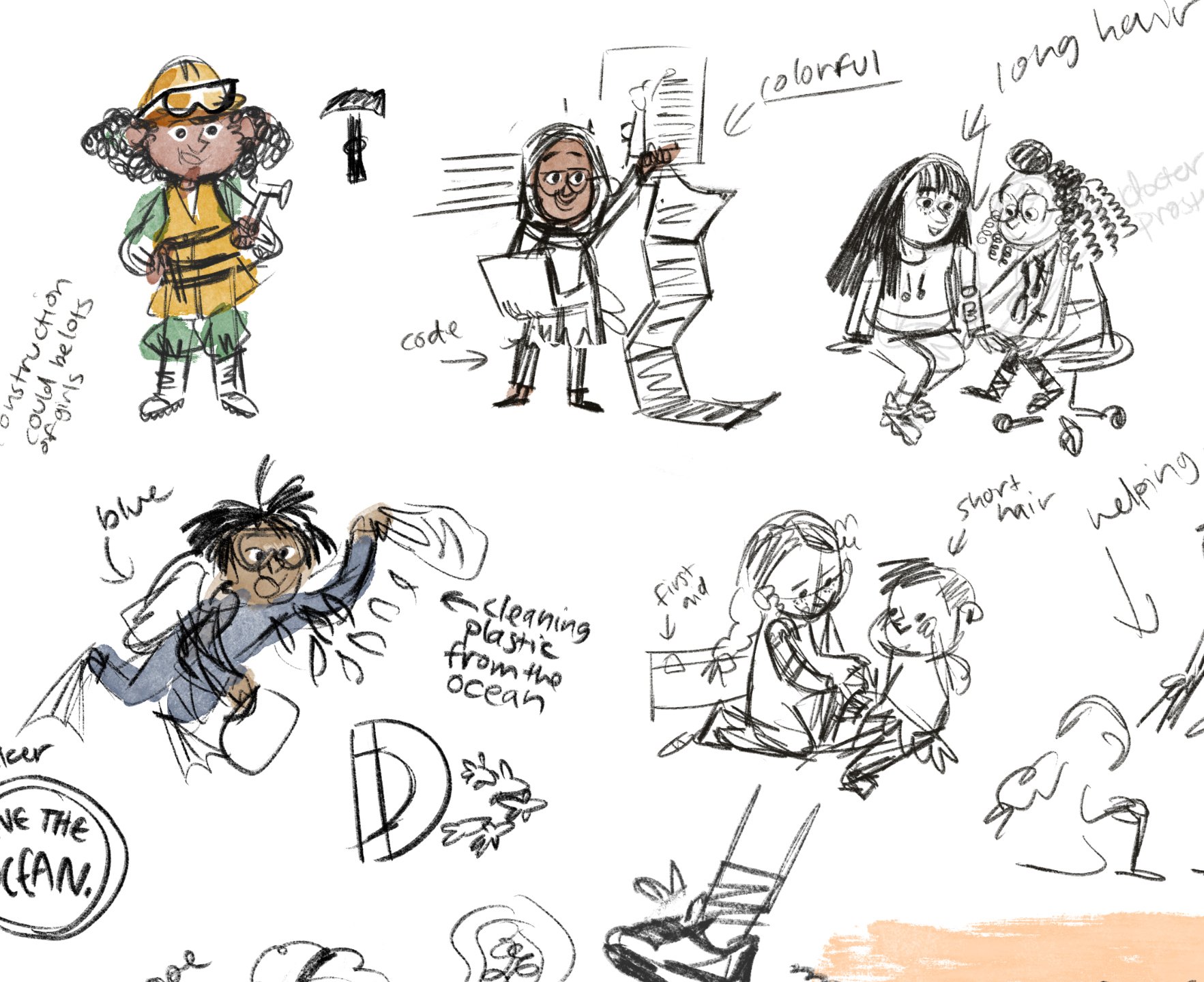
Character Designs
Okay, let’s get real: this book was created during an INSANE time in my life. I had just gotten married and I was about to move to the UK and I was turning everything upside down to get that all figured out.
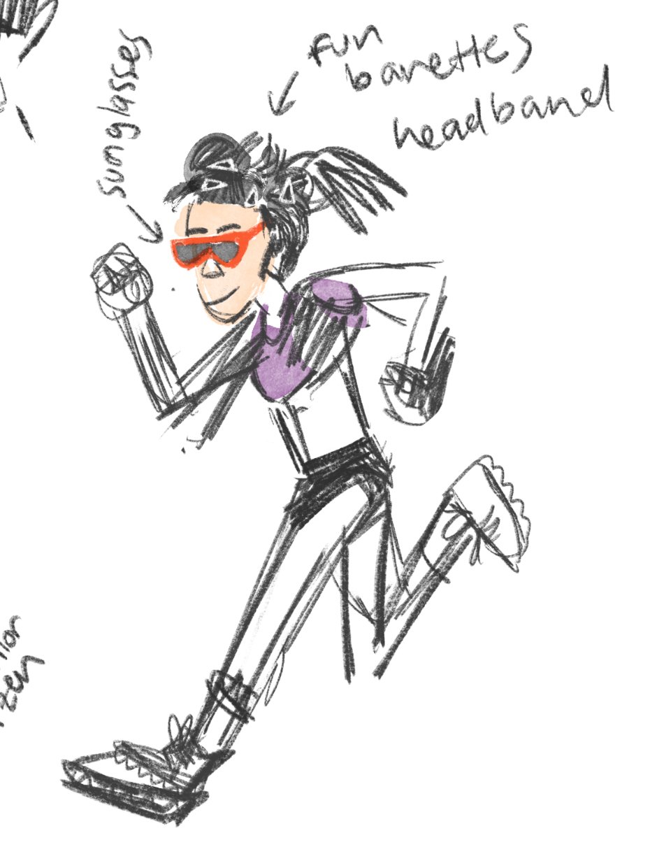
So I didn’t have the time to focus on character designs as much as I wanted. That means most of the character sketches were done quickly and in Procreate. I think I may have done some designs with pencil and paper, but I assume those were lost in the move…
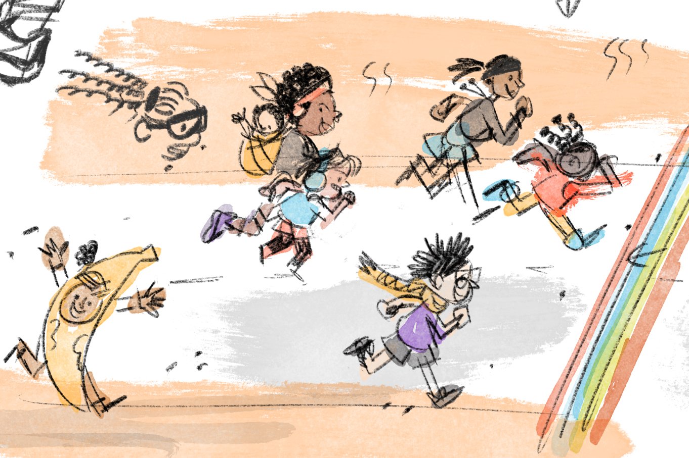
The character designs for this book weren’t as important as they had been for the first book anyway. In AMBITIOUS GIRL, we really needed to hammer down what Ambitious Girl was going to look like and it was important to make sure that her family was consistent from page to page. This book, eh, each page/spread was different, there was a new character/set of characters per scene outside of AG herself. I made the above really rough designs but mostly went with the flow deciding what kids would look like while sketching out the compositions.
Although, the above character sketches ended up being almost exactly what I painted in the finals! How funny is that?
Thumbnails and Sketches
Onwards and upwards to the thumbnails! Another difference between the two AG books is that with this book:
1. I had more time to create it (I only had a month to illustrate, from start to finish, the entirety of AMBITIOUS GIRL). This time around I had more like 6 months.
2. I wanted to add more color. Like WAAAAAAYY more color.
3. And I wanted to experiment more with imagery. Go a little wild!
When my editor, Farrin, and I initially talked about what we envisioned for A IS FOR AMBITIOUS, she suggested having more of a vintage feel to the book to challenge the idea of what the “classic” ABC book looks like. Oooo, I loved that idea. A vintagy feel but with contemporary text sounded like a fun challenge. I’m also a huge Mary Blair and Richard Scarry fan so I relished the idea of making something similar to their work. I really liked their use of bright primary colors, bold shapes, and big monochrome backgrounds on spreads.
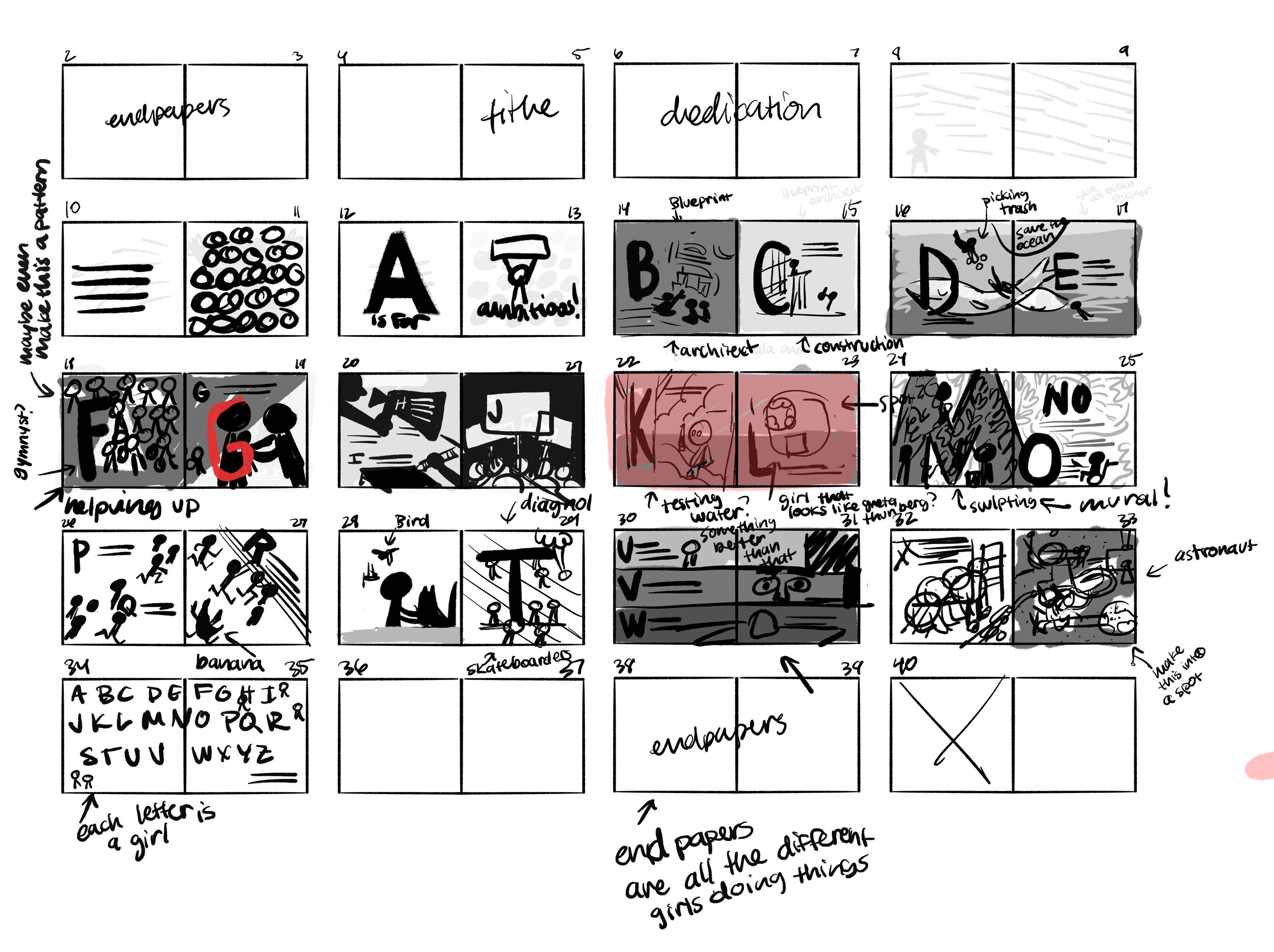
Super rough thumbnails for the book. I have to write down notes because I usually can’t tell what I’ve sketched out after a day.
While I had more time to work on the thumbnails, I found out quickly that it was going to be DIFFICULT.
I knew that I was going to be illustrating kids in professions and passions but it was difficult implementing those professions into real compositions. What made this even harder was that some spreads only had one letter on them, which meant lots of space to draw a scene. But others had three letters on them! The last thing I wanted to create was a cluttered book…
I spent a couple months just experimenting with the thumbnails to see what worked best. As you can see in the super, SUPER rough thumbnails above, I was trying to block out basic shapes on each spread and identify the foreground vs background. I also wanted a good mix of full spread, single page, and spot illustrations to keep the reader’s eye flowing through the story.
Side note: I know that children’s book illustrators are meant to draw lots of different kinds of compositions in a book, but hey, I like to go against the grain sometimes. My next goal is to make a book where there are only double page spreads! Okay, back to the topic at hand.
While it wasn’t easy drafting out the roughs for A IS FOR AMBITIOUS, it was a lot of fun. I like to think picture books are like puzzles (I had my wonderful editor on another book say the same thing to me once!). It takes so many tries to see what piece fits where. But it’s like glitter cannons and narwhal rockets go off when you place that last puzzle piece into its place because it’s just so dang satisfying getting it right!
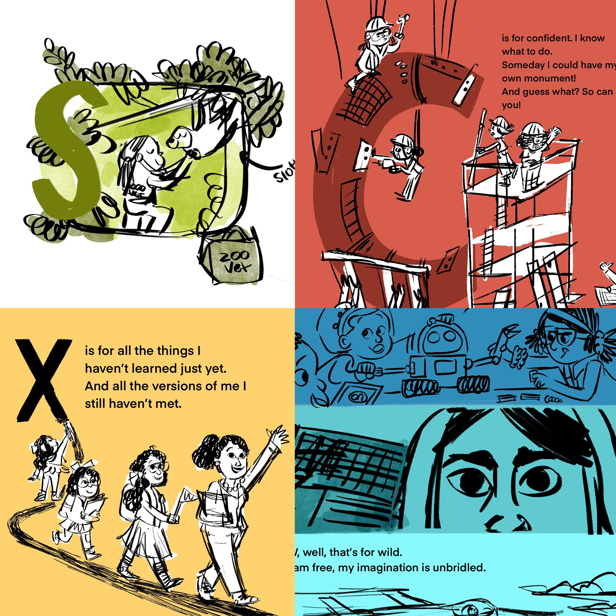
A few more finalized sketches from A IS FOR AMBITIOUS. Some of these made it to finals, some did not and some got moved around! Lots of fun :)
So I worked on the thumbnails and sketches for a few months and turned them in either right before or right after I made my major move to the UK. I was pretty happy with how they were looking! And my editor and art director were pretty stoked with everything as well. It was a blessing from the book gods that things were going so smoothly!
Then I hit a teeny snag. When I first started thinking about the book as a whole, I had to think about trim size. Which meant, what size would the book be? The first Ambitious Girl book was 9 x 11 inches, but because this was a totally different topic, I was thinking this would look better as a square. I felt like having a square book rather than a rectangular one would lend itself to that “classic” ABC book look.
My initial sketches were all for a square book, 10 x 10 inches. I was really happy with how it was looking but then a little email slid into my inbox. My editor said NOPE, we had to keep the size of the book the same as the first for marketing purposes.
Bummer! I was annoyed that I had to change every spread, but in the end, it wasn’t that big of a deal. I felt sad that the book was literally changing shape, but I got over that quickly when I started sketching out pages on the new dimensions. I realized there were some compositions that weren’t totally working on the square pages and in the new rectangular format they had a lot more space to breathe.
I feel like 95% of being a children’s book illustrator is rolling with the changes, keeping an open mind, and embracing new ideas for your book. Taking a cookie and coffee break when things don’t always go your way helps too ☕️
Color Palette
Sketchy sketches from several spreads in A IS FOR AMBITIOUS. The sloth one was moved around a few times in the book.
The color palette for this book really helped me figure out how to form the compositions. When I was sketching, I kept the vintage primary color palette in mind. I knew that I wanted a lot of bright primary colors to mimic that Mary Blair kind of style.
Looking back, I’m really glad that I made a moodboard/pinterest board to help me make my decisions as I moved through the book. The color palette has come as more of an afterthought for other books I’ve worked on, but I think the way I work best is by incorporating color, even if it’s just basic colors, early on in the process. It’s something I’m going to try and do for my future projects. I think it’s crazy that it’s taken me years (my whole life really) to figure this part of my process out. I love my brain but I wish it would be a bit more efficient with its thinking sometimes…
Because I was working on the color palette at the same time as the sketches, I turned it all in at the same time to the publisher, which was nice! Everything off in one handy dandy email. When I got notes back, I’m pretty sure there were NO notes about the color which was fantastic too. The book was coming together!
Finals
After doing a couple round of revisions on a few pages and changing the trim size of the book, I was given the okay to start on the finals. This happened only a little while after I landed in the UK so I said hi to my husband and then just plopped myself into a chair, turned on Star Trek: The Next Generation (which is a surprisingly EXCELLENT show by the way), and went to town on finalizing everything.
While finals aren’t usually the most fun part of the process for me, there were several times in this book where I finished a spread and was really proud of what I created. Especially some of the spreads that challenged me! I am NOT the type of artist that enjoys drawing cars or trucks or construction equipment, but I decided that I would try to do that for the letter F. And not to toot my own horn but, TOOT TOOOOT. The vehicles came out exactly like I wanted them to and I even wanted to draw more vehicles for books in the future.
Imagine caterpillar Marissa emerging out of her artsy chrysalis to blossom into a butterfly that thinks construction equipment is not so bad and kind of cool, really.
A final spread from A IS FOR AMBITIOUS.
The finals were made almost entirely in Procreate, using a few handmade textures here and there for minor details. I used watercolor brushes, chalk brushes, and some splatters to get the final look. From Procreate, I took the art into Photoshop to do some basic compositing and color correction. And then that was it! I loaded all the files into my Dropbox and sent them over to my art director, Saho.
It’s always SO nerve-racking sending in the finals for a book, but I felt such relief afterwards. I’m pretty sure I sent those in and then took the longest nap of my life.
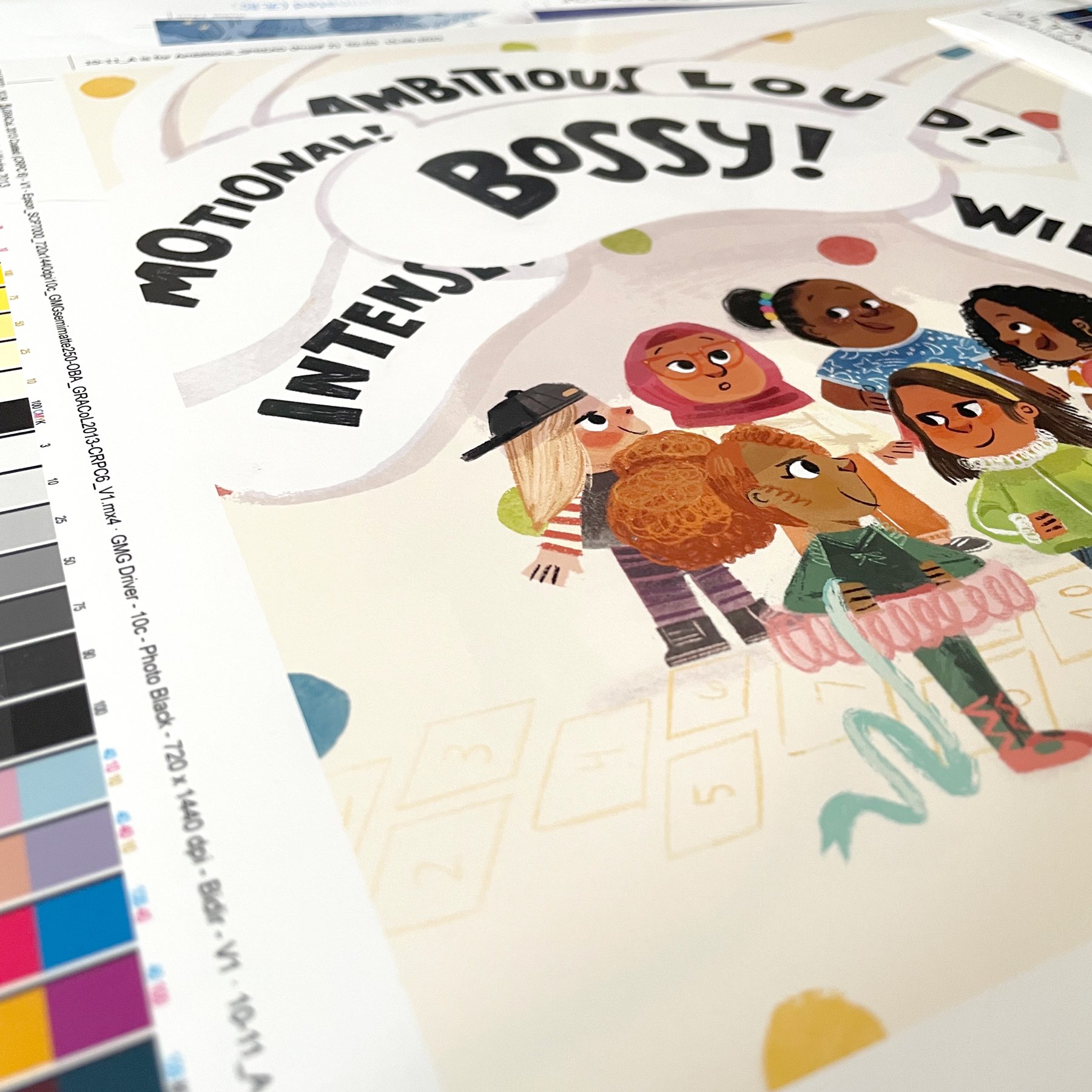
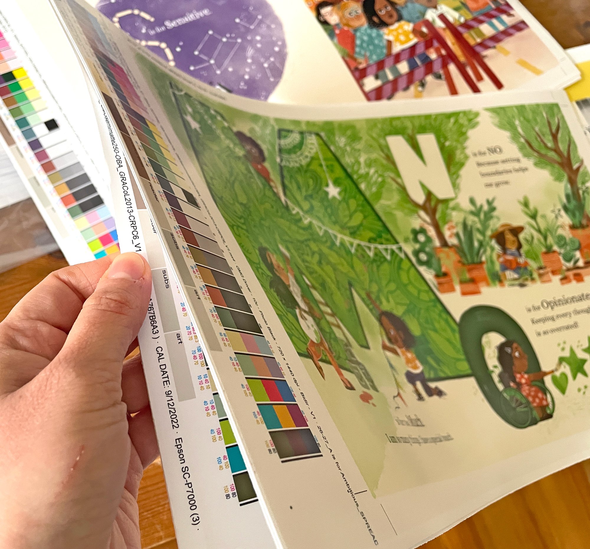
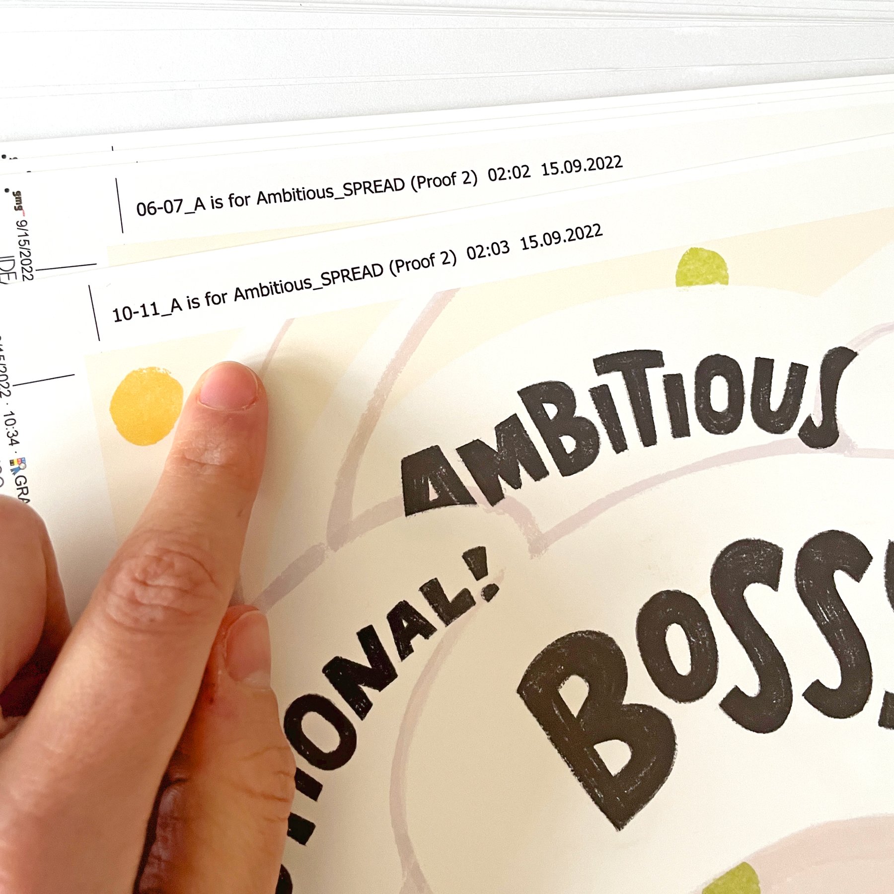
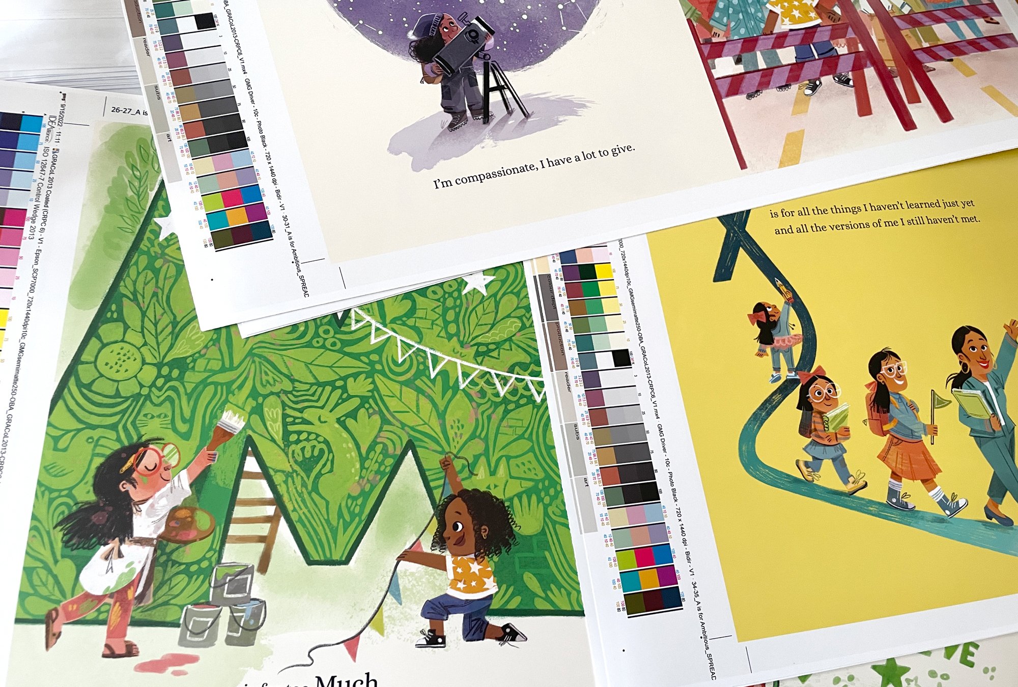
After turning in the finals and after doing some minor final revisions, I had the lovely wait for my proofs. I was working on a couple other books so my mind was occupied while I was waiting for the proofs, so it was a big surprise when they showed up on my doorstep! I really loved getting to see them because the color came out practically perfect. Previously I’ve had problems with other books looking washed out or being too dark but this one came out exactly how I envisioned.
I also really enjoyed the proofing process because it was the first time that I sat down with my editor and art director to discuss all the tiny details that we wanted to change from the printer for the final book. It was a lot of fun diving deep to make sure this book was going to be as beautiful as it possibly could be.
And that’s it! On to the next book :)
It was a real eye-opener working on A IS FOR AMBITIOUS because I got to push my style and it paid off! There have been times in the past where that was not the case, but I enjoy going forward, trying new things and taking the good and bad as they come. Talking about the good, below are some of my favorite images from the book. My all-time favorite thing to draw was the veterinarian and her sleepily-happy sloth! I NEED to draw more sloths in the future…
This is the second blog in the “Making the Book” series and I hope you enjoyed it! There’s A TON to creating a book so I hope this overview provides at least a teeny insight into the mysterious process of illustrating a book. OOoooOOOo.
P.S. I tried to put in as much of my process in this blog post, but there’s so much that goes into it that I’ve also had to leave a lot out! If you have a question about something I didn’t talk about here, please let me know and I can answer your question via the newsletter OR maybe even in another blog post.
A IS FOR AMBITIOUS is out now ❤️ If you liked what you saw in this blog post, you can grab the book at your local independent bookstore, at your local library, or through Amazon.
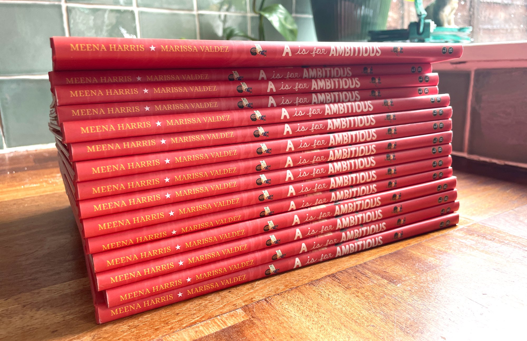
My stash!
