Well hello there, friends. I can’t believe it’s already May. How did it get to be five months into the year? I’m chugging along and looking 2024 straight in the face now. It’s sneaking up on me but I’m going to be ready for it! Hope your year is going at the perfect pace.
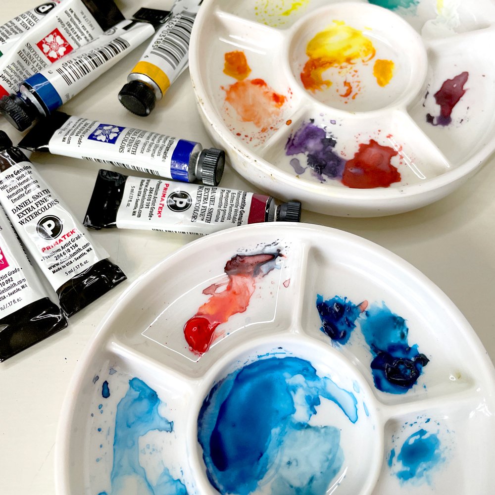
Gouache, watercolor, and colored pencil respectively. @marissaarts
I thought I would write about something lighthearted, tangible, and full of fun this month! So I’m talking about the pros and cons of working with three different traditional mediums: gouache, watercolor, and colored pencils.
But secretly, this blog post is a bit of an excuse for me to bust out my paints and draw cute cats! While I love getting messy with my paints, I don’t always have the time for it. I sometimes worry that the things that I enjoy doing will fade away unless I actively make the time to do them. I wanted to create an intersection of a blog post that I hope ya’ll enjoy while experimenting and having fun painting. I hope I’ve achieved that!
P.S. This is not a tutorial post, these are just my thoughts on a fun exercise. And truly I’d love it if this blog became a conversation. What traditional medium do you enjoy using the most? Are there any that are your less-than-favorites? Are you a digital artist that is trying to paint more traditionally? Like moi…
I’d love to hear what you think! Send me an email or comment in this blog post below. Alright, onto the reviews!
Initial cat space sketch on Bristol board. @marissaarts
The finished gouache painting. Pencil for scale :) @marissaarts
Okay, 1st up is Gouache.
My Materials:
M. Graham and Co. Gouache, Holbein Acryla Gouache, and Bristol Board
Pros:
I love how opaque gouache is. If I make a mistake, I’m still able to fix that mistake fairly easily without muddying up the painting. It’s a wonderful mix between the opaqueness of acrylic paint and the transparency of watercolor.
The colors are SO saturated! Sometimes when I work digitally, I can get stuck trying to figure out what my color palette should be, there can be too many options! With my gouache sets, I find that I can get a nice saturated palette from just a few paint tubes. And nothing is too neon like it can be if I work digitally. Neon yellow can work sometimes but I know I’ve overdone it in Procreate before…
It’s nice for painting in a more graphic style. You can lay down flat colors really quickly while also adding dry and wet textures.
Cons:
Not a lot of cons really!
It takes some getting used to. When I first started using gouache, I was using it only like watercolor and nothing seemed to come out like I wanted. Once I practiced with it more, I found my sweet spot between using the paint thickly in some parts and more watery in others.
The paint can start to build up if you’re repainting one spot over and over again. So be careful not to build up layers too thick, especially in trouble areas that you might be trying to get juuust right.
It can sometimes be difficult to gauge how a color will look on your canvas. Keep a test paper nearby so you don’t unintentionally start slathering on a shade of blue that is waaayyy too dark or a pink that ends up looking more like a red. You can dab a little paint on the test paper to make sure that it’s the color you’re actually looking for.
My final gouache version. @marissaarts
How do I think the painting turned out?
I’m a big gouache fan, sooooo I might have gone into this exercise with a bit of a bias. But I love how it turned out! Some of the line work is messier than I wanted, but I still like there are rough edges and splotchy textures throughout. The colors came out wonderfully saturated as well, which was exactly what I was hoping for.
Tips:
Work with a basic palette, don’t bother with buying a ton of different gouache paint tubes. I love working with red, yellow, blue, and white and that’s pretty much it! You can mix whatever color you need from there.
Gouache allows you to add some lovely dry textures into your illustration. Don’t be afraid to try a dry brush technique to give your painting a stippling effect.
I like using more of a squared brush head with gouache because it allows you to get really nice crisp edges with the slightly gooey paint. I find that if I use rounded brush tips (especially the larger sizes) the paint can get clogged up on my brush and refuse to go onto the paper easily.
Watercolor is next! #2
My Materials:
Daniel Smith Extra Fine Watercolors and Bristol Board
Pros:
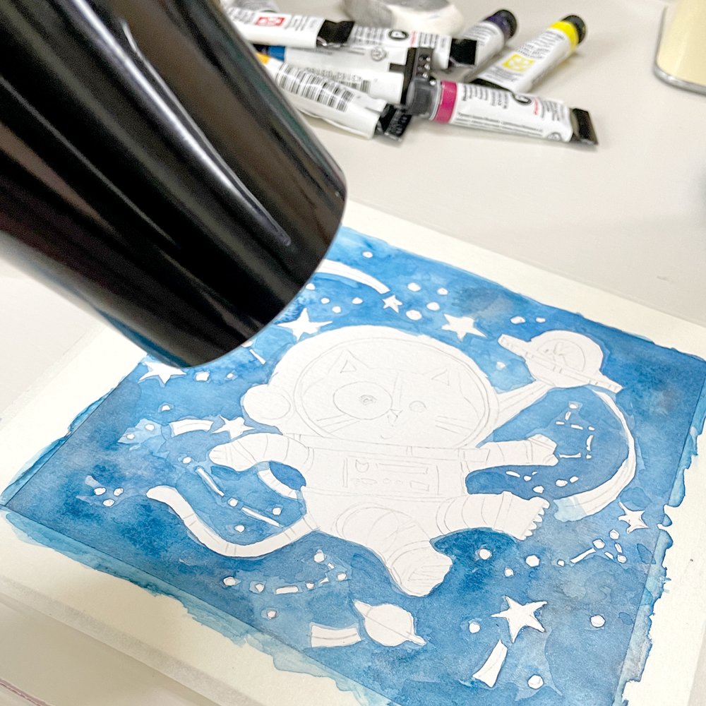
Painting with watercolor can be very calming. Adding one layer at a time and waiting for it to dry teaches me some much needed patience and gives me time to reflect on what I’m actually painting. I like that adding layers and layers of blue in the background of this piece made the galaxy behind the cat look really textured and full of space! (Although I will still pull out the hair dryer for a quick dry every once in a while…)
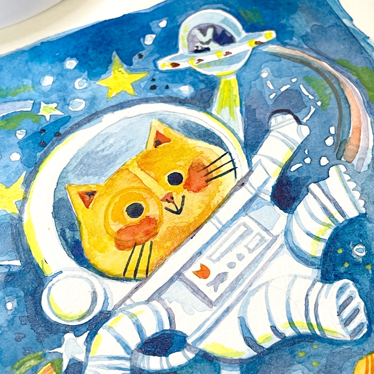
This painting has more form than the other two because I was able to add transparent shadow layers around the cat’s helmet and on the mouse’s alien spaceship. While it’s not impossible to create shadow with other mediums I find that it comes more naturally with watercolor.
Oh, that texture! The background came out looking really nice, especially in the corners, where I was able to let the water and color run a bit. The droplet textures really make your eye circle around the whole piece a few times. And it gave it a dreaminess that I feel like the gouache didn’t have.
Cons:
Patience! Or my lack of when it comes to painting with watercolor. This is a pro AND a con, I guess! I tend to run out of patience and not wait long enough to let my watercolor dry. Then I either smear my paint or I leave a section under colored.
I didn’t use masking liquid for this painting but I wish I did. It was difficult navigating around all the little stars and planets in the background even with a small brush. The constellations are a bit hidden because of that.
The color didn’t come out exactly like I wanted. I kept on trying to add more purple to the background but each time I mixed purple, it came out too muddy and just ended up looking like dark blue. This made me think of when I use purple in a Procreate painting in the CMYK space. My digital pieces tend to print out more blue/dark than purple. Hmm! A coincidence??
My final watercolor version. Couldn’t resist a paint splatter here and there. @marissaarts
How do I think the painting turned out?
I really like the texture that the watercolor created but I’m not super happy with the blue background. It came out more green-blue than I was looking for. This makes me want to try and paint it again to see if I can fix that. I enjoy the soft edges around the character though. It reminded me of a more classic children’s book illustration.
Tips:
Don’t overwork your layers. There are parts of this painting where I layered on too many colors and they ended up muddy. It’s my biggest pain with working with watercolor BUT there are sections where I didn’t overwork it and it looks AMAZING! I want to work with watercolor more because it’s a real exercise in using as few paint strokes as possible to get your point across.
Stay simple with your colors. This is more of a life tip than just a painting tip. The more I fill up my palette with different paint colors, the more I make a painting that looks too busy.
Invest in some masking liquid in case you want to keep really crisp lines around your white space. If you don’t use masking liquid, you might have more flowy/wavy edges, but that’s a great look too! Try out both methods and see what works for you.
Last but not least, Colored Pencils is #3.
My Materials:
Derwent Inktense Watercolor Pencils (technically watercolor pencils but I like to use them as colored pencils) and Bristol Board
Pros:
The coloring process. I LOVE sitting down with my colored pencils and just coloring away at a blank sheet of paper. It reminds me of when I was a kid and I used to pull out a stack of coloring books and just go to town. It might sound like a strange pro, but it’s one that matters to me. I think it’s important to like what you’re doing to continue doing it!
Texture!! Much like using watercolor, you get SOOO much texture from using colored pencils especially on rough toothed paper like this Bristol board. I love all the tiny white specks popping through the color. It almost makes the piece look like it’s covered in bits of starlight. 10/10 advantage for colored pencils for me!
Color blending is really easy with good quality colored pencils and makes for some great gradients. That’s pretty evident on the space cat’s face below.
Cons:
When you make a mistake, you MAKE a mistake. There’s no going back from accidentally drawing a line where you don’t want it. I attempted to use an eraser in a few spots that I wasn’t happy with but it didn’t make much of a difference. If there’s a way to completely erase a colored pencil line, please let me know!
Loss of detail at a smaller size. These pieces are about 6 inches x 6 inches, so not super huge. If the illustration started at a large size I could’ve drawn in more detail, especially in areas around the cat’s face and inside the mouse’s spaceship. A learning experience!
Smudging. Oh, the smudging. Some of the sections of this drawing definitely have smudging problems. With my palm, I kept on smearing blue dust from the background into the yellow of the stars and it really muddied up their color. I’m wondering if masking fluid could be used with colored pencil as well to keep smearing from being too much of an issue? An experiment for another time I guess :)
My final colored pencil version. You can still see faint pencil lines here too. @marissaarts
How do I think the painting turned out?
Like with the other two, I’m AGAIN really happy with how it turned out! I love, love, LOVE the texture of the colored pencil and I like how the shapes had to be a little more defined (especially with the star trails) because I wanted those areas to look really bright. The cat’s face came out way different from the other two pieces which I didn’t mean to do but just kind of happened while I was coloring. It was a nice surprise! Overall a great experience but I might try to recreate this image at a larger size to see if I can add in more detail.
Tips:
Put on a good podcast or audiobook while you’re finishing a piece with colored pencil. I found that it was a fairly slow process compared to the watercolor and gouache painting times. You might find that it’s meditative like for me though!
Keep a pencil sharpener close at hand. I think I was sharpening my pencils every minute or so to keep the lines crisp, especially in the more detailed areas.
Plan out where you want white space before drawing. Like watercolor, you’re working from light to dark. It can be really easy to draw over a section that you later realize should’ve stayed white and then you have to paint over it or composite two pieces digitally to get that white space back.
A teeny process video.
When I first started writing this blog post I had the initial idea of filming myself painting all three versions of this space cat. I got half-way through the gouache painting and my phone completely ran out of space. Yarg!
So here I am now, with half a process video that I don’t really want to keep locked away in file exile forever. I haven’t edited it, I haven’t added music behind it, and I haven’t sped it up. I thought it might be fun to share a totally real representation of what it’s like when I paint. Hope you enjoy!
P.S. I have a bad case of hay fever/allergies at the moment so you can hear me sniffling, coughing, and sneezing throughout the video. This is NOT for anyone who enjoys ASMR… Sorry about that!
Those are my reviews! I had a lot of fun creating these pieces and sharing my thoughts with ya’ll.
I often get asked if publishers will hire illustrators that work traditionally. Or is working digitally the only way to get a job? Honestly, I believe the children’s book industry is leaning towards books that have some sort of traditional aspect to the illustrations, like hand painted textures or just painting the whole book traditionally. Christian Robinson, Brenden Wenzel and Vanessa Brantley-Newton are all illustrators who do just that and do it beautifully.
If you’re someone trying to get into the children’s book illustration industry, don’t stop yourself from using traditional mediums because of outside pressure. Create art that feels like you. And here’s my last, last tip:
Have fun! I’ve felt that pressure. The pressure to work only in the way that I’ve worked previously, but I’m here to say it’s okay to experiment. That’s how you grow.
Please try this exercise yourself, share your thoughts, and give yourself room to try out new things. I’m thinking that I might try this exercise again but with mediums I rarely EVER use. Hellooooo oil pastels!
Have a lovely May, friends. Talk to you more soon ❤️
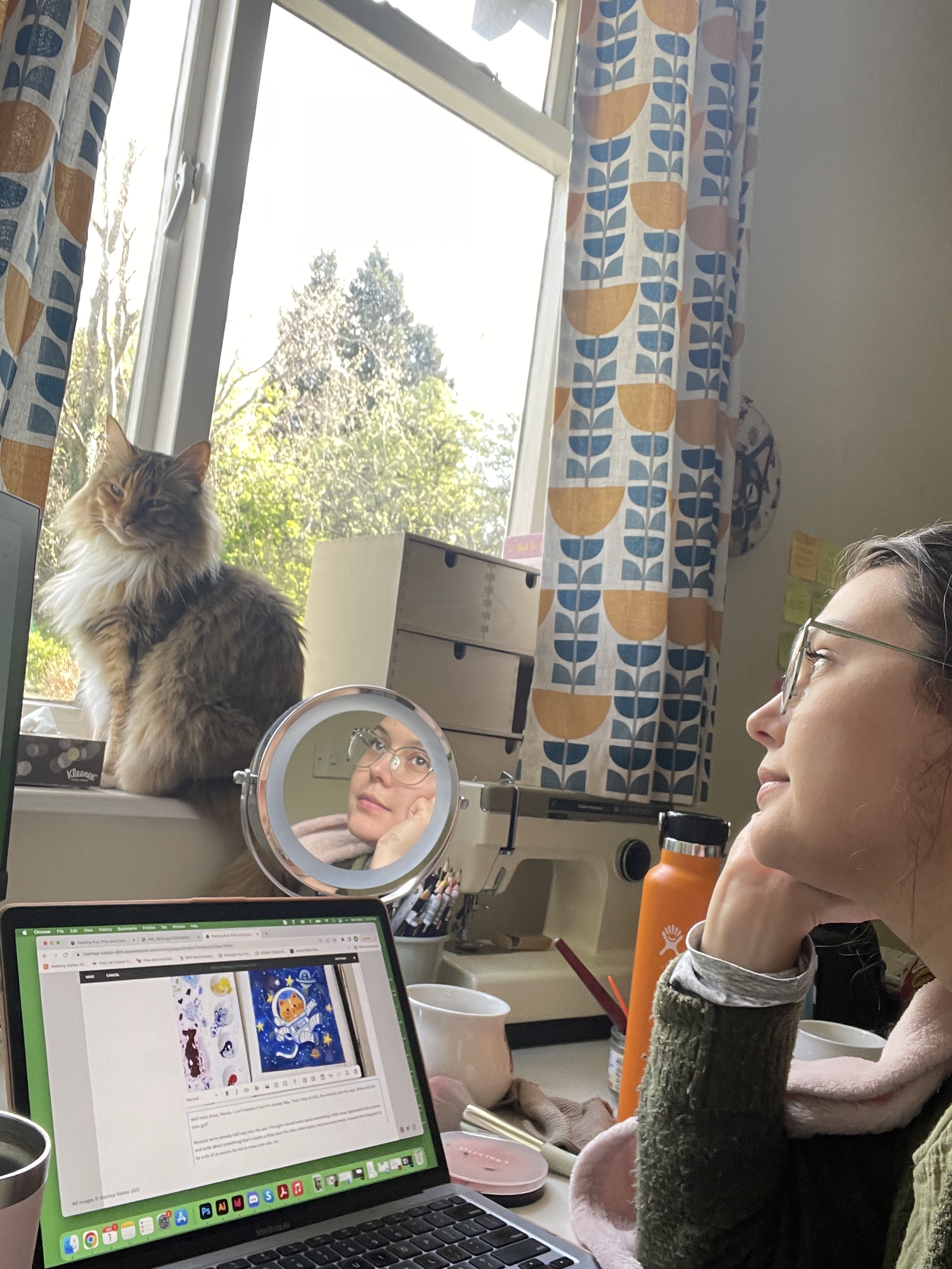
Me trying to look deep in thought. Chica got the stare down better than me though…
